
A line drawn across the body, on purpose
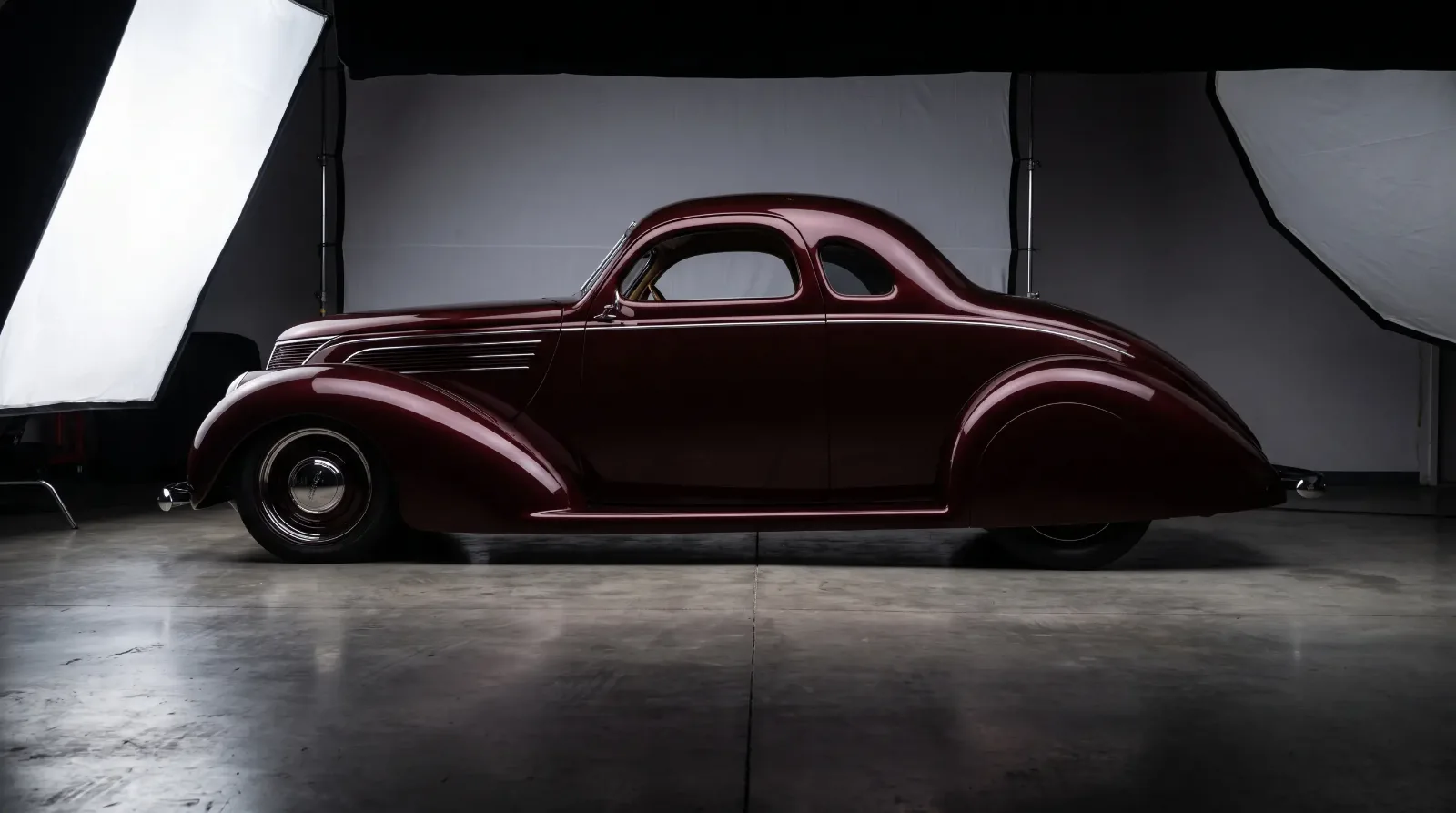
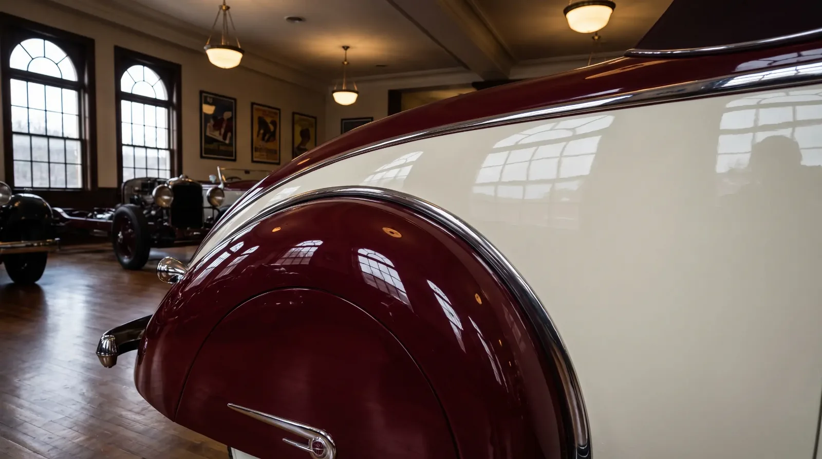
Picture a showroom floor in 1934, the overhead lights catching a fender that shifts from deep maroon below to cream above, the break between the two colors following the exact curve of a body crease as if the paint had been waiting there all along for someone to notice it. That was the intention behind two-tone paint in this era, not decoration added after the fact but a color choice built into the design from the first sketch. For the fuller design story behind these schemes, the 1930s two tone paint guide covers the wider movement.
The color break almost always followed a structural line already present in the body, a fender crease, a beltline molding, a running board edge, rather than being an arbitrary stripe painted wherever looked nice. Get that detail wrong on a repaint and the car stops reading as a period piece and starts reading as a costume.
Why the lower body almost always went dark
There was a practical logic underneath the aesthetic one. Road dust, mud, and general grime collected lowest on the car, so a darker color on the lower panels hid wear better than a light one would have. Designers built the visual scheme around that reality rather than fighting it, which is part of why the classic arrangement, dark below, light above, appears so consistently across manufacturers who otherwise had little in common stylistically. It solved a maintenance problem and a design problem with the same decision.
The lighter upper color also did real work for the eye. It drew attention to the greenhouse and roofline, making a car look lower and longer than its actual proportions, a trick particularly useful on cars that were, underneath the paint, fairly upright and boxy by later standards.
"The paint line was never just decoration. It was the designer's last chance to tell your eye where to look."
— Nora Beckett
What a careless repaint gets wrong
The most common mistake on a modern repaint is placing the color break somewhere convenient for masking tape rather than where the original body crease actually falls. It looks close enough in a driveway photo and wrong the moment you see the car next to a documented original. A second common error is choosing colors that feel period-appropriate in isolation but were never actually offered as a factory pairing for that model, an easy trap when working from memory rather than an original color chart or brochure.
Finding accurate reference material takes some digging. Original dealer brochures, factory color charts, and, where they survive, original paint chips under trim panels are the most reliable sources. Modern paint code cross-references exist for many popular models, but they should be checked against a primary source rather than trusted blindly, since transcription errors have crept into some of the secondary references circulating among restorers.
Reading a color scheme as a dating tool
Two-tone combinations sometimes shifted from year to year within the same model line, which means a documented color pairing can occasionally help narrow down a production date on a car with incomplete records. This only works reliably when cross-checked against other evidence, chassis number, build sheet, coachbuilder tag, since a car could always have been repainted into a scheme from a different year at some point in its life. Treat paint as a supporting clue, never as the deciding piece of evidence on its own.
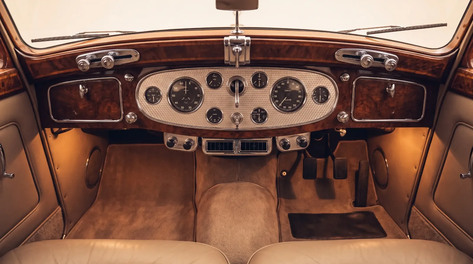
Color was only one part of how these cars communicated their design intent. The dashboard carried the same visual logic inward, into the cabin, where instrument layout and trim followed just as deliberate a plan. The next story picks up that thread.
The chemistry that made these colors possible
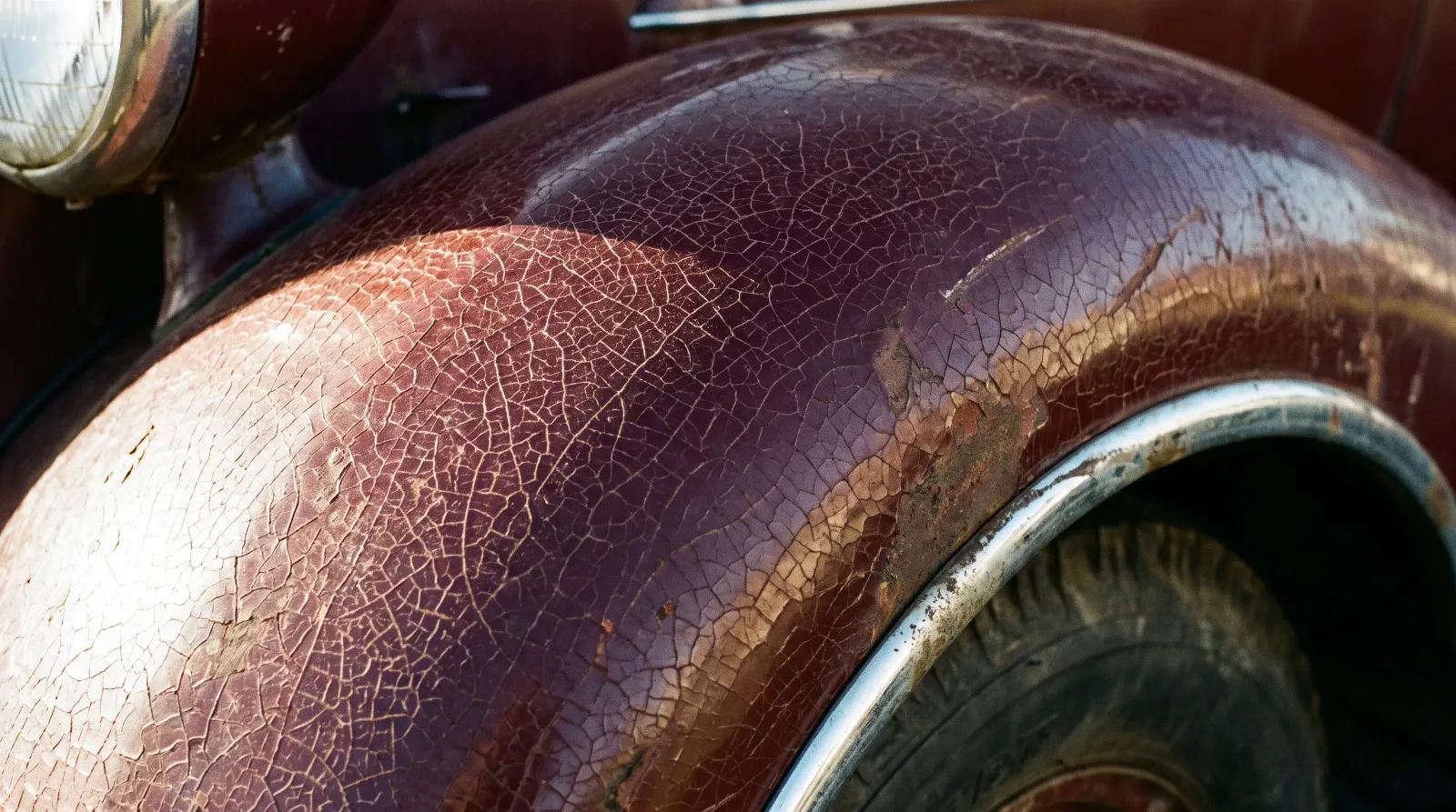
Deep, saturated automotive paint in this period often relied on nitrocellulose lacquer, the finish DuPont brought to market in the 1920s and that GM and many smaller independents favored through the 1930s (Ford, Chrysler, and a few others leaned on alkyd enamel instead). Lacquer produced rich color and a good shine but demanded real skill to apply evenly and real patience to maintain afterward. It also aged in a particular way, developing a soft patina and, on cars that spent years outdoors, a network of fine surface checking that collectors sometimes call alligatoring. That aging pattern is now, ironically, part of what tells an expert whether a paint job is truly original or a later repaint done to look old. A car wearing genuine ninety-year-old lacquer looks different up close from one wearing a modern basecoat-clearcoat repaint tinted to match, even when the color itself is correct.
This matters for anyone deciding whether to preserve original paint or refinish a car. Stripping and repainting with modern materials gets you a more durable, easier-to-maintain finish, but it also erases a layer of the car's actual history, the specific batch of pigment, the hand of whoever sprayed it originally, the decades of exposure that gave the surface its particular character. There's no universally correct answer here. A car intended as a driver benefits from modern paint chemistry. A car intended as a preserved historical document is often worth more, and more honest, wearing its original finish even with visible wear.
Buyers evaluating a car's paint should also account for how much of it may be original filler and primer work, hidden underneath the visible topcoat, rather than assuming color alone tells the whole story. A skilled bodyman in this era could hide a fair amount of minor damage under lead filler and still deliver a smooth, correct-looking finish, which is part of why paint condition and body condition need to be assessed as related but separate questions. A beautiful, correct color scheme sitting over hidden rust or old repair work is still a car with real problems, whatever the surface suggests at a glance.
A magnet, run gently along a fender in a few spots, is still one of the simplest ways to get a rough sense of how much filler sits under a finish before you commit to a deeper inspection. It won't replace a proper paint-thickness gauge or a trusted appraiser's eye, but it costs nothing and takes a minute, and it has saved more than one buyer from falling for a color scheme that looked flawless purely because of how much material was hiding underneath it.
Sources and notes
- Automotive American - A history of American automotive paint
- BodyShop Business - A history of automotive finishes
- American Coatings Association - Automotive coatings technology history
- Hagerty: How the price guide is made
- Wikipedia: Coachbuilder
- Island Detail and Color - Brief history of automotive paint