
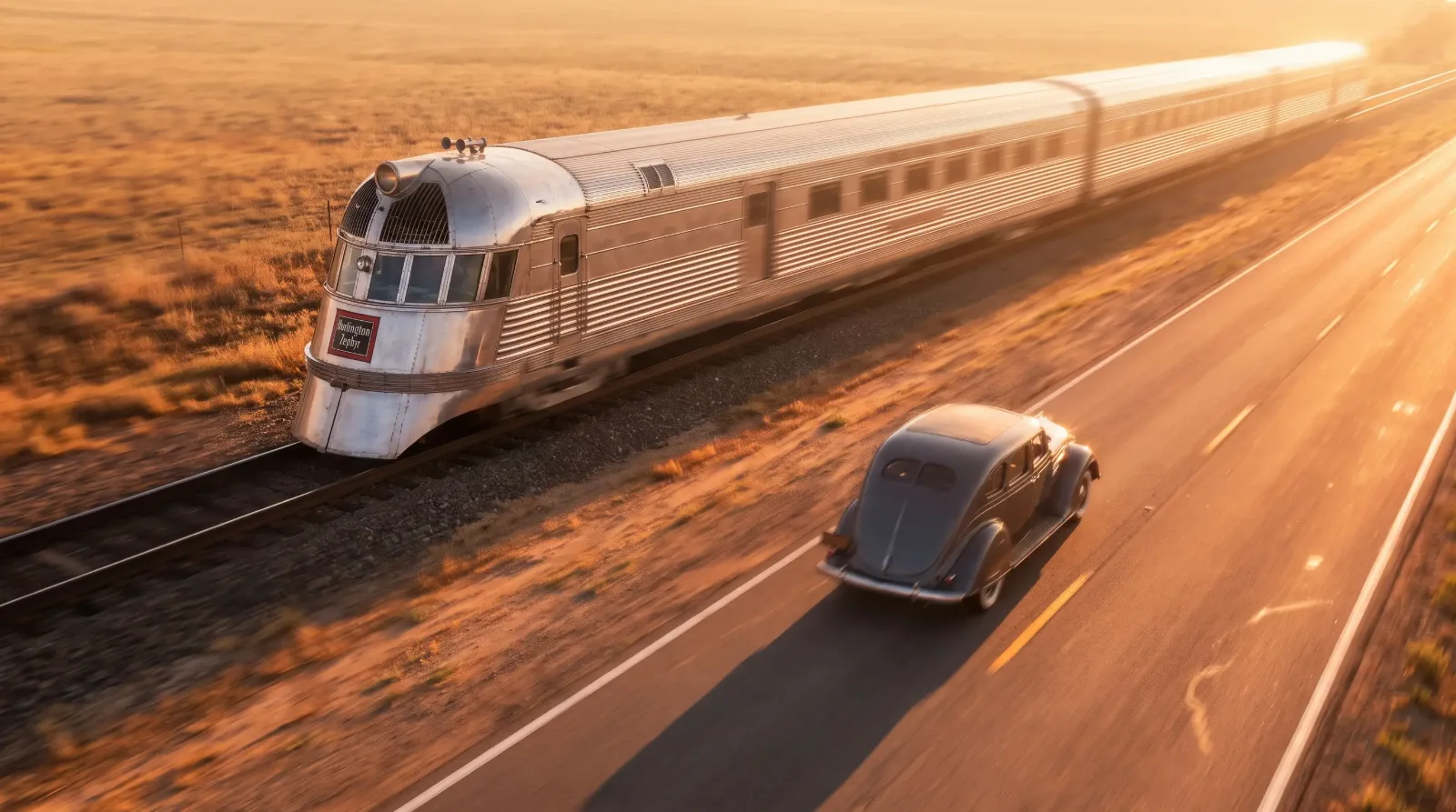
On a May morning in 1934, a crowd gathered along the tracks outside Denver to watch something that looked more like a rocket than a locomotive. The Burlington Zephyr, all riveted stainless steel and rounded nose, was about to run a dawn-to-dusk dash to Chicago that would end with it rolling into the world's fair grounds to a wall of flashbulbs. People who had never given a train a second look stood along the route just to see the shape go by. That is the moment worth starting with, because it explains something a textbook timeline never quite captures: streamlining did not begin as an automobile idea that trains borrowed. It moved both directions at once, and the public fell for the shape before anyone finished explaining the physics behind it.
Cars and trains were solving different problems with the same visual vocabulary, and untangling who influenced whom is less useful than understanding why the era wanted this look so badly in the first place. For the wider design movement this shared aesthetic belonged to, see the streamline design cars story.
A single afternoon, two industries watching each other
The early 1930s were a hard stretch for both railroads and automakers. The Depression had gutted passenger rail ridership, and car sales had fallen just as sharply. Both industries needed something that photographed like the future, and streamlining offered exactly that. It promised speed, efficiency, and modernity all in one silhouette, at a moment when the country badly wanted to believe better days were coming.
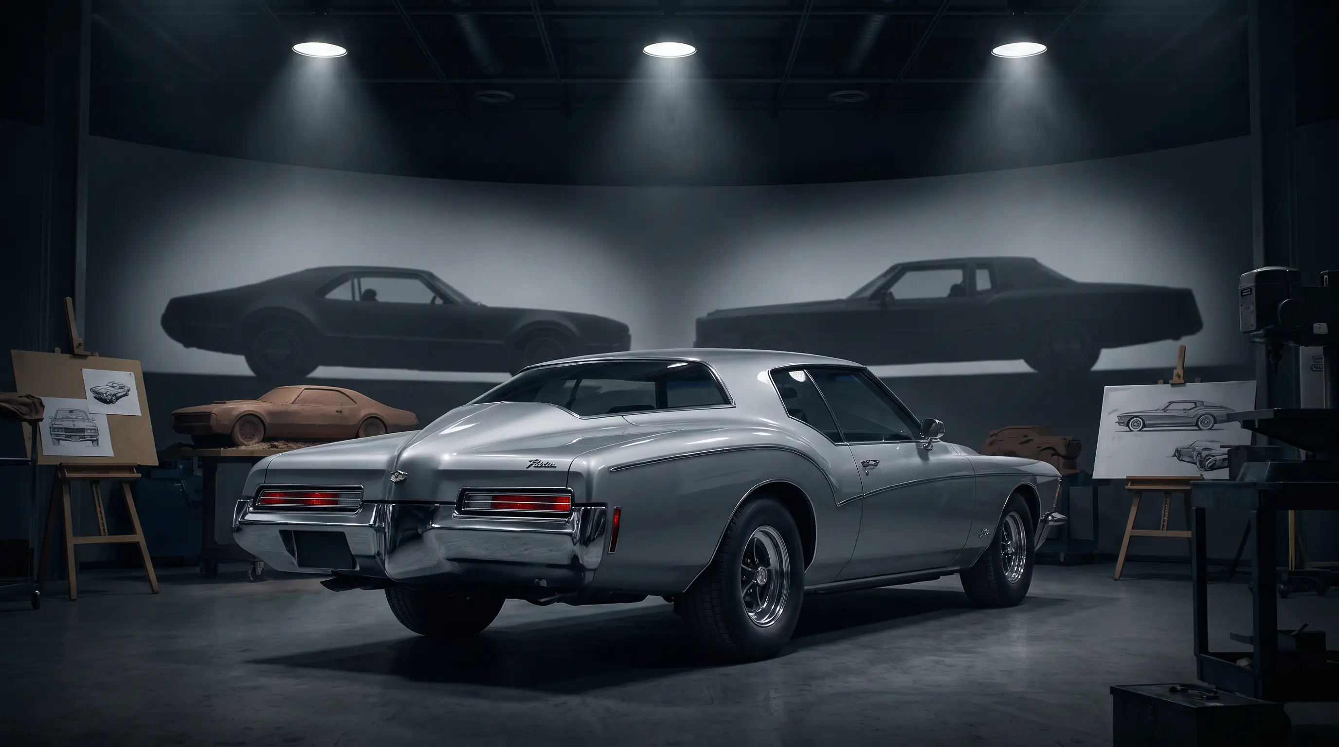
Industrial designers, a relatively new profession at the time, moved fluidly between the two worlds. A stylist who consulted on a locomotive's nose one year might be sketching a car's grille the next, carrying the same instincts about smooth surfaces and continuous lines from one project to the other. That cross-pollination is a large part of why a 1930s train and a 1930s car can look like siblings even though they were engineered by entirely separate teams.
The Zephyr and the language of speed
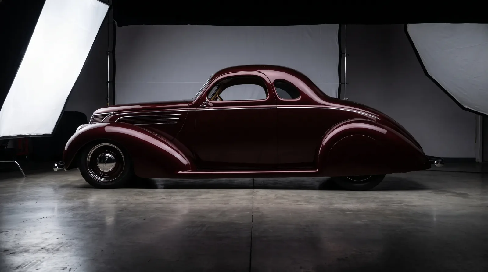
The Burlington Zephyr and its contemporary, the Union Pacific's M-10000, set the visual template that so much of the decade followed: a rounded, tapered nose, fluted or smooth stainless-steel skin, and a low profile that read as fast even sitting still at a platform. That last quality, the ability to suggest motion while stationary, was exactly what automobile stylists were chasing with the same period's speed lines and teardrop fenders.
Chrysler's Airflow, launched around the same time, leaned on comparable aerodynamic reasoning, a rounded nose and a smooth, faired-in profile intended to cut wind resistance rather than simply look modern. The Airflow's sales struggled, but the visual argument it made, that a car's shape should look like it belonged to the same family as a streamlined train, kept resurfacing in showrooms for the rest of the decade.
Designers who moved between rail and road
A handful of industrial designers became genuine celebrities of the era precisely because their work crossed between transportation modes. Raymond Loewy, who is more often associated with locomotives and consumer products, also consulted on automotive projects, and his broader philosophy about clean, unbroken surfaces shaped how a whole generation of stylists approached both trains and cars.
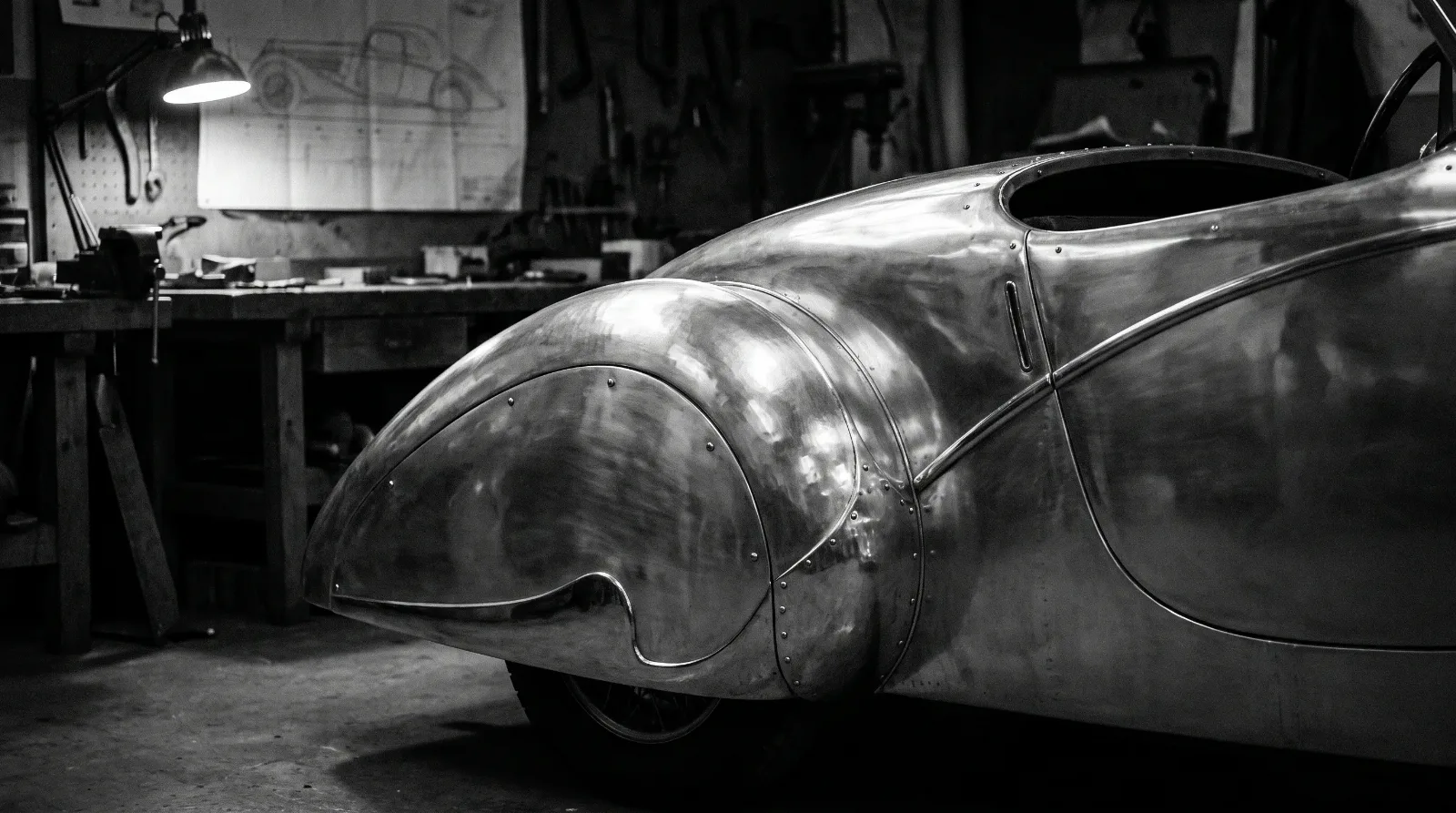
What these designers shared was less a specific shape than a set of instincts: hide the mechanical clutter, let the body read as one continuous surface, and use metal trim sparingly to draw the eye rather than clutter it. Those instincts translated almost without modification from a locomotive's nose to a car's hood, which is why the family resemblance between the two forms feels so natural rather than coincidental.
Trade publications of the period picked up on the connection quickly, and advertising copy for both industries leaned on nearly identical language, words like modern, swift, and tomorrow appearing in brochures for trains and automobiles within the same season. A buyer flipping through a magazine in 1935 would have seen the same visual promise repeated across very different products, and that repetition did real work in convincing the public that this was simply what the future was supposed to look like, not a passing fashion confined to one industry.
Where the aesthetic diverged
The two industries did not stay in lockstep forever, and the differences are worth noting. A train's streamlining had to account for genuine aerodynamic drag at sustained high speed over long distances, a real engineering problem that stainless-steel skins and tapered noses meaningfully addressed. A car, especially an American production car cruising city streets and rural highways at a fraction of a train's speed, gained far less real benefit from the same shapes, though a handful of well-engineered exceptions like the Airflow did the wind-tunnel work to back up the styling.
For most automakers, streamlining was closer to fashion than physics, borrowed for its emotional resonance rather than its measurable performance gain. That does not make the cars any less compelling to look at today. It just means the honest way to talk about them is as design objects first, aerodynamic objects a distant second.
"I think about that Zephyr crowd a lot. Nobody standing trackside that morning cared about drag coefficients. They cared that something had finally arrived that looked like it belonged to tomorrow instead of yesterday, and cars borrowed that feeling wholesale."
— Patrick Walsh
Why the connection still matters to collectors
Understanding the rail connection changes how you look at a streamlined pre-war car. The fenders, the faired lamps, the horizontal speed lines running the length of a hood, all of it belongs to a broader cultural moment that included trains, buildings, and household appliances, not just automobiles. A collector who only studies cars in isolation misses half the context for why the shapes look the way they do.
That context also helps explain why certain examples of the era command such outsized attention and value today. The cars that carried the streamline idea furthest, and carried it with real design conviction rather than surface decoration, are the ones the market still rewards most. If you want to see how that plays out in dollars and cents, read on.