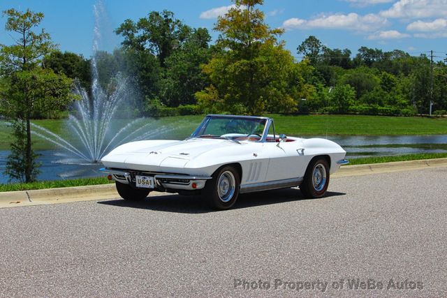

A symbol built into every Corvette ever made
The crossed-flags emblem has appeared on the Chevrolet Corvette since the car's first production year in 1953. Seventy-plus years later it is still there, redesigned for each generation but always present, always recognizable. That kind of longevity is rare in automotive branding. It also means the logo has accumulated a complicated history: political decisions, corporate repositioning, flag-code controversies, and enough subtle refinements across C1 through C8 to keep collectors arguing at Bloomington Gold every summer.
I find the logo interesting for the same reason I find factory documentation interesting. The emblem is a primary source. Every version tells you something specific about when and where it was made, and about what General Motors believed the Corvette stood for at that moment. The purists who insist the 1953 design was the only correct one have a point, even if they take it too far. So do the people who say the current C8 version is the most resolved the logo has ever been. Both things can be true.
The original 1953 design: checkered flag meets Stars and Stripes
When Harley Earl's team designed the first Corvette for the 1953 model year, the crossed-flags badge was conceived as a statement of racing intent. The design placed a checkered racing flag against an American flag, the two crossing at the staffs. The checkered flag was straightforward enough: it signaled motorsport ambition at a time when Chevrolet was trying to establish the Corvette as a genuine sports car competitor, not just a styling exercise. The American flag grounded the car's identity in national pride during a period when European sports cars, particularly British and Italian roadsters, dominated the performance conversation in the United States.
The 1953 emblem was rendered in enamel and applied to the front of the car, the hood, and interior elements. The colors were deliberately patriotic: red, white, and blue on the American flag side; black and white on the checkered flag. The overall composition was busy by modern standards, with fine detail that read well at close range but simplified at distance. In photographs from the era, particularly the early press shots from the Motorama show circuit, the badge catches light in a way that emphasizes its depth and craftsmanship.
This version stayed essentially intact through the early C1 years. Minor refinements occurred in how the enamel was applied and how the badge was mounted, but the fundamental symbolism remained: America's sports car, racing ambitions declared right on the nose.
The 1963 redesign: fleur-de-lis replaces the American flag
The switch that still bothers purists happened with the introduction of the C2 Sting Ray in 1963. The American flag was removed from the crossed-flags design and replaced with a fleur-de-lis, the stylized lily that had long served as one of Chevrolet's corporate symbols. The checkered flag remained. The basic geometry of two crossed staffs remained. But the nationalistic statement was gone.
Chevrolet's documented rationale centered on the U.S. Flag Code. The Flag Code discourages use of the American flag in commercial applications, on merchandise, and in advertising contexts. Whether the emblem on a production car technically violated the code or simply created legal and reputational exposure is a distinction the lawyers at GM apparently decided not to test. The simpler explanation is that someone in the legal or corporate affairs department flagged the issue, and the design team found a solution that preserved the visual structure of the badge while removing the problematic element.
The fleur-de-lis brought its own meaning. The symbol has heraldic roots stretching back to medieval France, and its association with Chevrolet dates to the early days of the company. Louis Chevrolet was Swiss-born but had French heritage; the bowtie logo itself has a loosely heraldic quality. Incorporating the fleur-de-lis tied the Corvette's emblem to Chevrolet's broader brand identity in a way the American flag, specific to one car, never quite did.
"The 1963 switch made sense from a corporate standpoint, and the fleur-de-lis is actually a cleaner graphic element than the American flag was. But the original design meant something different. A checkered flag crossing the Stars and Stripes is a very specific claim about what the car is. The replacement is more polished and less direct."
— Emily Chen
The 1963 C2 emblem also reflected the Sting Ray's more sophisticated visual language overall. The split-window coupe was a significant departure from the C1 in terms of design ambition, and the badge evolved accordingly. The new version was cleaner, more heraldic in character, better suited to the dramatic bodywork it sat against. You can read the full story of the Corvette's most significant design icons to understand how this period shaped the car's identity across every generation that followed.
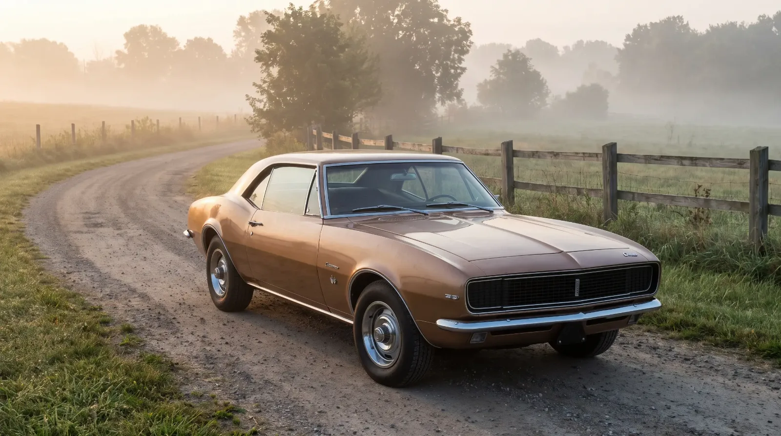
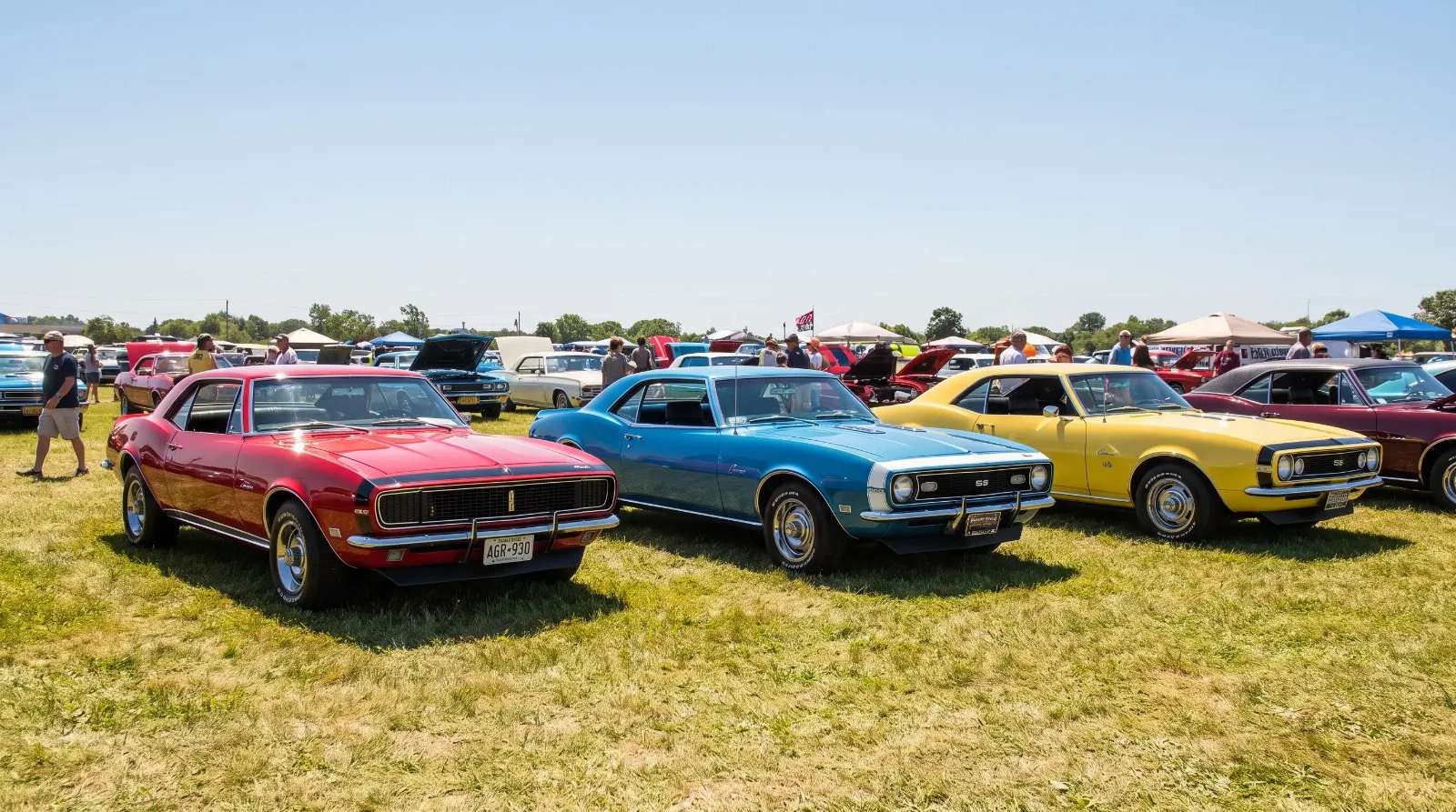
C2 through C7: refinement without reinvention
From 1963 through the C7 generation, the crossed-flags emblem went through a series of refinements that were meaningful to specialists and largely invisible to casual observers. The core composition stayed fixed: checkered flag crossing a staff bearing the fleur-de-lis, rendered in the Corvette's color-appropriate palette, applied to hood, nose, steering wheel, and various interior and exterior trim points depending on the year.
| Generation | Years | Key emblem change | Primary placement |
|---|---|---|---|
| C1 | 1953–1962 | Original: checkered flag + American flag | Front hood, nose panel |
| C2 | 1963–1967 | American flag replaced by fleur-de-lis | Front nose, hubcaps, steering wheel |
| C3 | 1968–1982 | Rendering simplified; chrome-finished variants introduced | Nose, hood, wheel centers |
| C4 | 1984–1996 | Flat graphic version for body panels; 3D badge on nose | Hood graphic, nose badge, interior |
| C5 | 1997–2004 | Refined proportions; higher-relief casting | Nose, rear, wheel centers |
| C6 | 2005–2013 | Flags lengthened; more detailed rendering | Nose, rear fascia, wheel centers |
| C7 | 2014–2019 | More angular, aggressive proportions; darker finishes on some trims | Nose, rear, interior, wheels |
| C8 | 2020–present | Complete geometric redesign; modern flat-graphic sensibility | Nose, rear, interior, wheel centers |
The C3 years, running from 1968 through 1982, saw the emblem rendered in chrome on some applications, with enamel fill remaining on others. The long production run of the C3 means there is more variation in how the badge appears across those fifteen years than in any other generation. Early C3 badges have a different quality of detail from the later emissions-era cars, and the placement shifted modestly as the body underwent its various facelifts.
The C4 introduced something new: a large graphic version of the crossed flags applied directly to the hood as a decal or paint-and-bodywork element, in addition to the conventional raised badge on the nose. This was a product of 1980s design thinking that made some enthusiasts uncomfortable, though the C4 has since found its advocates. The graphic version read well at speed and at distance in a way the small badge never could.
C5 and C6 brought the emblem back toward a more traditional raised-badge treatment, with refinements to the flag proportions and the quality of the casting. The C6's version is generally considered the most fully resolved pre-C8 iteration: the flags are longer and more detailed, the staff crossing point is clearly articulated, and the fleur-de-lis reads legibly even at smaller sizes. C7 pushed the design toward sharper angles and introduced darker finishes on Z06 and Grand Sport trims, reflecting the more aggressive visual language of those models.
The C8 redesign and what it changed
The C8 Corvette, introduced for model year 2020 with its mid-engine layout and dramatically reshaped body, required a rethinking of the badge rather than another incremental refinement. The result was the most significant departure from the established crossed-flags design since 1963.
Chevrolet's designers flattened the emblem considerably, moving away from the three-dimensional, heraldic quality of the C5 through C7 versions toward a geometric, almost architectural graphic. The flags themselves are more abstracted: the checkered pattern is present but rendered with less literal detail, and the fleur-de-lis side of the design has been simplified to a cleaner shape. The overall composition is wider and lower than its predecessors, matching the horizontal proportions of the C8's body.
The C8 badge works well in the applications where modern cars display logos most often: on screens, in marketing materials, on merchandise, and on the car's relatively flush exterior surfaces. Whether it works as well as a pure object, held in the hand or examined at close range, is where opinions diverge. The older raised badges have a physical presence the C8's flatter version does not.
The flag code issue, resolved in 1963, is not a factor in the C8 design. The fleur-de-lis remains. The change is aesthetic and generational, not regulatory.
The purist debate: which version is correct
The disagreement among Corvette collectors about which version of the crossed-flags logo represents the "real" emblem is not entirely a matter of nostalgia. It tracks some genuine differences in what people believe the Corvette is and should be.
Those who prefer the 1953 original are usually arguing that the American flag element was not incidental, it was the point. The Corvette was positioned explicitly as an American answer to European sports cars. Removing the flag removed that claim, substituting a more corporate, international-leaning symbol in its place. The fleur-de-lis, in this reading, is not a bad design element but it is a less honest one.
The counter-argument has two parts. First, the flag code concerns were legitimate, and designing around them was the responsible move. Second, the 1963-onward design is, by most objective graphic criteria, more coherent. Two flags crossing makes compositional sense. A flag crossing a corporate heraldic symbol also makes sense. The specific meaning shifts, but the grammar of the design is actually cleaner after 1963.
A third position, less often stated but reasonable, is that the C6 badge is the peak: it represents the culmination of sixty years of incremental refinement on the 1963 template, a version that is more detailed and better proportioned than any of its immediate predecessors. The C8 redesign, in this view, threw away accumulated equity for the sake of modernity.
Nobody has an obviously wrong answer here. The NCRS and Bloomington Gold judging standards apply the correct emblem for each specific model year, which sidesteps the argument by making it a question of authenticity rather than preference. For a 1956 car, the correct badge is the 1956 badge. For a 1969 car, the correct badge is the 1969 badge. Substituting a later version, even a superior one, is a deduction.
Sources and notes
- Antonick, Michael. Corvette Black Book 1953–2023. Michael Bruce Associates. Long-running reference for production numbers, option codes, and year-by-year specifications across all Corvette generations.
- National Corvette Restorers Society (NCRS). Judging Standards and Guidelines. ncrs.org. The primary authority on authentication and restoration correctness for all production Corvettes; badge specifications are covered in the year-specific judging materials.
- Ludvigsen, Karl. Corvette: America's Star-Spangled Sports Car. Revised ed. Bentley Publishers. Comprehensive production history covering the design and emblem evolution from 1953 forward.
- U.S. Flag Code, 4 U.S.C. §§ 1–10. The relevant statutes regarding commercial use of the American flag; the specific provisions discouraging use on merchandise and in advertising are in § 8.
- Falconer, Tom, and Leffingwell, Randy. Corvette: Fifty Years. Publications International, 2002. Documents the design rationale behind each generation's visual identity, including emblem changes at the C2 transition.
- Bloomington Gold Corvette Show. Authentication Program Documentation. bloomington-gold.com. Bloomington's authentication program specifies correct emblems by year for certification purposes, providing a practical reference independent of NCRS standards.