
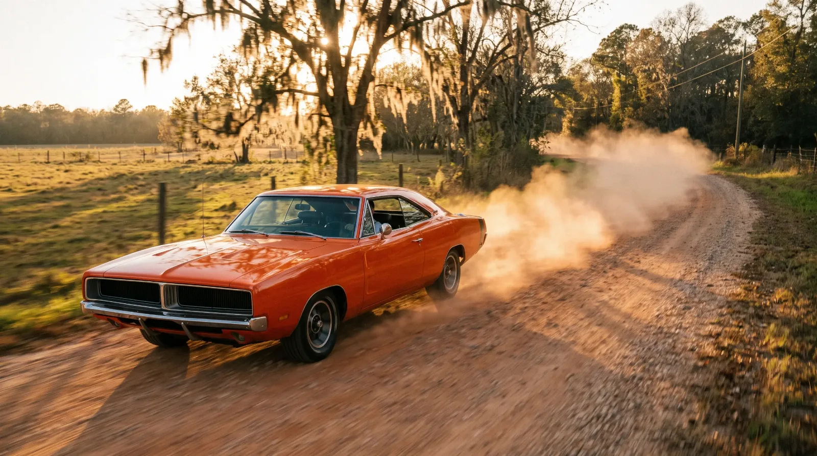
The first muscle car most kids ever owned was made of paper. It hung over the bed, held up with thumbtacks, curling at the corners by the second summer. Long before you could afford a GTO or even a driver's license, you could afford a poster of one, and for a whole generation that piece of paper did the work of a test drive. The car in the picture was always cleaner, lower, and angrier than anything parked on the street outside, because it was never a photograph of a car. It was a painting of a feeling.
Ownership & Lifestyle
7 min read
Muscle Cars in Advertising Art and Poster Culture
How muscle car poster art and painted 1960s ads sold the dream before the metal, from Fitz and Van's Pontiacs to the bedroom-wall poster boom.
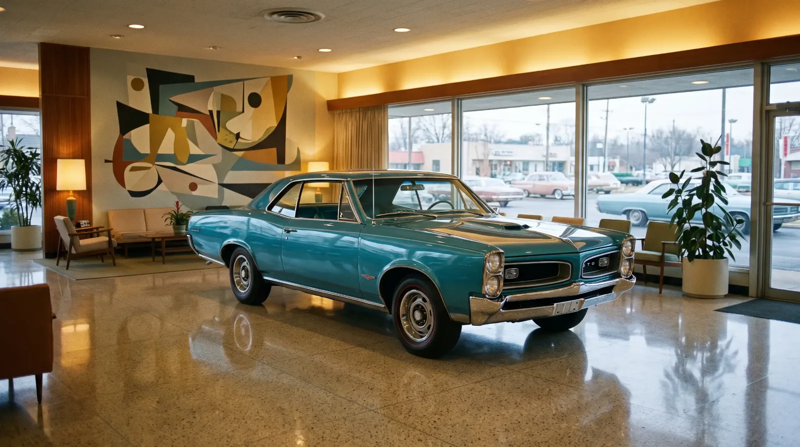
That gap between the real machine and the imagined one is where muscle car advertising art lived. Detroit did not sell horsepower in the 1960s so much as it sold the promise of what horsepower would do to your Saturday night. The illustrators, art directors, and copywriters who built that promise are mostly forgotten now, but their work shaped how millions of people pictured these cars before they ever heard one run. If you want the wider view of how all this fits together, muscle car culture ran on images at least as much as it ran on engines.
Why Detroit painted its cars instead of photographing them
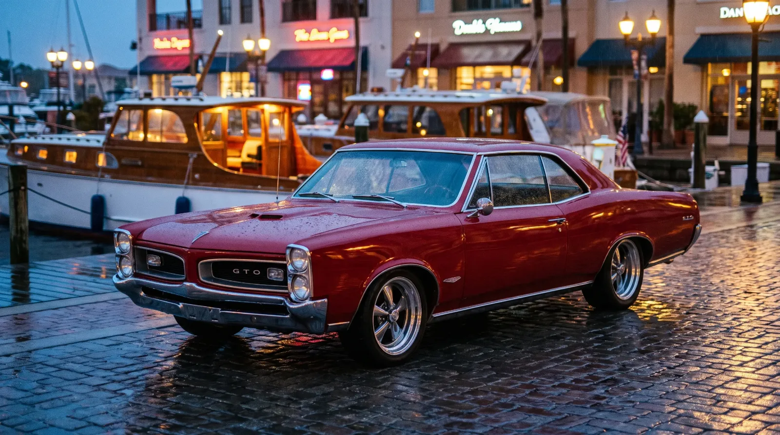
Here is the thing people forget. For most of the muscle era, the glossiest new-car ads were not photographs at all. They were illustrations, and there was a hard commercial reason for it. Cars were photographed months before they went on sale, sometimes before the final trim was even signed off, so an artist could draw the promised car while a camera could only capture the prototype. Paint could fix a bumper that had not been tooled yet. Paint could also lie a little, and everyone understood the deal.
The most famous team working this angle was Art Fitzpatrick and Van Kaufman, the pair usually credited together as Fitz and Van. Through the 1960s they built Pontiac's whole visual identity, stretching the cars wider and lower than any factory ever shipped, dropping them into glamorous settings of ski lodges and marinas and evening streets shining with rain. A real Wide-Track Pontiac was a big honest car. The Fitz and Van version was a jewel. Buyers did not feel cheated when the real one showed up, because by then the painting had already done its job on them.
The copy hit as hard as the color
The art pulled you in, but the words closed the sale, and muscle car copywriting had a swagger nothing else on the magazine rack could match. Plymouth leaned into cartoon anarchy with the Road Runner, licensing the Warner Bros. bird and slapping a "beep-beep" horn on the car itself. Dodge invented the Scat Pack and its Rebellion, complete with a little bumblebee stripe and a mail-order club a teenager could actually join. Pontiac talked about the GTO like it was contraband your father would not approve of, which was exactly the point.
None of it was subtle. That was the era's genius. These ads did not argue that the car was sensible transportation. They admitted, cheerfully, that it was too much, and they dared you to want it anyway. You can trace the same attitude across a dozen brands fighting for the same driveway, and it is worth seeing how the advertising sat alongside everything else muscle car culture threw at the same young buyer at the same moment.
How the ad became the poster on the wall
Somewhere in the late 1960s the advertising art jumped off the magazine page and onto the bedroom wall, and that jump is the part collectors care about most today. Some of it was official. Dealers handed out showroom posters, and manufacturers printed promotional pieces meant for the parts counter and the service bay. A lot of it was not official at all. Kids clipped full-page ads straight out of Hot Rod and Car Craft and taped the paper to the wall, turning a piece of paid advertising into a personal shrine.
Then came the aftermarket poster boom of the 1970s, when companies figured out that a teenager with no money would still spend two dollars on a photo of a car he could never buy. These were mostly photographs by then, not the old illustrations, and the cars were often already a few years out of production. That timing matters. The poster era caught muscle cars right as insurance rates and emissions rules were killing them off, so the paper on the wall was already a little bit nostalgic even when it was new.
Reading a vintage ad the way collectors do
The people who chase this material now read a vintage muscle ad the way a birder reads a field guide, and once you know what to look for, the good stuff separates fast from the reprints. Original magazine tear sheets, dealer promo posters, and factory sales brochures each carry their own value, and condition is everything when the medium is fifty-year-old paper.
What holds up about this whole world is how honest the dishonesty was. Everybody knew the painted GTO was lower than the real one. Everybody knew the copy was written to get a teenager in trouble. The art worked anyway, and it still works, because it was never really selling the car. It was selling the version of yourself you would be once you owned it. That promise outlived most of the cars, and it is a straight line from those painted rain-slicked streets to the way these machines showed up on screen a few years later, and you can read the full story of that next.
"I've met guys who can tell you exactly which wall in their childhood bedroom held which poster, forty years later. They don't remember it as an advertisement. They remember it as the first car they ever loved, and it was made of paper."
Patrick Walsh
The metal aged and rusted and got restored. The paper faded and tore and mostly got thrown out, which is exactly why the surviving pieces climb in value now. But the idea those images planted never went anywhere. Detroit painted a promise on the page, a kid pinned it to the wall, and that promise is still driving the whole hobby.
Related Reading
Have a
Classic Car
for Sale?
Reach thousands of serious classic car collectors across the US.
Sell It Here →
Are You a Classic Car Dealer?
List your full inventory and connect with targeted classic car buyers.
Join as a Dealer →
#muscle car culture
#muscle car poster art
#vintage car advertising
#Fitz and Van
#automotive illustration

About the author
Patrick Walsh
Automotive journalist covering classic car shows, events, and the enthusiast community across North America.
More in Ownership & Lifestyle
Comments
Be the first to comment on this article.