
A teenager flips through a magazine at the barbershop, past the cologne ads and the cigarette ads, and stops on a page with bold lettering and a car photographed at an angle that makes it look like it's already moving. He doesn't own a car yet. He might not own one for years. But he remembers that page long after he's forgotten what the barber charged him that afternoon. That's the kind of moment Pontiac was chasing when it built the print campaign around Pontiac's Judge, and it's a moment that repeated itself in thousands of variations across the country in 1969.
Car Features
7 min read
The Judge in Print: The Ad Campaign That Sold the Attitude
Pontiac's Judge advertising leaned on attitude over specifications, borrowing a courtroom catchphrase to sell a feeling that still shapes the car's identity.
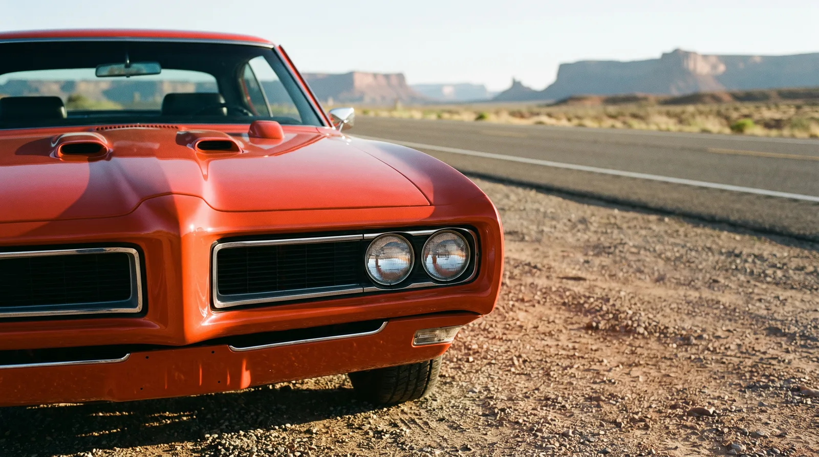
A courtroom name for a car built to argue
The Judge name itself came wrapped in a wink, borrowed from the popular catchphrase circulating through television and comedy at the time, "here come de judge." Pontiac's marketing team took that cultural moment and built an entire identity around it, giving the car a name that already carried a sense of playful authority before a single ad ever ran. It was a clever bit of borrowing, current enough to feel fresh to a young audience without needing much explanation, and it gave copywriters an easy hook to build headlines around.
The campaign leaned into that courtroom language throughout, framing the car as something that rendered a verdict on the street rather than simply competing on a spec sheet. It wasn't subtle, and it wasn't trying to be. Subtlety doesn't sell cars to nineteen-year-olds standing in a dealership deciding how to spend money they'd been saving for a year.
What the pages actually looked like
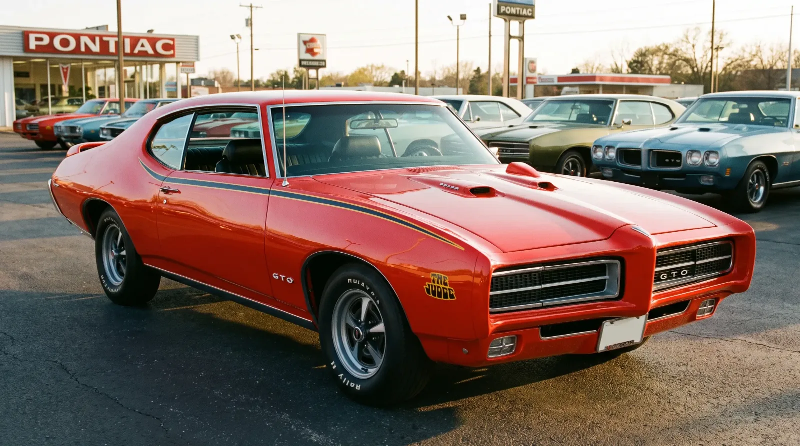
Flip through a period issue of a car magazine carrying the Judge campaign and the visual language is consistent and confident. Bold color, usually built around the Carousel Red the car was so strongly associated with, dominates the layout. The car sits at a dynamic angle rather than a flat side profile, suggesting motion even in a still photograph. Copy is short, punchy, built for a reader who was going to spend seconds on the page, not minutes, and needed the message to land immediately.
There's a quiet skill in that kind of design that gets overlooked when people talk about muscle car advertising as if it were all just loud typography and horsepower claims. Someone made careful decisions about where the eye should land first, how much white space to leave, how the car's silhouette should break across the page. The Judge's ad campaign wasn't accidental. It was built by people who understood exactly what a magazine page could do to a reader's imagination in the small window before they turned to the next page.
Selling an attitude, not a spec sheet
What strikes me most, looking back at these ads decades later, is how little space they actually gave to technical detail. A reader could come away from a Judge advertisement with a strong feeling about the car, aggressive, confident, a little rebellious, without necessarily walking away with a precise memory of the engine displacement or the exact horsepower figure. That was deliberate. Pontiac understood that the young buyer they were courting responded to identity first and specifications second, and the campaign was built around that understanding rather than around a traditional list of features and benefits.
That approach mirrored something happening more broadly in car advertising as the sixties came to a close. The audience was getting younger, and that audience wanted a car that said something about who they were, not just a machine that moved them from one place to another efficiently. The Judge campaign captured that shift about as well as any print campaign of the era.
"The car in the photograph was never really the product. The feeling of standing next to it in the parking lot, that was the product, and the ad existed to plant that feeling before the reader ever set foot on a dealer lot."
Nora Beckett
The voices behind the headlines
Someone had to write those lines, and whoever it was understood the rhythm of talking to a young reader without sounding like they were talking down to one. The copy read less like a corporate pitch and more like a friend leaning in at a party to tell you something you needed to hear. Short sentences. A little swagger. Headlines built to be read once, fast, and remembered longer than that single glance should have allowed. That's a harder trick to pull off than it looks, and a lot of period car advertising missed it entirely, burying a decent car under paragraphs of technical language nobody the target audience's age actually wanted to read closely.
The photography deserves its own mention too. These weren't static studio shots lit like a furniture catalog. The Judge was photographed the way a person poses when they know the camera is on them, angled to suggest presence rather than simply document dimensions. Whoever was behind the lens understood that a picture of a parked car could still feel like it had somewhere to be, and that feeling did more work in a fraction of a second than a paragraph of specifications could have managed in a full minute of reading.
What the campaign meant to the dealers on the ground
Dealers noticed the effect too, even if they couldn't always explain it in marketing terms. Salesmen who worked the floor in 1969 have talked for years about walk-in customers, often young men who had clearly seen the magazine ads before they ever set foot on the lot, asking specifically for the Judge by name rather than the GTO generally. That kind of pre-sold interest, built entirely by a page in a magazine sitting in someone's living room days or weeks earlier, is exactly what a marketing campaign is supposed to accomplish, and by that measure, the Judge's print run did its job about as well as anyone could have hoped.
The legacy on a page nobody kept
Most of the magazines carrying those original Judge ads are long gone, thrown out in some cleanup decades ago, pages yellowed and forgotten in the ones that survived. And yet the imagery persists anyway, passed down through reprints in enthusiast books, digitized archives, and the collective memory of a generation that grew up flipping through those same pages. That persistence says something about how well the original campaign worked. Advertising this effective doesn't need the physical page to survive. It survives in the shape of the car itself, in the decals and colors that owners still specifically request when they restore one today, chasing a look a copywriter and an art director dreamed up more than fifty years ago.
A quiet page in an old magazine, and a car still being restored to match it. That's not a small thing for an ad campaign to accomplish. The Judge wasn't born in a vacuum either. It arrived as Pontiac's answer to a very specific competitive pressure building in Detroit at the time. Read on for how the Road Runner shaped the Judge's entire reason for existing.
Sources and notes
Related Reading
Have a
Pontiac GTO
for Sale?
Reach thousands of serious classic car collectors across the US.
Sell It Here →
Are You a Classic Car Dealer?
List your full inventory and connect with targeted classic car buyers.
Join as a Dealer →

About the author
Nora Beckett
Automotive features writer and photographer who tells the human stories behind the cars, from show fields to cross-country road trips.
Related Listings - Pontiac GTO

Comments
Be the first to comment on this article.