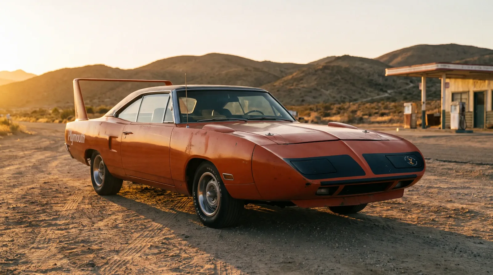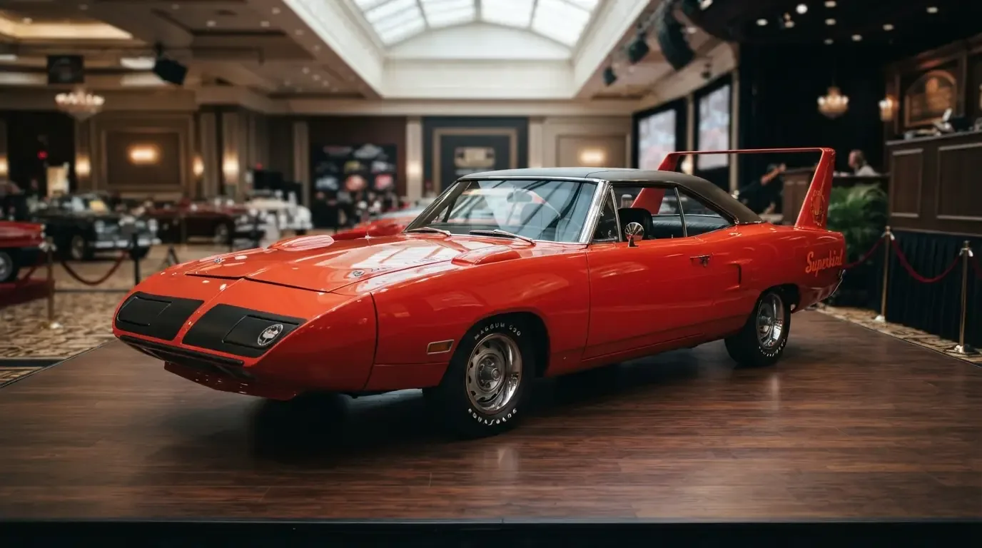

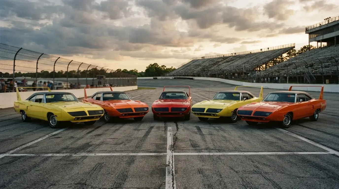
A man at a car show in Ohio once told me he bought his Superbird in 1970 for the color first and the wing second, a confession that sounds backwards until you actually stand in front of one painted Vitamin C Orange under afternoon sun. The superbird colors offered that year were as loud as the engineering underneath them, and Plymouth knew exactly what it was doing when it built a rulebook special and then painted it like a dare.
Names that sold a feeling, not a hue
Chrysler's High Impact color palette hit its full, unapologetic stride right around the time the Superbird went into production, and the names alone tell you the marketing department understood the assignment. Lemon Twist. Tor-Red. Vitamin C. These were not paint chips borrowed from a conservative sedan lineup. They were declarations, colors meant to be seen from across a parking lot and remembered long after the car left it. A Superbird in one of these shades did not blend into 1970 traffic. It announced itself before the wing on the trunk had a chance to.
The factory kept the Superbird's palette tighter than people assume. Buyers could order the car in exactly seven official colors: Lemon Twist, Vitamin C, Tor-Red, and Limelight on the loud end, plus Alpine White, Blue Fire metallic, and Corporate Blue (the shade tied to Richard Petty's number 43 and now often called Petty Blue) for buyers who wanted the aerodynamics and the performance without quite so much attention on the drive home. Not every Superbird buyer wanted to be seen coming, but the quieter end of the factory list still stopped well short of anything resembling a dark green or a truly subdued color.
What the color actually does to a car's presence
There is something particular about how the Superbird's shape interacts with a bright color that a more conventional muscle car body does not share. The nose cone extends the eye's read of the car's length before you even register the wing, and a saturated shade like Lemon Twist exaggerates that effect, making the whole silhouette feel like it is already in motion sitting still in a driveway. Photographs from period brochures capture this, cars angled just so under studio light, the wing catching a highlight that makes the whole thing look less like a sedan and more like something that escaped a race shop by accident.
A car painted Alpine White or Corporate Blue tells a different story entirely. The engineering is identical underneath, the same nose cone and the same wing doing the same aerodynamic work, but the visual volume drops. Those cars read almost stealthy next to their Lemon Twist or Vitamin C siblings, and collectors who have owned both tend to describe genuinely different ownership experiences, one inviting constant conversation at gas stations, the other letting the driver enjoy the car in relative peace.
"My father always said the orange one found him, not the other way around. He walked onto that lot looking at a plain white car and drove home in something the color of a traffic cone. Forty years later he still could not fully explain why, except that it felt like the right kind of foolish."
- Nora Beckett
What the wing does to a bright color, and back again
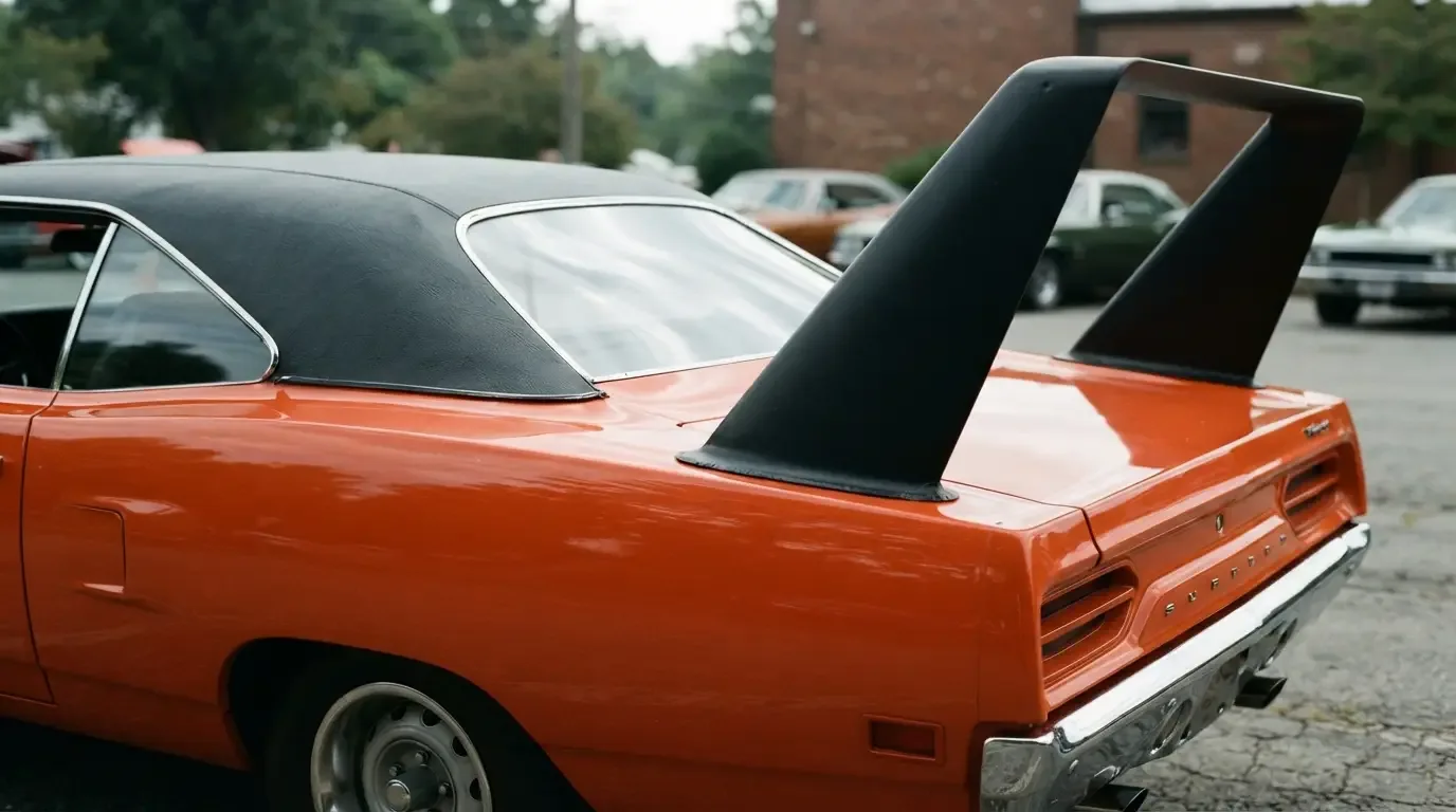
Stand at the rear quarter of an orange or yellow Superbird and watch how the tall wing catches light differently than the body panels below it, mounted higher and angled to work the air rather than to match the curve of the trunk lid. That mismatch of surfaces, one shaped for aerodynamics and one shaped for style, does something unexpected to a bright color. It fractures the reflection, breaks up what would otherwise be one long unbroken sweep of paint, and gives the eye more to track across the car than a same-color notchback ever offers. People who dismiss the wing as a purely functional afterthought are usually looking at photographs taken from the front three-quarter angle that brochures favored. From the rear, in direct sun, in a High Impact color, the whole assembly reads as one deliberate composition rather than a spoiler bolted onto an otherwise ordinary trunk.
Owners who have restored these cars talk about paint work on the wing specifically as its own small challenge, matching a saturated color across a shape with almost none of the gentle curvature of the rest of the body. A flat mismatch there, even a slight one, stands out immediately against a color as unforgiving as Lemon Twist or Vitamin C Orange, in a way it might not on a quieter shade.
Rarity hiding inside a color chip
Certain colors turned out rarer than others simply because fewer buyers ordered them, an outcome nobody planned for at the time but one that collectors now track closely. Every production Superbird wore the same mandatory black vinyl top regardless of body color, so the rarity here lives entirely in the paint code itself rather than any color-matched roof combination. A documented, correctly coded Superbird in one of the scarcer factory shades can meaningfully affect what a given car commands today, less because of any performance difference and more because that specific color survives in smaller numbers. Paint that looked merely bold in 1970 became, decades later, a quiet marker of how uncommon a particular build actually was.
Choosing a color said something about the buyer
A dealer order sheet from 1970 did not just list an engine and a transmission. It asked a buyer to commit to a color that would follow the car, and the buyer, everywhere it went for as long as they owned it. Choosing High Impact orange over a subdued color was a small act of self-definition in a way that choosing a beige family sedan simply was not. It told a neighbor, a coworker, a state trooper, exactly what kind of driver was behind the wheel before the engine ever turned over. That is a different kind of decision than picking an engine option, and it is one reason color conversations around this car still carry more personality than most spec-sheet arguments about horsepower.
Color as memory
Ask enough owners how they remember their first Superbird sighting and the answer is rarely about horsepower. It is a color, glimpsed from a school bus window or a gas station pump, bright enough to interrupt whatever the rest of the day had planned. That reaction was the point. Chrysler built a car around a NASCAR rulebook, then painted it like it wanted to be forgiven for the wing. For the deeper story of why that wing exists at all, our complete history walks through the racing requirement that shaped the whole car, color chips included.
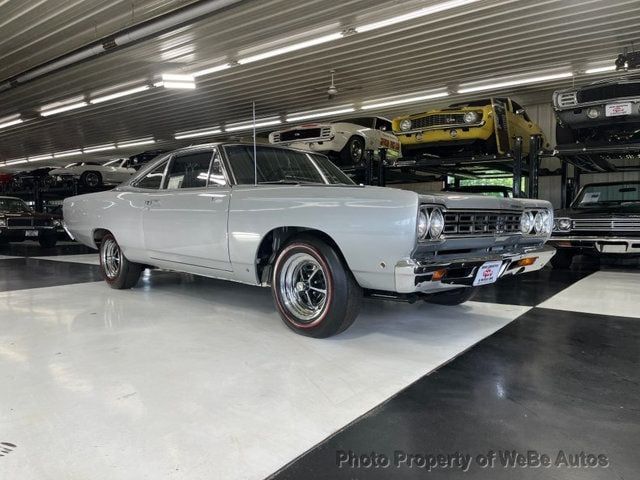
If a particular shade has stuck with you the way orange stuck with that man in Ohio, you can browse classic Runner listings and see which combinations are actually out there waiting for someone to feel the same kind of foolish he did.