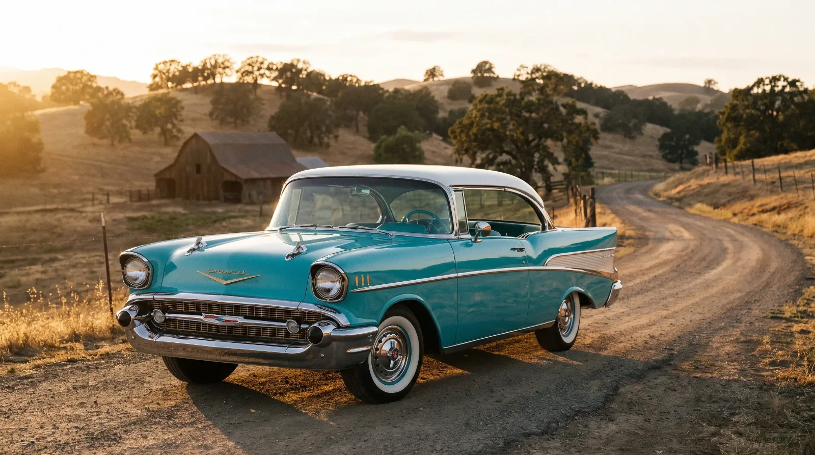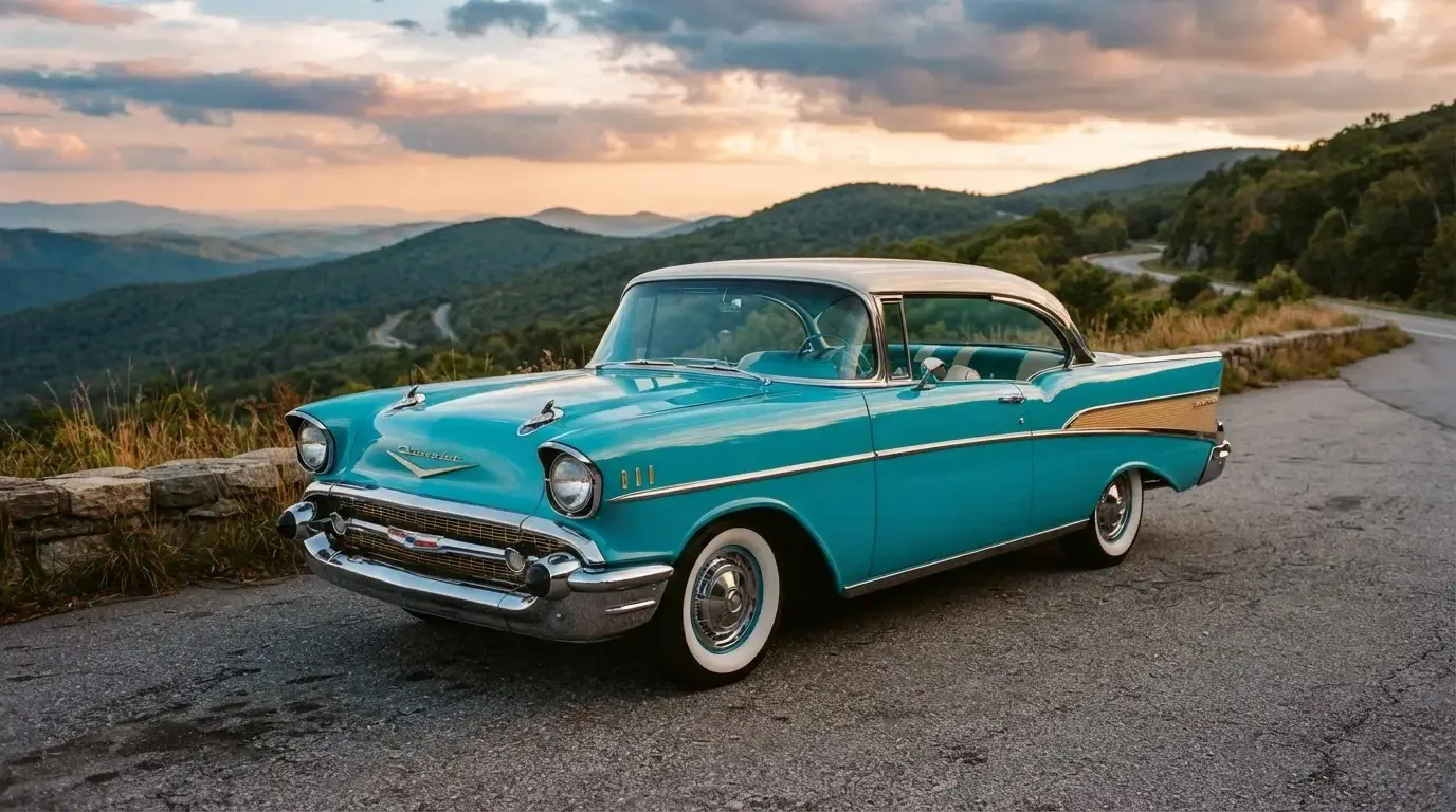

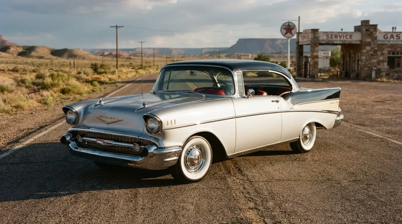
Walk any big car show and the 1957 Bel Air colors are what stop people cold before they even register the fins or the grille. I have built and repainted a dozen of these cars over the years, and I can tell you the paint chart on a 1957 Bel Air did more work for General Motors than half the engineering department. Chevrolet gave buyers a two-tone palette that turned an ordinary family sedan into a rolling advertisement for postwar optimism, and that palette is still the reason so many restorers chase the original codes instead of picking whatever looks good under shop lights.
Why the two-tone scheme mattered so much
By 1957, two-tone paint was not a novelty item on a Bel Air, it was practically the expected look. Chevrolet split the body with a color break that ran along the beltline and swept up into that sculpted rear fin, and dealers pushed the combinations hard because they moved cars off the lot. A plain single color Bel Air existed, sure, but it read as the budget choice next to a car wearing Larkspur Blue over India Ivory or Onyx Black paired with Colonial Cream. The factory offered something like fifteen exterior colors that could be mixed into dozens of two-tone combinations, and dealers kept sample chips on the counter because customers wanted to see the split before they signed anything.
I have stripped enough of these bodies down to metal to notice a pattern. The color break was not just cosmetic. It followed a stamped line in the sheet metal, a subtle character line that GM's stylists built into the body specifically so the paint shop could mask it cleanly. That is smart industrial design dressed up as a sales gimmick, and it is part of why the 1957 Bel Air colors still photograph so well six decades later.
The colors people actually remember
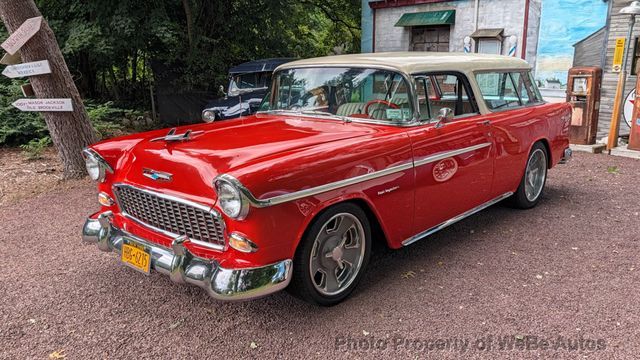
Ask ten collectors to name a 1957 Bel Air color combination off the top of their head and most will land on Matador Red over India Ivory or Tropical Turquoise over Colonial Cream. Those two combinations show up constantly at cruise nights because they were popular new and because they survive well; light colors on the lower panels hide fading better than dark solids exposed to decades of sun. Onyx Black over Dusk Pearl reads formal and almost businesslike next to the loud pastels, and it tends to draw a different kind of buyer, someone who wants the shape of the car without shouting about it.
Harbor Blue, Larkspur Blue, Canyon Coral and Sierra Gold round out the combinations that turn up most in restoration circles. None of these names are marketing fluff invented later; they were the actual paint codes stamped on build sheets and used in dealer literature at the time. Chevrolet's 1957 palette ran to roughly sixteen solid colors, mixed into about a dozen and a half factory-sanctioned two-tone combinations documented in period dealer literature and later paint-code references, so the true count of Bel Air paint options depends on whether you are counting solids, two-tones, or both together.
What a repaint teaches you that a brochure never will
When you actually mask and shoot one of these bodies, the two-tone split stops being a design flourish and starts being a lesson in patience. Get the tape line a sixteenth of an inch off the factory character line and the whole car looks wrong, even to people who could not tell you why. I have seen shops rush that line and the customer notice it within a week, usually standing in their own driveway in daylight rather than under shop bulbs. Original color combinations also carry real money at judged shows, where a car finished in a period-correct pairing scores differently than the same body in a color that never left the sample chip stage.
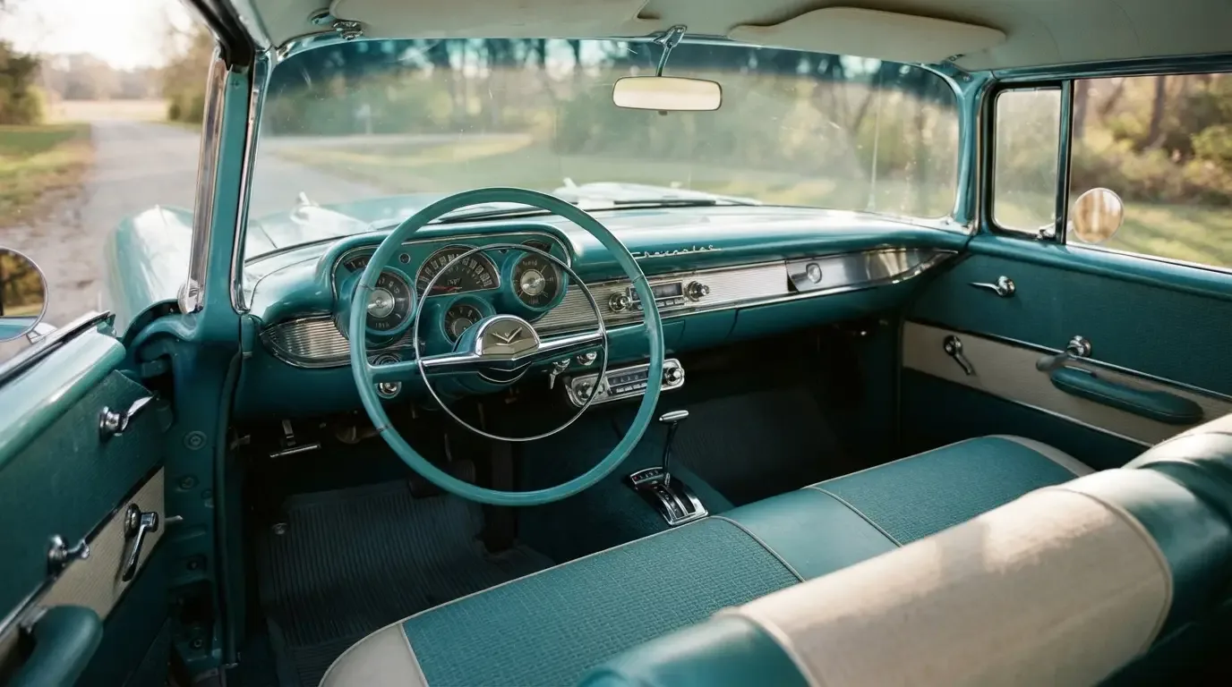
There is also the matter of interior coordination. Chevrolet did not let exterior colors run wild against random interiors; certain paint combinations were paired with specific vinyl and cloth trims so the whole car read as one designed object rather than a mismatched pile of choices. A buyer chasing originality has to track both halves of that equation, not just the outer skin.
"People think two-tone paint is just a stripe down the side of the car. It is not. It is a whole design decision that touches the body line, the trim, and the interior, and if you get any one piece wrong the rest of it stops making sense."
- Jim Vasquez
Buying, matching, and living with the palette today
If you are shopping for a car today, the paint combination changes the price conversation before you even open the hood. A well-documented, numbers-matching Bel Air in one of the classic combinations, Matador Red over India Ivory especially, commands a premium over an identical car resprayed in a color it never wore from the factory. Buyers who care about long-term value should ask for the original build sheet or trim tag before assuming a color is correct, because plenty of cars have been redone in whatever shade the previous owner liked best.
For anyone who wants the background on how this generation of Bel Air came together mechanically and historically before diving into paint specifics, the full story covers that ground. And if you are past the research stage and actually hunting for a car wearing one of these combinations, it is worth checking a classic Air for sale rather than assuming you will stumble on the right color at a swap meet.
The chips that never made it far
Not every color Chevrolet listed in 1957 sold in equal numbers, and that unevenness is part of what makes tracking these cars interesting decades later. Some combinations barely left the printed brochure before regional dealers quietly stopped ordering them, either because a particular pairing did not photograph well in showroom light or because a competing color simply outsold it two to one. I have run across build sheets calling for combinations I had never seen on an actual restored car, which tells you plenty about how thin the surviving population of certain pairings has become. A shop that keeps records across enough projects starts noticing which colors show up again and again at swap meets and which ones seem to have vanished almost entirely.
That unevenness also shapes what a restorer can responsibly do when a car arrives with no usable paint and no trim tag to confirm the original combination. Guessing is common in this hobby, and I understand the instinct, but guessing wrong turns a genuinely original car into a car that merely looks period-correct, and those are not the same thing to a judge or to a buyer who cares about the difference. When the tag is missing or illegible, cross-referencing dealer invoices, factory shipping records, or even period photographs of the specific car becomes the only honest path forward, slow as that process is.
The colors as culture, not just cosmetics
What makes the 1957 Bel Air colors worth writing about, rather than just cataloging, is how much they say about the moment they came from. This was a country buying appliances in pastel colors, building drive-in restaurants with neon, and putting fins on cars that never needed to go faster because of it. Chevrolet's paint department was reading that culture correctly, and the two-tone Bel Air became one of the clearest physical objects that captured it. Sixty-some years later, those same combinations still do the job. Park a Tropical Turquoise over Colonial Cream Bel Air next to a modern car and the difference is not really about technology. It is about a company that understood color was doing marketing work, and built a car willing to wear it.