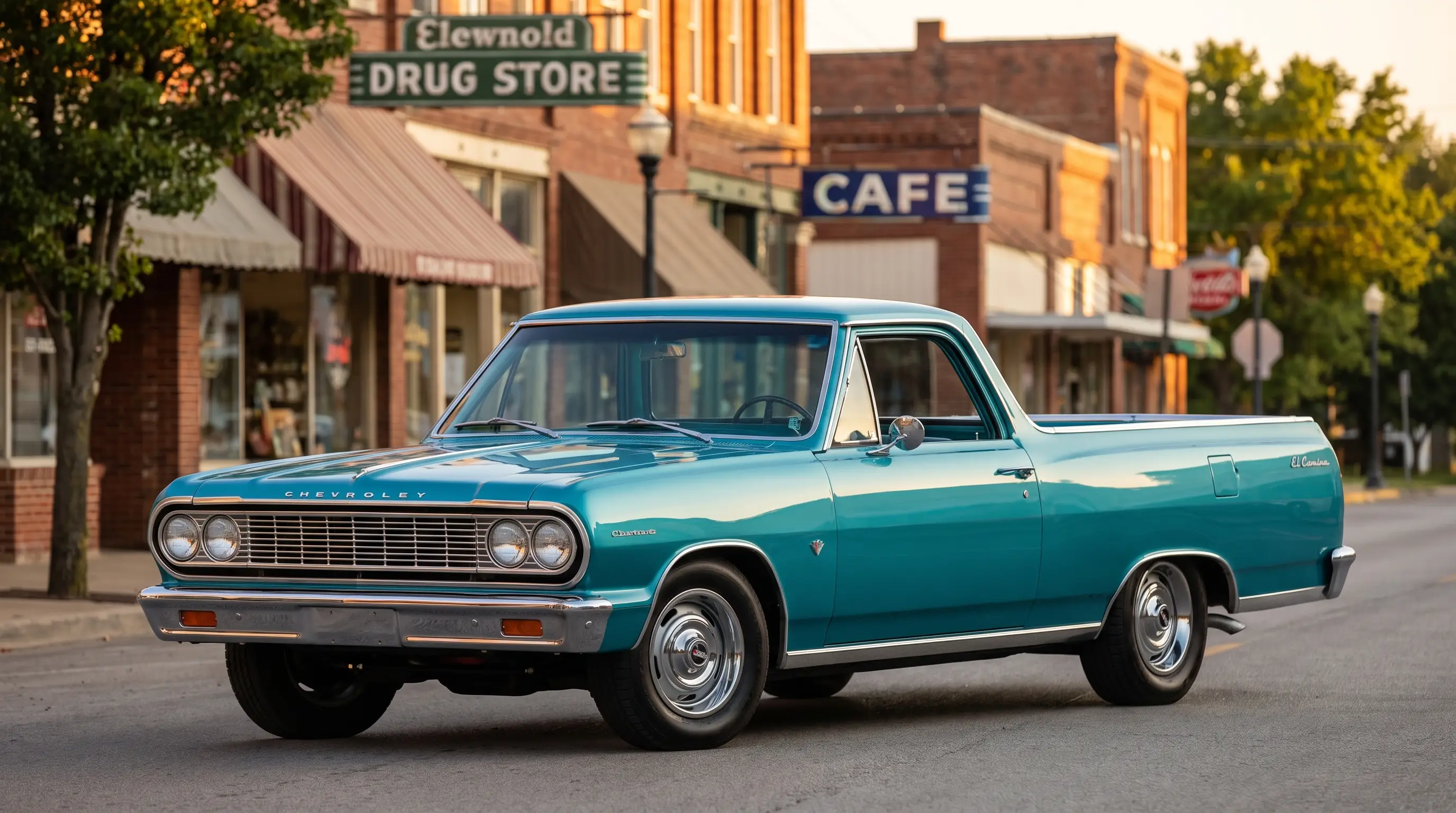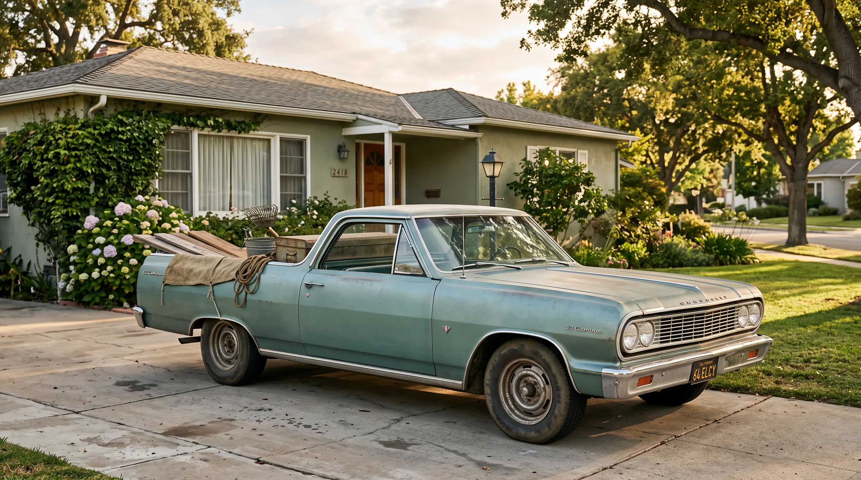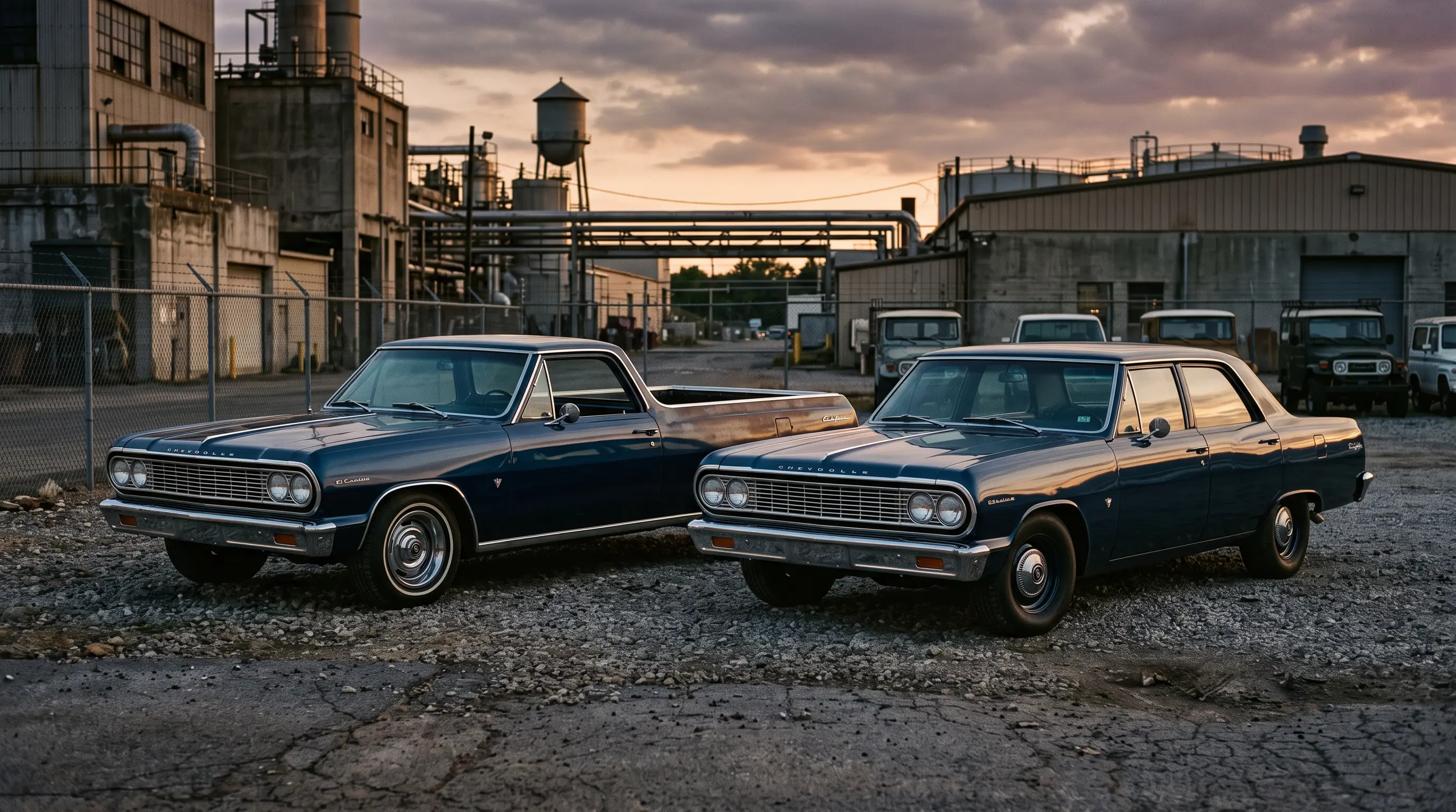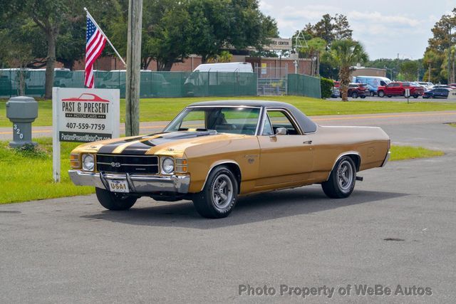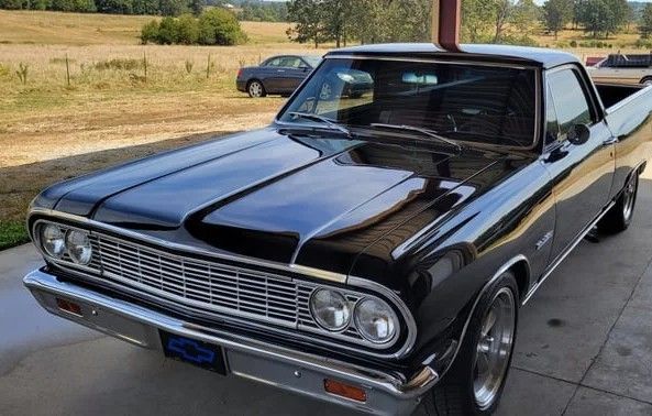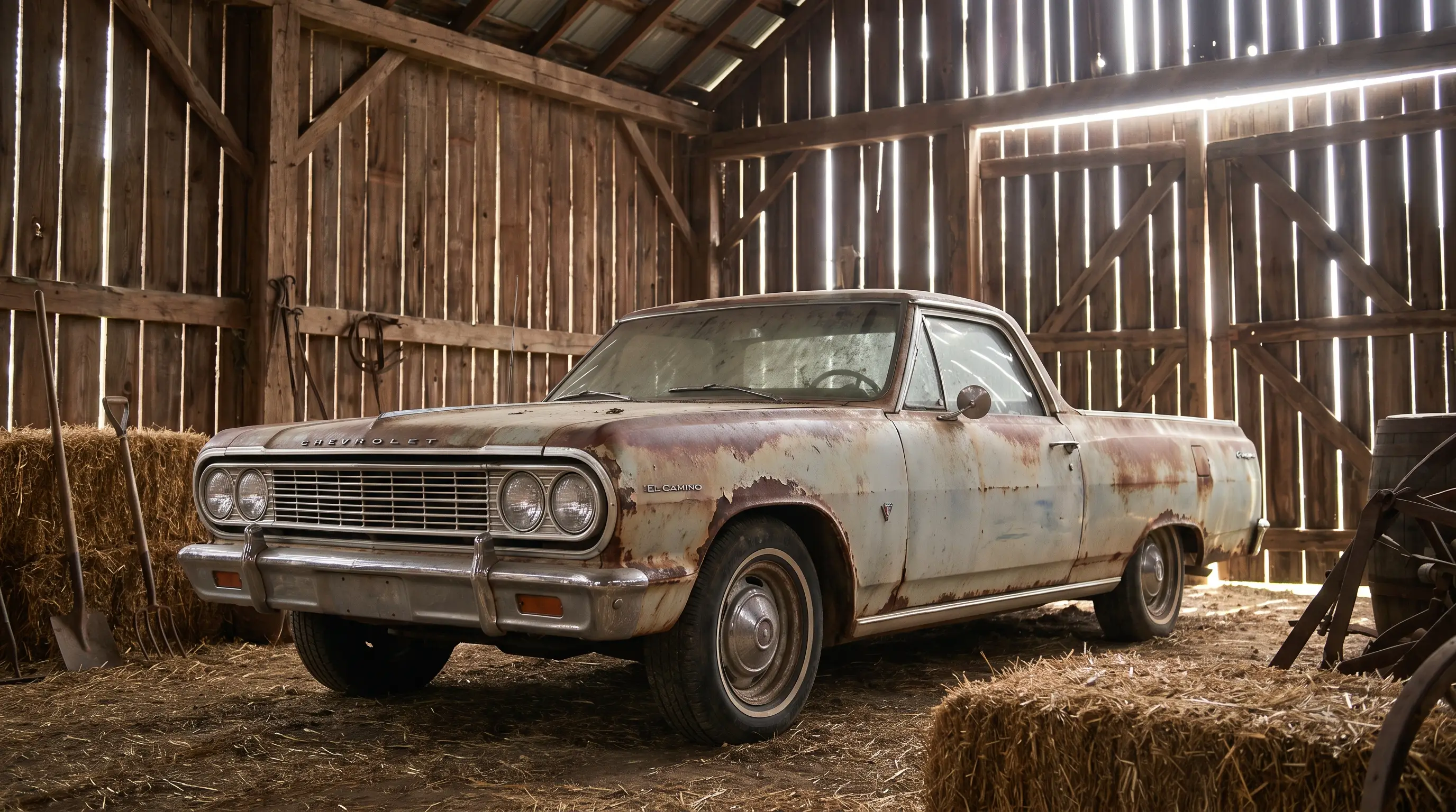

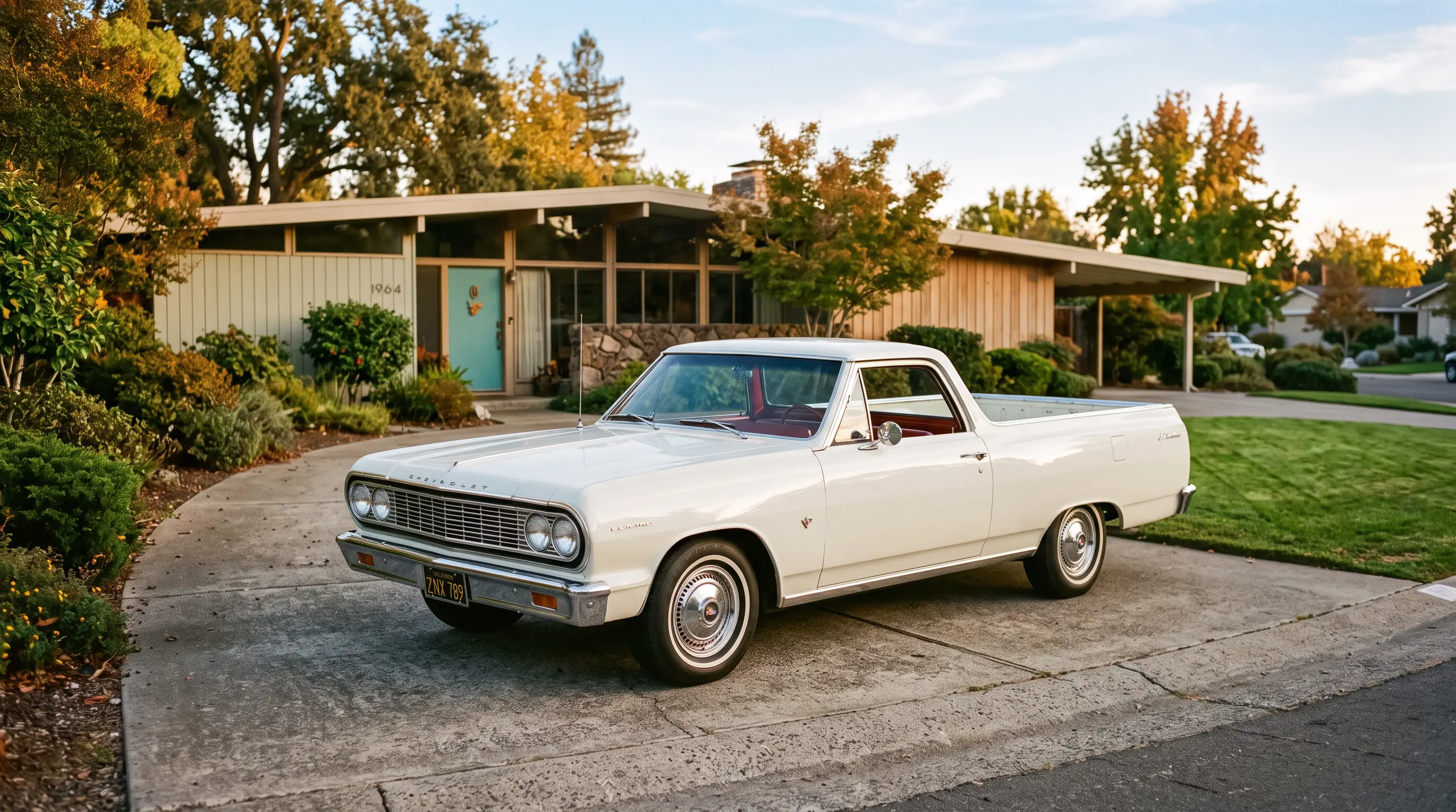
Spend enough time under the paint on old Chevelles and El Caminos and you start noticing something about the mid-1960s cars specifically. The el camino 1964 color and style era produced some of the cleanest, most honest lines Chevrolet ever put on this platform, before chrome bodyside trim, stripe packages, and later muscle car graphics started competing for attention. There is a discipline to the 1964 through 1967 body that a lot of restorers and painters respect, even if it does not get talked about as much as the SS years that followed.
Restraint as a design choice, not a limitation
The 1964 El Camino carries clean, uninterrupted body lines with minimal ornamentation, a look that reflects broader design trends across Chevrolet's lineup at the time rather than any budget shortcut specific to the El Camino. Compared to the heavier, more sculpted look of the cars that came before it, and the aggressive coke-bottle profile that would arrive in 1968, this generation reads as almost architectural in its simplicity. Straight character lines run the length of the body without the added scoops, stripes, or badging that later performance-focused years would pile on.
From a bodywork perspective, that simplicity is a gift. Fewer trim pieces means fewer gaps and reveals to get perfectly straight during restoration, and a body this clean shows every flaw in panel alignment or paint work with nowhere to hide. Anyone who has actually laid color on one of these cars knows that a simple design is not necessarily an easier one to execute well. It just fails more visibly when the fundamentals are off.
Factory color palette of the era
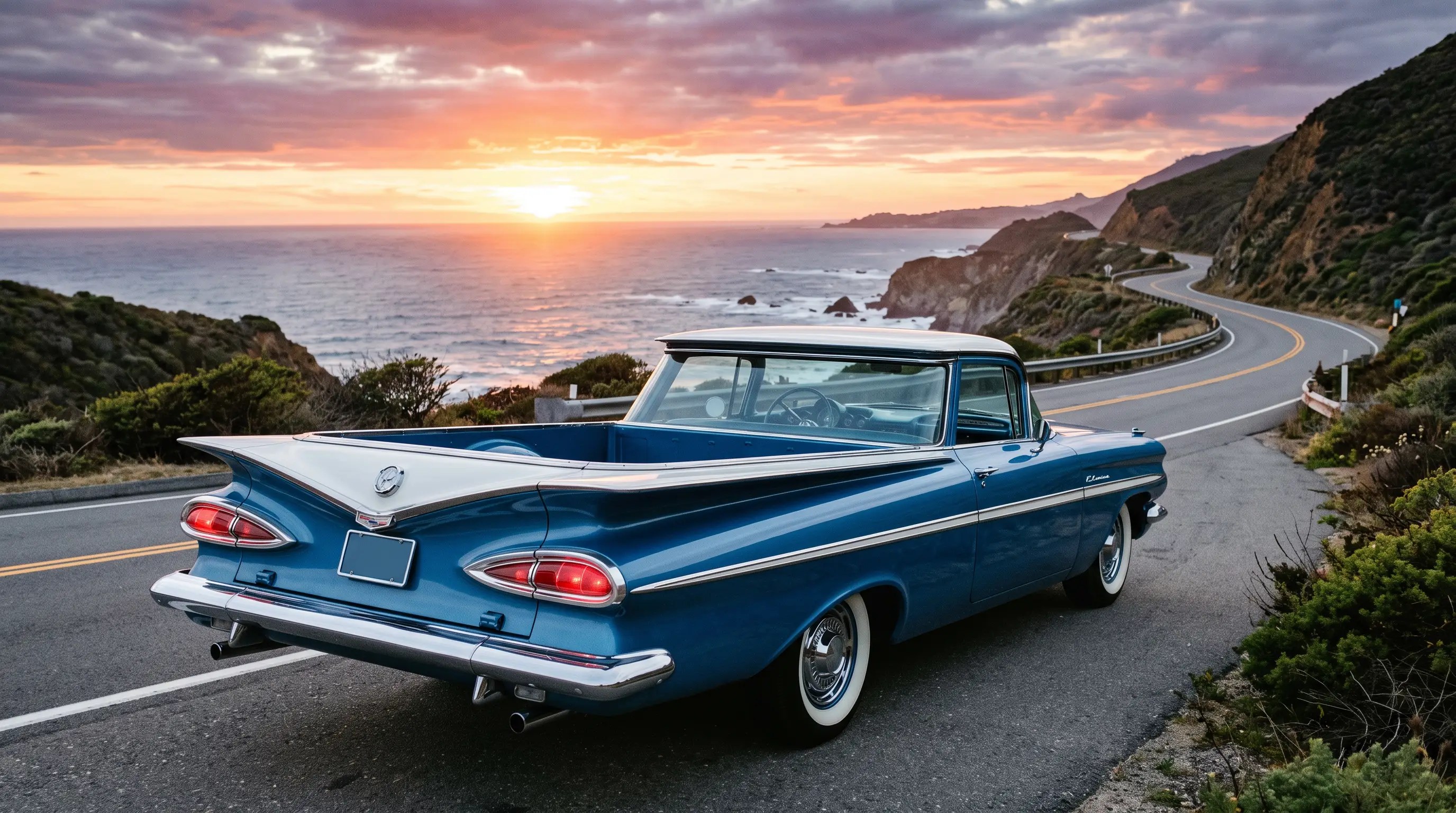
Chevrolet's mid-1960s color offerings leaned toward solid, confident tones rather than the wilder high-impact colors that would show up on muscle cars a few years later. Buyers picked from a range of period-correct solid colors that suited the car's clean lines without fighting them, a pairing of design and color strategy that worked because Chevrolet's stylists clearly understood the body they were dressing. Two-tone combinations were available and showed up reasonably often on Custom trim cars, giving the model a bit more visual interest without departing from the overall restrained character of the era.
Getting factory-correct color right on a restoration matters more than a lot of buyers realize. A period-correct color, applied properly, does more for a car's presence and value than any aftermarket paint scheme, no matter how well executed the aftermarket work might be. Cowl tag codes remain the definitive source for confirming original factory color on a specific car, and any serious restoration should start there rather than guessing from remnants of old paint found under trim panels.
Interior materials that matched the exterior discipline
Inside the cabin, the same restraint applied. Vinyl and cloth combinations were straightforward, patterns were understated compared to what would come later in the decade, and the dash layout favored simple, legible gauges over anything flashy. For a builder doing an interior restoration, this simplicity is workable in a way that later, more complex interiors sometimes are not, since fewer trim pieces and simpler patterns mean fewer opportunities for reproduction parts to look obviously wrong next to original surviving material.
That said, sourcing correct period materials still requires care. Reproduction upholstery quality varies significantly between suppliers, and a builder aiming for a truly correct restoration should compare swatches directly against documented original material whenever possible rather than trusting a supplier's marketing description of historical accuracy. Readers wanting the complete story of how this generation came together should check the full story of the 1964 relaunch for the broader context behind these design decisions.
"People forget how disciplined this body actually is until they try to get the panel gaps perfect themselves. The clean lines look simple, but simple only works when everything underneath is done right."
- Jim Vasquez
Why builders still respect this era
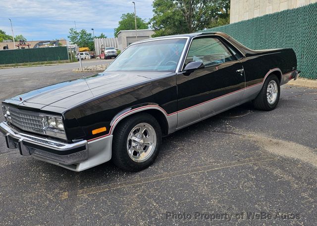
Custom builders working on later El Camino generations, particularly the 1968 to 1972 muscle years and the 1978 to 1987 G-body cars, often cite the mid-1960s body as a reference point for clean proportions, even when their own builds head in a completely different visual direction. There is something to be said for a design era that holds up on its own terms, without needing performance graphics or aggressive styling cues to carry visual interest.
For anyone shopping this generation today, that same restraint is worth keeping in mind when evaluating a potential project or a finished restoration. A car that stays true to its factory-correct color, trim, and proportions honors what made this generation distinctive in the first place. Buyers wanting to see this era in person should classic El Camino for sale and look closely at panel fit and paint quality on any car under consideration, since this body's clean lines make shortcuts in bodywork far easier to spot than they would be on a more heavily ornamented car.
Chevrolet did not need to shout with this generation of El Camino, and that quiet confidence is exactly why it still holds up as a genuinely well-designed vehicle six decades later.
What repaints get wrong most often
After enough years working on these bodies, the same mistakes show up over and over on cars that have been repainted outside a factory-correct color. The most common issue is a builder or painter reaching for a color that looks close in a swatch book but reads noticeably wrong once applied across large flat panels in daylight. Mid-1960s Chevrolet colors were formulated for the specific lighting and reflective qualities of the paint technology available at the time, and modern paint formulations do not always reproduce that same character even when the color code matches on paper.
The second common mistake involves two-tone application. Getting the dividing line between colors placed correctly along factory character lines takes more care than it looks like it should, and a division line set even slightly off throws off the whole visual balance of the car. Builders doing a two-tone restoration should reference documented factory photos or an unrestored original example whenever possible rather than guessing at where the line falls, since a division that is even an inch off from stock location changes how the car reads from a distance.
Trim and brightwork condition checks
Because this generation relies on clean lines rather than heavy trim to carry its visual identity, the trim pieces it does have need to be in excellent condition to do their job. Pitted or dull chrome on a car this understated stands out more than it would on a busier design with more brightwork competing for attention. Buyers evaluating a potential purchase should look closely at the condition of the limited trim these cars carry, since replacing or re-chroming pieces on this era can be harder to source correctly than trim from more heavily produced later model years.
Getting this right is part of what separates a genuinely well-done restoration from one that merely looks acceptable in photographs. The mid-1960s El Camino rewards attention to these smaller details precisely because it does not have flashy design elements to distract from them.
Sources and notes
- Wikipedia - Chevrolet El Camino
- SS396.com - 1964 El Camino Parts and Restoration Information
- MotoGallery - 1964-1967 Chevrolet El Camino Base Guide
- Hagerty Valuation Tools - 1964 Chevrolet El Camino
- Curbside Classic - 1968 Chevrolet El Camino SS 396
- ClassicCars.com Journal - Vehicle Profile: Chevrolet El Camino