A horse on the hood: where the pony emblem came from
When Ford unveiled the Mustang to the public at the 1964 New York World's Fair, the car carried a galloping horse on its grille, side fenders, and steering wheel. Within weeks that image was on posters, magazine covers, and the minds of a generation of car buyers. But the emblem did not appear overnight. It was the product of deliberate design work that began years before the production car existed.
The credit for the running-horse emblem is widely attributed to designer Phil Clark, who joined Ford in the spring of 1962 and worked on the Mustang I concept car project that same year. Clark had been sketching ideas for a galloping-horse badge for several years, and the team favored his concept, a horse in full stride set against a red, white, and blue tri-bar. The Mustang I was a mid-engine two-seat roadster built as a styling and engineering exercise, never intended for production. It carried an early version of the horse motif, a connection that traces the emblem's lineage directly to the car's concept origins rather than as a late-addition badge grafted onto a finished design. Clark's contribution was largely forgotten for decades and was later championed by his daughter, Holly, whose research has helped keep his name attached to the design.
Clark's running horse was not a static crest in the tradition of European coachwork. It was a horse in full gallop, legs extended, capturing motion. That single choice defined how the badge would read at speed, on the road, in the minds of buyers who wanted to believe the car beneath them was as animated as the emblem above the bumper.
The tri-bar background and the grille corral
The horse did not stand alone. The production emblem placed the running pony against a set of horizontal bars, the design element known as the tri-bar background. Three parallel lines, red on top, white in the center, and blue at the base, formed the field behind the horse. The colors were deliberately chosen: they echoed the American flag without being a literal reproduction of it, and they gave the badge a visual anchor that balanced the kinetic energy of the galloping figure.
Getting Clark's concept onto the production car was a separate job. Clark sketched the original horse, but the proportions of the Mustang I pony were judged too tall to sit comfortably inside a production-style grille corral. Studio modelers Charles Keresztes and Waino Kangas were tasked with reworking the pony for the 1963 Mustang II show car and the 1965 production car, refining the proportions and translating the drawing into the final tooled badge. Kangas is generally credited with the fender emblem, where the horse is rendered slightly flatter, with less relief than the grille casting.
On the front of the car, the emblem sat inside what became known as the grille corral, a chrome rectangular surround integrated into the honeycomb or bar grille depending on the model year. The corral framed the horse at the center of the car's face, making it the focal point of the front end. This placement was not accidental. In a parking lot full of cars, the eye finds the Mustang badge and works outward from it. The grille corral made that possible.
For readers interested in how the emblem fit into the broader visual language of the early car, the full design story covers the body lines, interior details, and styling decisions that surrounded it.
"The tri-bar wasn't decoration, it was structure. Without it the horse would have been floating in space. Ford's designers understood that a great badge needs a frame as much as it needs a figure."
— Jim Vasquez
Why does the pony face left?
One of the most persistent questions among Mustang enthusiasts concerns the direction the horse faces on the badge. On the standard emblem, the horse gallops to the left when viewed from the front of the car. Ford has never issued an official statement explaining this directional choice, and no internal design document explaining it has surfaced in the public record. What is documented is preference rather than reason: designer Gene Halderman is said to have wanted the pony to face left the way Clark had almost always drawn it, and Lee Iacocca's often-repeated line was simply that "the Mustang is a wild horse, not a domesticated racer." Neither amounts to an official explanation of why left was chosen, and design models from 1962 to 1964 survive with the horse pointed both ways.
Several anecdotal explanations have circulated for decades. One holds that the left-facing pony is a horse running west, the direction it would gallop on a typical map, an idea repeated often but backed by no concrete evidence. Another points to Clark's own hand: he was right-handed, and a right-handed artist tends to find it easier to sketch a figure moving left, so the orientation may simply reflect how the drawing naturally came off his pencil. A third version claims the original sketch actually faced right and was flipped during the transfer to tooling, with the reversed direction never corrected.
None of these explanations has been confirmed by Ford or by documentation from the design team. They remain enthusiast lore. The direction of the horse is real; the reason for it is, as of this writing, unverified and probably unknowable without access to internal Ford records from 1962 and 1963.
How the emblem changed across the first generation
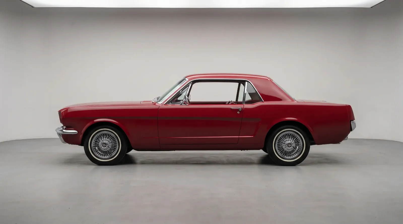
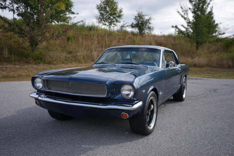
The 1964-and-a-half and 1965 Mustang carried the emblem in its most restrained form. The chrome grille corral was clean, the tri-bar colors were vivid, and the horse was a relatively fine casting with distinct muscle definition in the legs and neck. The overall execution reflected the care Ford put into the launch car, where every detail was scrutinized.
As production volumes climbed through 1965 and into 1966, subtle changes appeared. The casting quality on some examples became slightly less crisp, a natural consequence of high-volume manufacturing. The 1966 cars carried the emblem in essentially the same configuration, though grille treatments varied between the standard and optional equipment lists.
The 1967 and 1968 models brought a broader, heavier car and the emblem's context changed with it. The grille opening grew larger and the corral proportions were adjusted to suit the new front-end geometry. The horse itself remained recognizable but the surrounding architecture gave it a different weight. By 1968 the car was offering the 390 cubic-inch big-block and the GT package, and the emblem on those cars carried an association with performance that the original 1964 badge, fitted above a 170 cubic-inch six-cylinder, could not have anticipated.
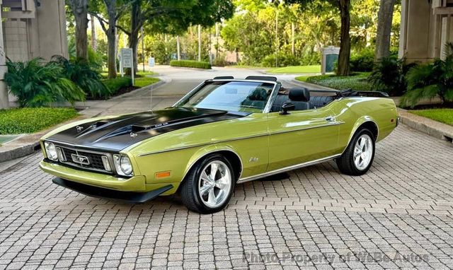
The 1969 and 1970 models pushed the first generation to its furthest point stylistically. The SportsRoof fastback, the Mach 1 with its flat-black hood treatment, and the Boss 302 and Boss 429 variants all wore variations of the running horse. On the Mach 1, the horse appeared on the simulated air intake scoops on the hood in addition to the grille. On the Boss models, the badging was kept minimal in keeping with the purpose-built character of those cars, but the pony remained on the grille corral.
One of the most recognized car badges in production history
By almost any measure, the Mustang running-horse emblem earns its place among the most recognized automobile badges ever produced. The combination of a clear, readable silhouette, a kinetic pose, and a simple color field behind it created something that works at any scale, on a grille badge, a key fob, a television advertisement, or a postage stamp. Very few automotive emblems survive that range of applications without losing their identity.
Part of what makes it durable is specificity. A galloping horse in full stride is not ambiguous. There is no stylized letter, no abstract shape requiring explanation. You see the badge and you understand immediately what it is trying to communicate: speed, freedom, American energy. Whether the car beneath the badge was a 260 cubic-inch two-barrel coupe or a 428 Cobra Jet fastback, the emblem made the same promise. The fact that Ford delivered on that promise often enough to sustain a fifty-year production run is what converted the badge from marketing device to cultural artifact.
The Phil Clark attribution, the tri-bar colors, the corral frame, and the still-unexplained leftward direction of the gallop all became inseparable from the car's identity. Collectors who hunt for numbers-matching first-generation cars pay close attention to the casting quality of the grille horse as part of their authentication process, treating a correct early casting as evidence of provenance in the same way they treat a correct engine code or a factory build sheet.
Sixty years on, the running pony is still on the grille of every Mustang Ford sells. The details have been refined through each generation but the essential idea, a horse in full gallop against a simple background in a rectangular corral, has not changed. Phil Clark, with the production modelers who turned his concept into a tooled badge, produced something that proved almost impossible to improve on.
Sources and notes
This article reflects the best-documented account of the Mustang pony emblem's origins as of publication. Ford never issued an official explanation for the horse's leftward direction, so the explanations offered for it are enthusiast lore presented as anecdote, not established fact; where the historical record is thin or sources disagree, we have said so in the text. The sources below were used to verify the attributions and details.