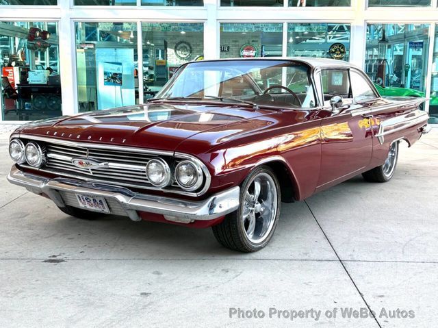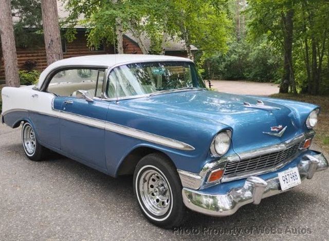

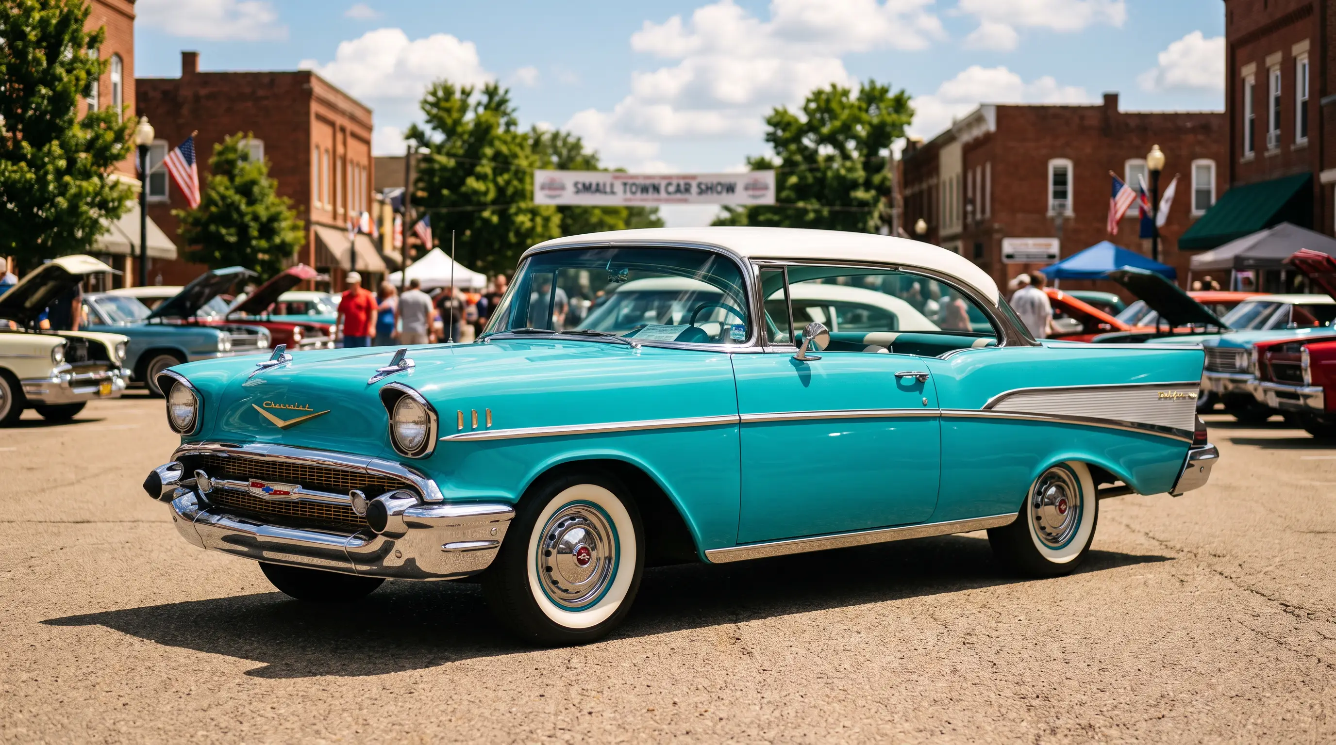
I've stood next to enough freshly painted Tri-Five Chevrolets to know within about three seconds whether the two-tone split is right or wrong, and most people who buy the paint job off a chart never learn to see it. Tri five two tone paint is not decoration. It is architecture. Get the break line wrong by an inch and a Bel Air that should look confident looks confused, like it's wearing someone else's jacket. Get it right and the whole car reads as one clean idea instead of two colors fighting for attention.
Why Chevrolet split the paint in the first place
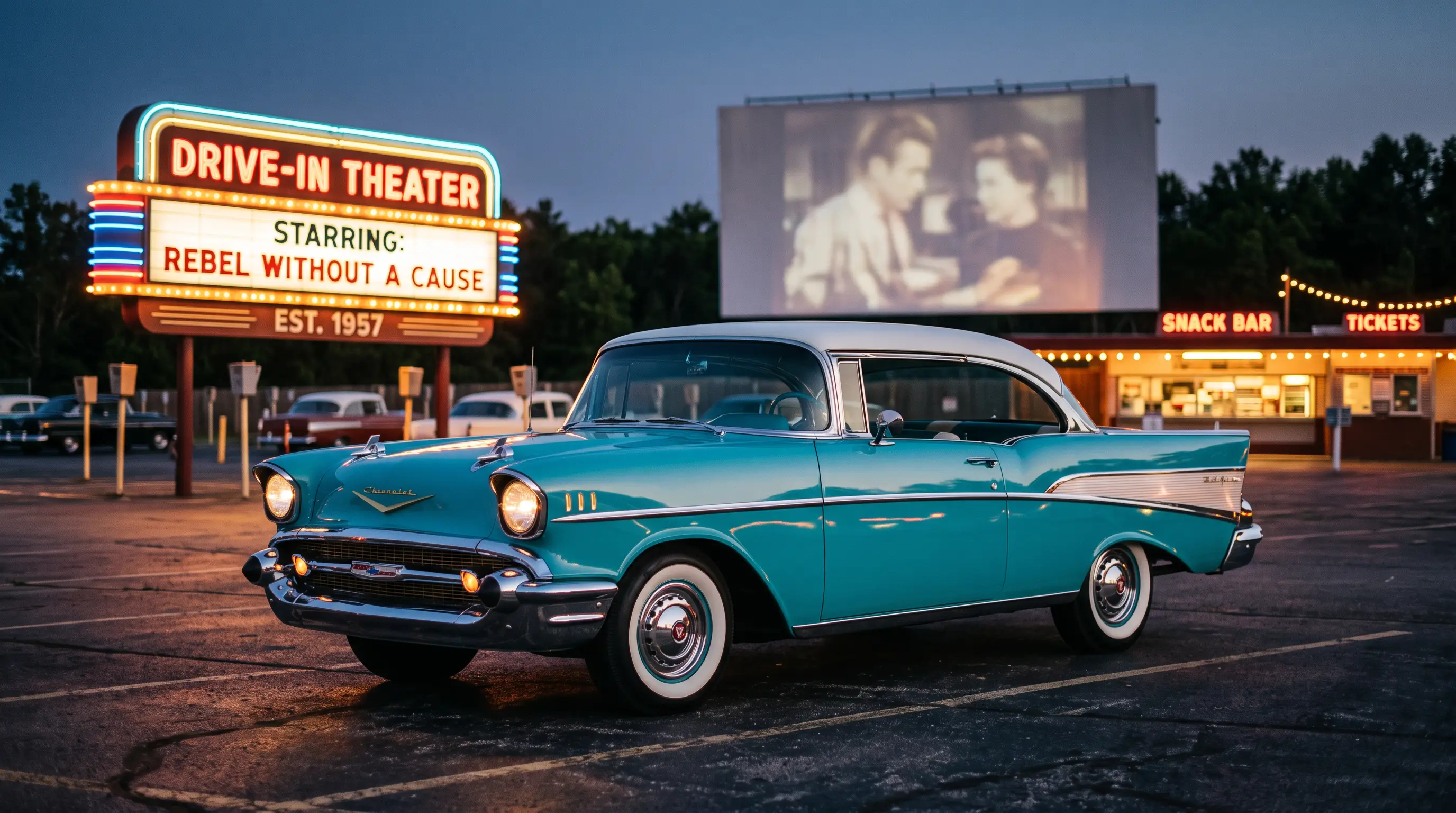
Two-tone paint schemes were not invented for the Tri-Five generation. Other manufacturers had been playing with contrasting colors since the early 1950s, chasing the same postwar appetite for cars that looked less like transportation and more like a statement. What Chevrolet did differently with the 1955 through 1957 Bel Air was tie the paint split to the actual sheet metal, letting the color break follow a styling crease rather than sitting on top of the body like an afterthought. That decision is why these paint jobs still hold up as design today instead of reading as a dated gimmick. The color line does structural work. It emphasizes the car's proportions instead of just decorating them.
By 1957 the factory offered dozens of approved two-tone combinations, and the gold anodized aluminum trim insert that ran along the car's flank did double duty, separating the colors cleanly while also giving Chevrolet's dealers something to point at on the showroom floor that no competitor could match that same year.
What a builder actually looks for
When I'm evaluating a two-tone car for a build or for a buyer, the paint colors themselves matter less than whether the break line sits where the factory intended. Reproduction trim is available, and it fits close enough that most owners never think twice about it. But close enough is not the same as correct, and a trim piece sitting a quarter inch off the factory line throws the whole visual balance out. I've seen beautifully executed paint jobs ruined by a trim kit that didn't sit flush to the body crease, and I've seen tired, faded originals that still look sharper than a fresh restoration because whoever built the car in 1957 got the geometry right the first time and nobody has disturbed it since.
That's the difference between period-correct and what I'd call a poseur job. A poseur two-tone slaps a popular color combination on a car because it looks good in photographs. A period-correct build respects that the paint break was engineered, not chosen, and treats the trim line with the same seriousness as any structural panel gap.
Color as identity, not just fashion
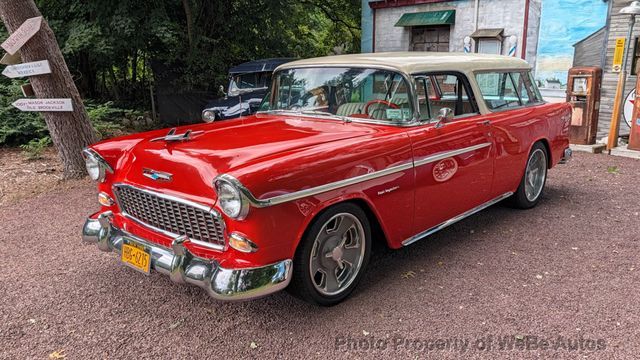
Certain color combinations became so closely associated with specific years and trim levels that longtime owners can often identify a car's model year from twenty feet away just from the paint split, before they've read a single badge. The narrower, upper-body-only two-tone treatment common on the 1955 cars reads differently than the more dramatic, sweeping color break Chevrolet introduced for 1957, and each version tells a slightly different story about where the design language was headed. Collectors who care about originality treat these color choices the way a historian treats a primary source document. The combination on the build sheet is evidence, not decoration.
The wider cultural story behind why these color choices mattered so much to buyers in the 1950s goes deeper than paint chemistry. If you want to read the background on that, the broader history explains how the whole Tri-Five generation became wrapped up in postwar identity and status in ways that extended well past what color a family chose for their new car.
The custom scene took it somewhere else entirely
Once these cars aged out of daily-driver status and into the hands of builders and customizers, two-tone paint stopped being a factory-approved decision and became a canvas for personal expression. Some of the wildest scallop and flame treatments in American car culture were laid down over stock two-tone Tri-Five bodies precisely because the factory paint break already gave a builder a strong foundation to work from or deliberately break against. A builder who understands the original geometry can bend the rules with intention. A builder who does not understand it just makes noise.
That same color culture bled into music and popular imagery of the era in ways that are worth exploring further. The Bel Air's color choices showed up as a kind of shorthand for style and aspiration well beyond the driveway, and if that angle interests you, our piece on the model's presence in period songs is worth a look too, since it traces how deeply this car's visual identity worked its way into the broader culture of the time.
What holds up fifty years later
The best two-tone Tri-Five Chevrolets I've worked on are not the ones with the boldest color combinations. They're the ones where the break line disappears into the design so completely that a first-time observer doesn't consciously register two colors at all, just a shape that looks right. That's harder to achieve than most people assume, and it's why the factory engineers who worked out those crease lines in the mid-1950s deserve more credit than they usually get. Getting a paint split to look effortless takes real discipline, whether you're doing it in 1957 with a factory jig or in a home garage sixty years later with a laser line and a lot of patience.
I've turned down paying work over a paint split before, and I'd do it again. A customer once asked me to run a color break straight across a door skin with no relationship to the crease underneath, purely because he liked how it looked on a different car in a magazine. It would have looked fine in a photograph and wrong in person, the kind of wrong you only notice once you're standing next to the car and your eye keeps sliding somewhere it shouldn't. That is the whole argument for respecting the factory geometry even on a car headed for heavy customization elsewhere. The paint break is one of the few elements on a Tri-Five body that Chevrolet's stylists genuinely got right the first time, and a builder ignores that at their own risk.
"A two-tone paint job isn't two colors. It's one decision about where a car's shape should end and another one should begin, and most people never notice how much work goes into making that look easy."
- Jim Vasquez
If you're ready to see how these color splits actually look in person rather than in a catalog scan, you can shop classic Air listings and start comparing real paint breaks against everything discussed here.