
My grandfather kept a coffee can of touch-up paint on a shelf in the garage, and for years I thought the color inside was just "truck green." It wasn't until I started digging into build sheets that I learned it had a name, a code, and a whole story behind it. The 1958 Ford F100 colors chart reads less like a paint catalog and more like a snapshot of what postwar America wanted to look like on the way to work.
Car Features
8 min read
Colors of the 1957-60 F-100
The 1958 Ford F100 color chart reveals how Ford turned a work truck into a style statement, from bold two-tones to the shades that survive today.

Ford's third-generation trucks, sold from 1957 through 1960 and often called the Styleside generation for the flush-sided bed introduced that year, arrived at a moment when trucks were shedding their strictly-for-hauling reputation. Farmers and contractors still bought them by the thousand, but so did young families who wanted a second vehicle that could double as a weekend hauler. The color palette followed that shift. Where the previous generation leaned on a handful of somber solids, this truck offered a real menu, and dealers pushed two-tone combinations hard because they made the truck look like something you chose rather than something you settled for.
The palette that defined a generation
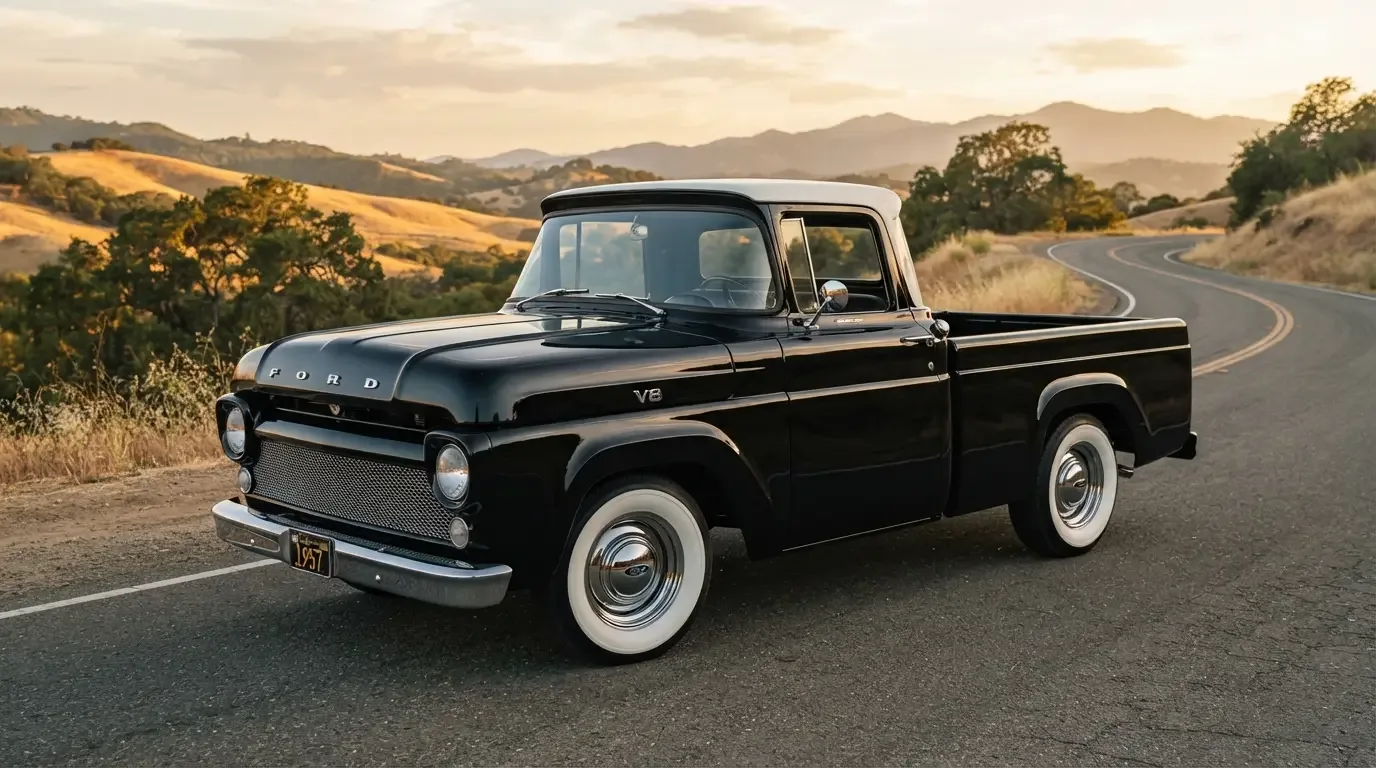
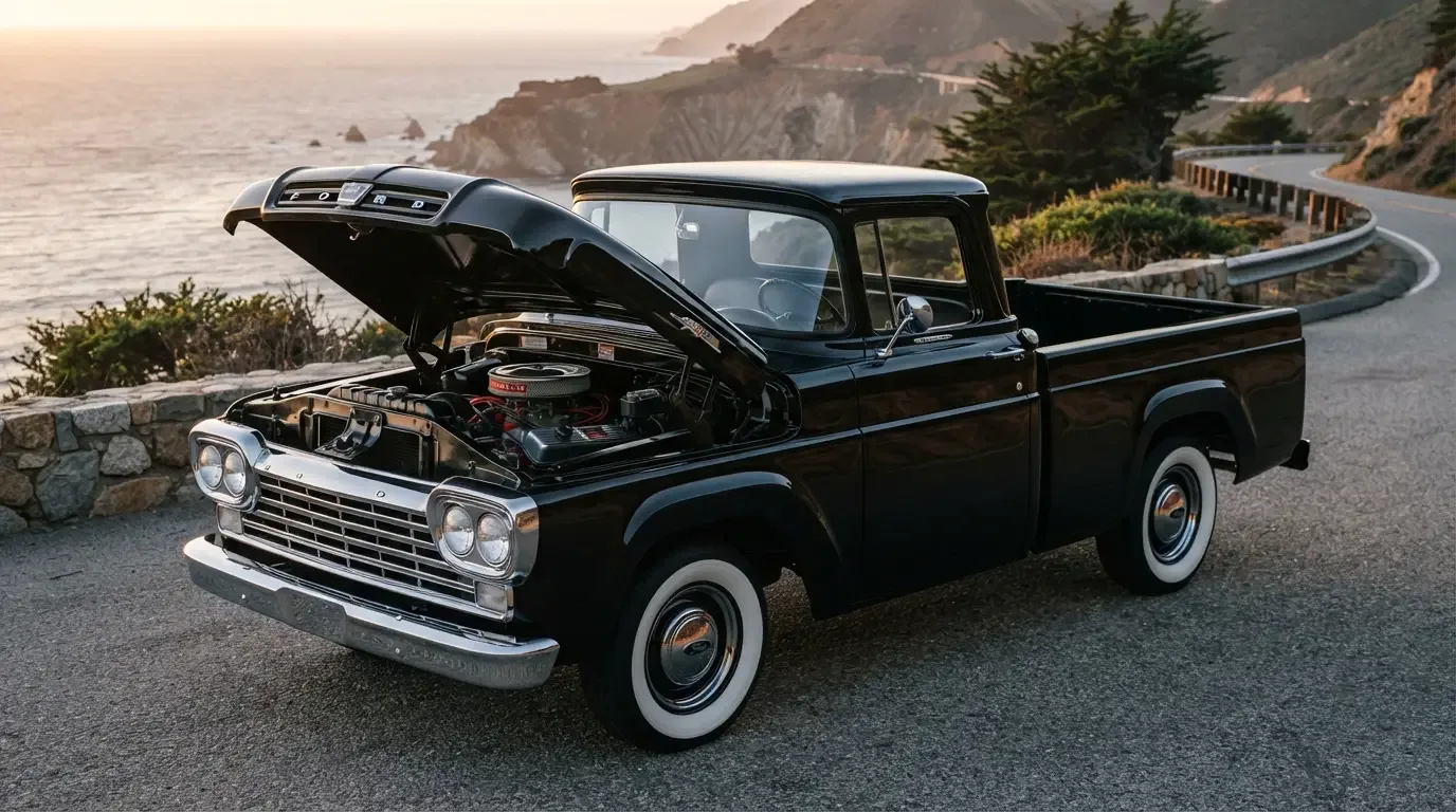
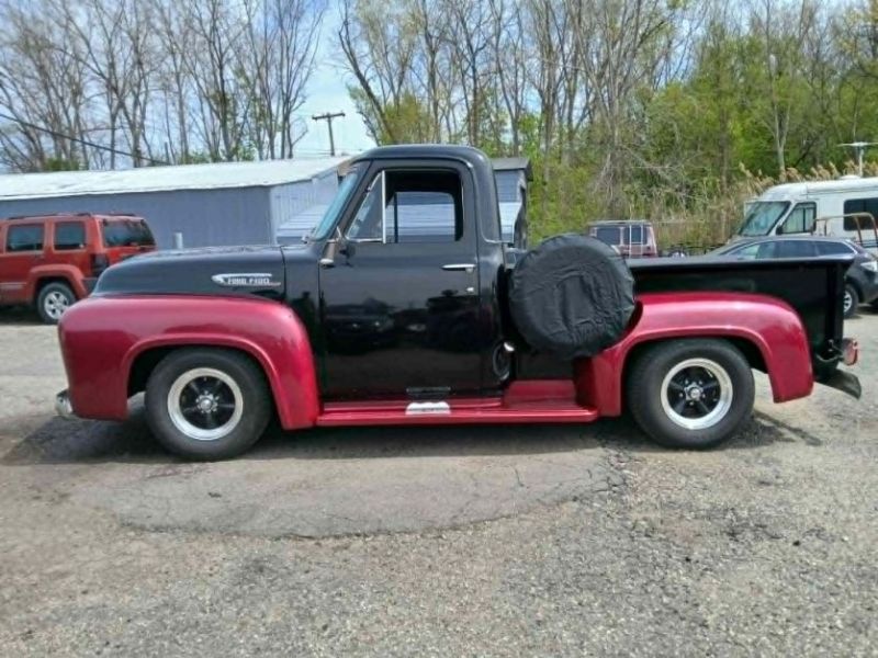
Ford's color list for these trucks ran through warm, saturated hues that feel distinctly of their moment: Colonial White, Meadow Green, Willow Green, Raven Black, and a rotating cast of blues and reds that shifted slightly year to year. Two-tone treatments were common, with the cab roof or the lower body panel picked out in a contrasting shade. A white roof over a deep body color was a favorite combination on dealer lots, and it is still the pairing most collectors chase today because it photographs so well parked next to a barn or a diner.
What is easy to miss, looking at faded photographs, is how bold some of these choices actually were. A truck in a bright turquoise or a warm coral was not hiding. It was announcing that the owner had opinions about how a work vehicle should look, which was a fairly new idea for the segment. Read the 1957 ford f100 story for the full account of how this generation came together, because the color program only makes sense against that larger redesign.
Two-tone as a status signal
Two-tone paint cost extra, and that mattered. A single-color truck said work vehicle. A two-tone truck, especially one with chrome trim to match, said the owner had spent a little more than they needed to. Dealers in farm country reported that two-tone orders climbed steadily through the run, and by 1959 and 1960 it was common enough that a solid-color truck almost looked like the budget option, even though it originally had been the standard.
The trim level mattered too. Custom Cab trucks got more chrome and nicer interior treatments to go with their paint, while base trucks kept things plainer. A buyer walking onto a lot in 1958 could genuinely build a truck that matched their personality, whether that meant a stripped-down green work truck or a two-tone showpiece meant to be seen outside church on Sunday.
"People forget that color was marketing long before it was nostalgia. Ford wasn't picking these shades for us to admire sixty years later. They were picking them to move metal off a lot in 1958, and that urgency is baked into every choice."
- Nora Beckett
What survives, and what fades
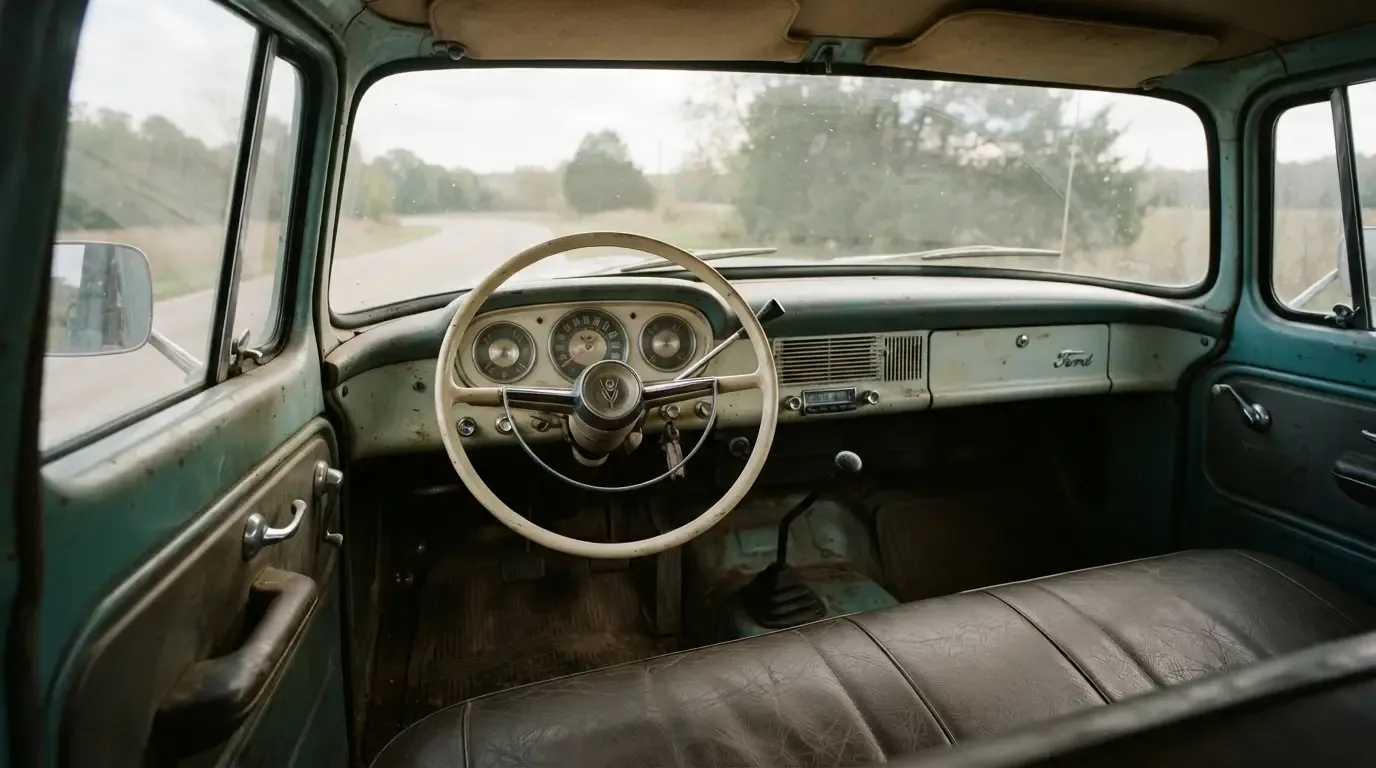
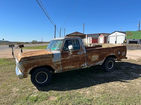
Original paint on a truck this old is rare, and original two-tone paint that has not been touched is rarer still. Sun does brutal things to lacquer over six decades, and a lot of these trucks were repainted at least once during their working lives, often in whatever single color was cheapest at the local body shop. That makes an honest, documented original color combination one of the quieter value drivers in this market. It is not as flashy as a numbers-matching engine, but it tells a story that a fresh repaint simply cannot.
Restorers chasing period accuracy lean on old dealer brochures, paint chip cards, and the occasional untouched trunk lid or door jamb where the factory color survived under years of grime. It is detective work, and the payoff is a truck that looks the way it did rolling off the line rather than the way a well-meaning owner in 1975 decided it should look.
Finding one today
If you want to see how these colors actually read in person rather than in a faded photo, there is no substitute for standing next to a real truck. Browsing classic F-100s on the market is the fastest way to get a feel for how a two-tone combination ages, and how differently the same color can look under fluorescent garage light versus open sky. Pay attention to panel gaps and overspray around trim, both of which hint at a repaint even when the color itself looks period-correct.
A truck wearing its original paint, even if that paint is tired and thin in places, tends to hold a different kind of value than a glossy repaint in the same shade. It is not always the flashier choice at a show, but it is often the more honest one, and honesty ages well in this hobby.
Reading old photographs correctly
Black-and-white dealer photos and faded family snapshots are the main window most of us have into how these trucks actually looked on the day they were sold, and they lie to us more than we'd like to admit. A dark color in a black-and-white photo could be black, dark green, or a deep maroon, and without a caption or a surviving color brochure there is genuinely no way to tell from the image alone. I have seen collectors argue for years over what color a particular truck in a particular photograph actually was, only to have the debate settled by a single surviving build tag turning up decades later.
Color film from this era does not solve the problem entirely either. Dyes faded unevenly over sixty-plus years of storage, and a scanned slide can shift warm or cool depending on how it was processed and stored. The safest approach is always to cross-reference a photograph against an actual period paint chip or a documented build tag rather than trusting the photo's color rendering on its own. It is slow, unglamorous work, but it is the only way to get an honest answer.
Regional habits and dealer stock
Not every dealer ordered the same mix of colors. A rural dealership serving mostly farm and ranch customers tended to stock more work-truck greens and plain whites, colors that hid dust and did not show every scratch from a day in the field. A dealer in a bigger town, competing for buyers who wanted their truck to look sharp parked outside a business, ordered a heavier mix of two-tones and brighter solids. That regional variation means a color that looks common in old photographs from one part of the country can be genuinely uncommon in another, and it is worth factoring into how you judge a given truck's rarity.
This regional pattern also shapes what turns up on the used market today. Trucks that spent their working lives on farms tend to surface in plainer colors, while trucks with an urban or suburban history are more likely to show up in the flashier two-tone combinations that dealers pushed to a different kind of buyer.
The color story behind the story
None of this happens in isolation. The colors of the 1958 Ford F100 only make sense in the context of the whole redesign, from the wraparound windshield to the wider cab that finally let a driver's elbow rest somewhere comfortable. For readers who want the complete picture of how this generation changed the shape and character of Ford's truck line, the full story traces the whole arc, colors included, from introduction through the changeover to the next generation.
A coffee can of unmarked touch-up paint might not mean much on its own. Matched against a real color chart, it becomes a small piece of evidence about who bought these trucks, what they wanted them to say, and why so many of us are still chasing that particular shade of green sixty-odd years later.
Sources and notes
Related Reading
#two-tone paint
#ford f-100
#classic Ford trucks
#classic truck colors
#Task Force trucks
#1958 Ford F100

About the author
Nora Beckett
Automotive features writer and photographer who tells the human stories behind the cars, from show fields to cross-country road trips.
Related Listings - Ford F-100
Comments
Be the first to comment on this article.