
The object standing on the nose of a great luxury car did almost nothing useful. It did not improve the engine, the ride, or the aerodynamics. What it did was tell everyone approaching, and everyone in the oncoming lane, exactly what they were looking at. For most of the twentieth century the hood ornament was the most concentrated piece of status a manufacturer could bolt to a car, and the language it spoke was surprisingly precise.
Car Features
5 min read
Hood Ornaments as Luxury Signaling: From Flying Ladies to Crests
From the Spirit of Ecstasy to Cadillac crests, hood ornaments signaled status on classic luxury cars. What the mascots and heraldry actually meant.
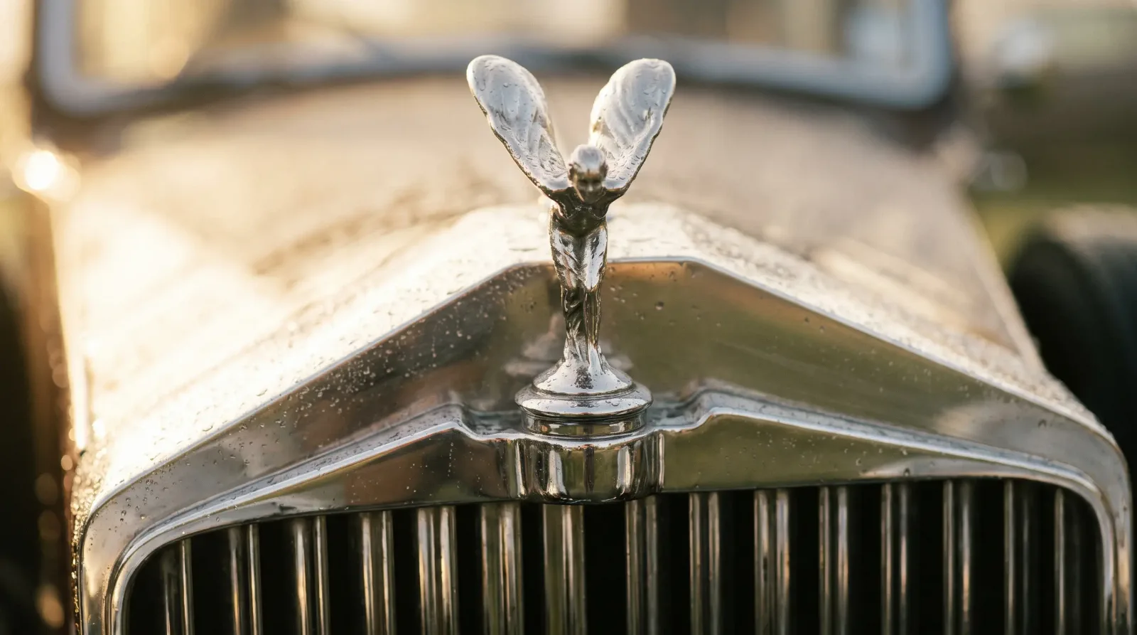
There were two broad dialects. One was the figural mascot, a sculpted figure meant to be admired as a small work of art. The other was the heraldic crest, borrowed from coats of arms and aristocratic tradition. Both survived from the era when the radiator cap sat exposed on top of the cowl, and both became shorthand for a whole class of car. This detail sits inside a much larger visual system, which is worth reading through the design language hub for the full picture.
From radiator cap to sculpture
The hood ornament started as a functional part. On brass-era cars the radiator filler cap sat on top of the shell, often with a temperature gauge, the Boyce MotoMeter being the common example that let a driver read coolant temperature through the windshield. Once owners started dressing up that exposed cap, the mascot was born. By the 1920s and 1930s the radiator cap sculpture had become a genuine field of decorative art, with owners commissioning custom pieces and glassmaker Rene Lalique producing a famous series of molded glass mascots for the wealthy to fit to their own cars.
As radiator caps moved under the hood in the 1930s, the ornament lost its function entirely and became pure styling. That freed the sculptors. The figure no longer had to unscrew or seal a filler neck, so it could be whatever the marque wanted it to say.
The flying ladies and their meaning
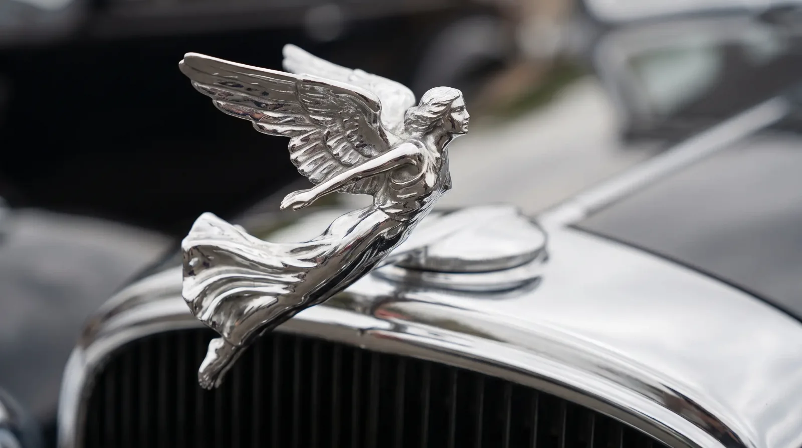
The most famous figural mascot is the Rolls-Royce Spirit of Ecstasy, the leaning female figure with flowing robes designed by Charles Sykes and adopted around 1911. It set the template: a mascot that read as motion, grace, and forward momentum. Its long production and careful trademark protection made it the single most recognized car ornament in the world.
American makers built their own flying figures. Cadillac used a stylized goddess and later a heraldic approach. The Packard cormorant, often called the pelican, and its optional Goddess of Speed mascot gave that marque an instantly readable nose. Lincoln adopted the greyhound for a time before settling on its four-pointed star. Each figure was chosen to project a specific idea, usually speed, elegance, or aristocratic calm, and buyers learned to read them at a glance.
"A well-made mascot was designed to be recognized from the front three-quarter view at speed. That is a very deliberate piece of sculpture, solving a problem most fine art never has to consider, which is legibility at forty miles an hour."
Sarah Whitfield
Crests, heraldry, and borrowed nobility
The other tradition was heraldic. Rather than a sculpted figure, the crest used the visual grammar of a coat of arms: shields, crowns, laurel, colored enamel divided into quarters. Cadillac's crest drew on the arms attributed to the French explorer Antoine de la Mothe Cadillac, complete with merlettes and coloring meant to suggest old lineage. Packard used a stylized family crest. Buick's tri-shield and the Pontiac arrowhead worked the same territory in a more modern idiom.
The point of the crest was association. A newly wealthy American buyer in 1935 could not inherit a title, but a car wearing convincing heraldry offered a small borrowed piece of the aristocratic world. The enamel work on the best crests was genuinely fine, closer to jewelry than trim, and it aged the car upward rather than downward. Buyers who wanted that world in full could still find classic luxury cars for sale wearing exactly these badges today.
Why the standing ornament disappeared
The upright hood ornament died for reasons that had nothing to do with taste. Pedestrian safety regulations in Europe and rising liability concern in the United States made a rigid sculpture standing on the leading edge of a car increasingly hard to justify. Manufacturers responded with spring-loaded or retracting mounts that let the ornament fold flat under impact. Rolls-Royce fitted a mechanism that retracts the Spirit of Ecstasy into the shell if struck or if tampering is detected.
Aerodynamics finished the job. As drag coefficients became a selling point in the late 1970s and 1980s, a protruding figure on the nose was dead weight in the wind tunnel. The ornament shrank, laid flat into a badge, or vanished entirely into a grille emblem. What had been a sculpture became a logo.
| Ornament type | What it signaled | Representative marque |
|---|---|---|
| Figural mascot | Motion, grace, speed | Rolls-Royce Spirit of Ecstasy |
| Animal figure | Swiftness, heritage | Packard cormorant, Jaguar leaper |
| Heraldic crest | Borrowed nobility, lineage | Cadillac coat of arms |
| Star or geometric emblem | Modern precision | Lincoln star, Mercedes three-pointed star |
Reading ornaments on a collector car
For anyone assessing an old luxury car, the ornament is worth a close look. Reproduction mascots exist for the popular marques, and an incorrect or aftermarket piece stands out to a judge immediately. Original enamel crests show their age honestly, with fine crazing and slightly muted color that reproductions rarely capture. A mismatched ornament is often a clue that other correct-detail work was skipped too.
The mascot and the crest together did the work of announcing a car before a single mechanical fact was known. That announcement is a large part of why these cars still command attention. The next question is who actually built the bodies these ornaments crowned, which brings us to next: What "Coachbuilt" Actually Meant vs. Mass-Production Styling.
Related Reading
Have a
Classic Car
for Sale?
Reach thousands of serious classic car collectors across the US.
Sell It Here →
Are You a Classic Car Dealer?
List your full inventory and connect with targeted classic car buyers.
Join as a Dealer →

About the author
Sarah Whitfield
Third-generation classic car collector specializing in pre-war American and European coachbuilt automobiles. Researcher and concours enthusiast.

Comments
Be the first to comment on this article.