
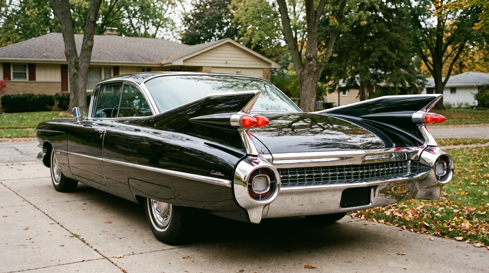
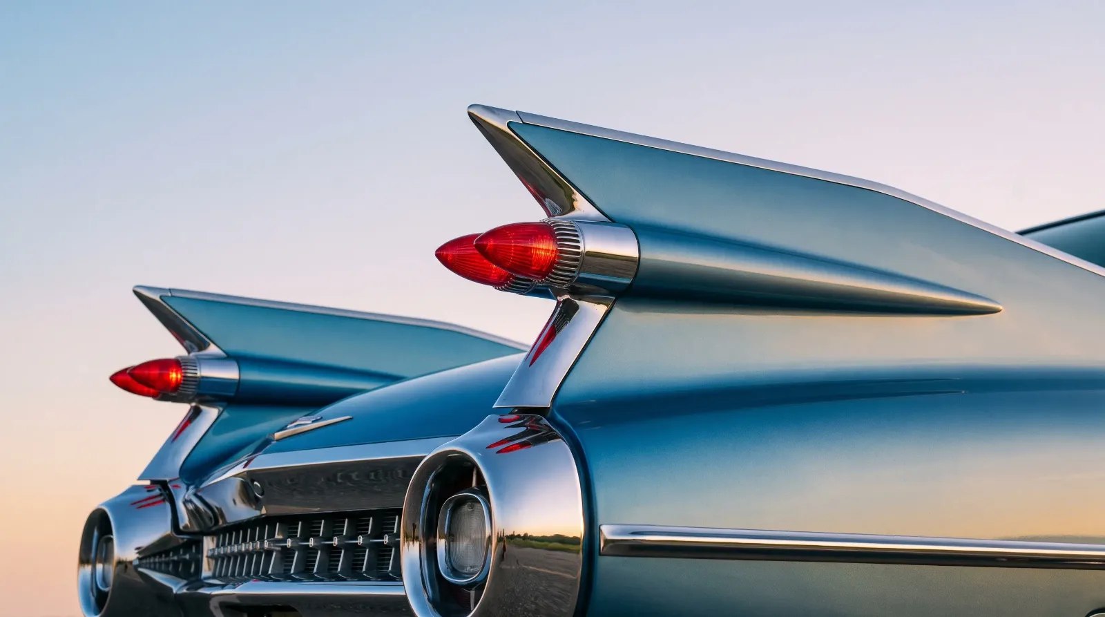
A classic luxury car communicates before it moves. The grille, the fenders, the height of the roofline, the amount of brightwork, all of it was chosen to say something specific about the owner and the moment. Learning to read that vocabulary is one of the quiet pleasures of the hobby, and no single element carries more meaning than the classic car tail fins that came to define the American luxury car at mid-century. The fin was never functional. It was language, and it was fluent.
Car Features
8 min read
Classic Luxury Car Design Language Explained
Classic car tail fins, chrome, grilles and proportion explained. How luxury car design language signaled status, and what the details tell a collector.
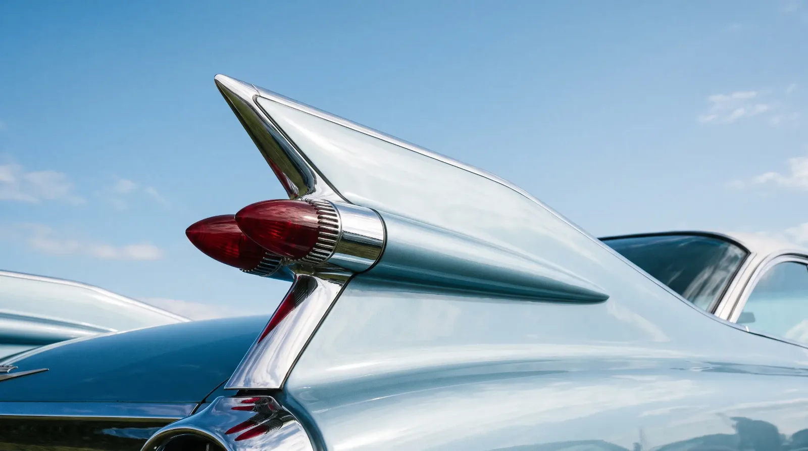
This piece treats the car as a designed object, the way a concours judge or a coachbuilding historian would. It runs alongside the complete classic luxury car story, but the concern here is narrower and more visual: what the shapes meant, where they came from, and how to read them on a car in front of you.
Reading a car like a face
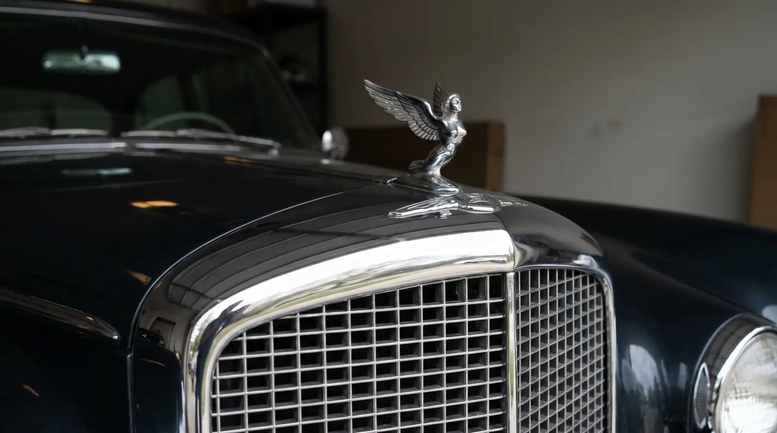
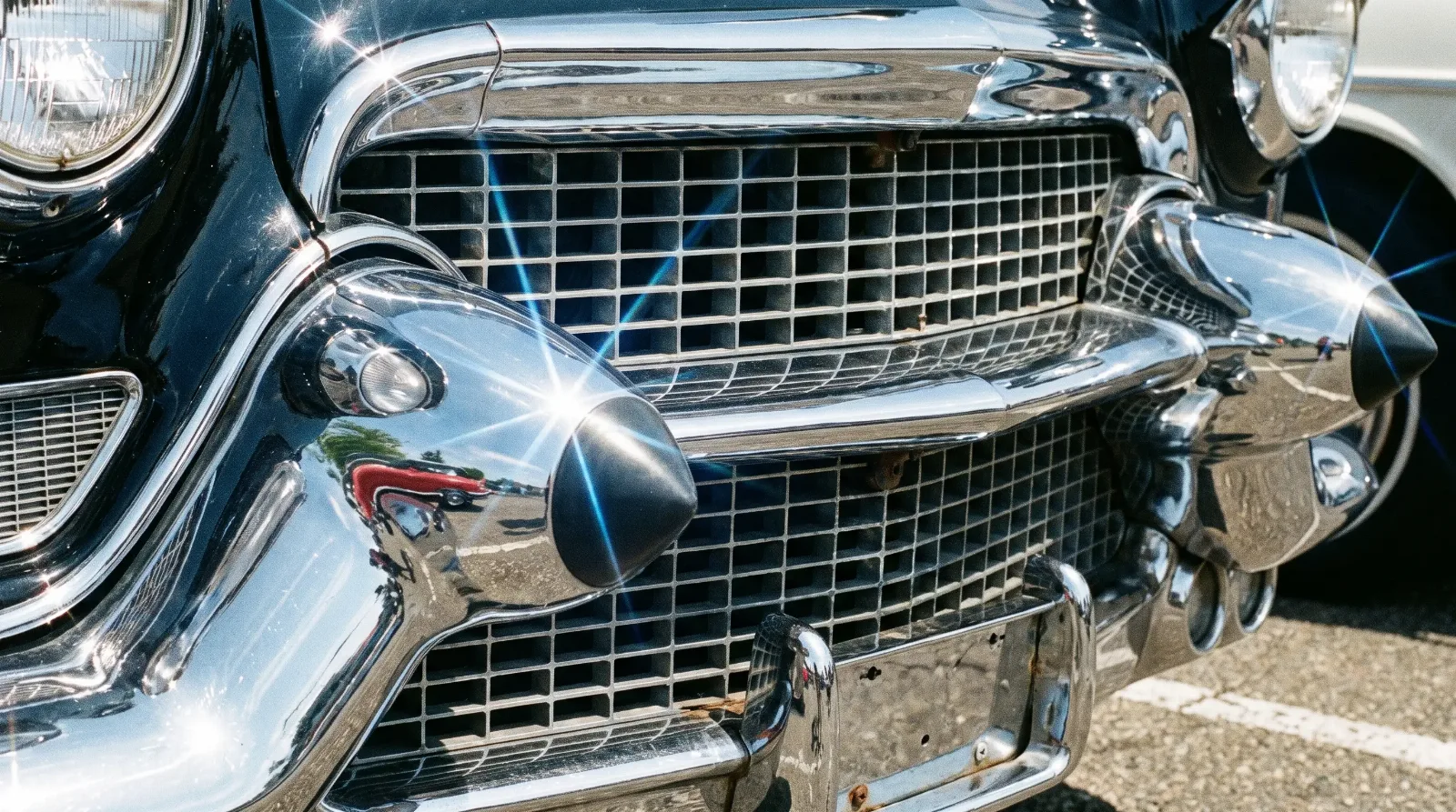
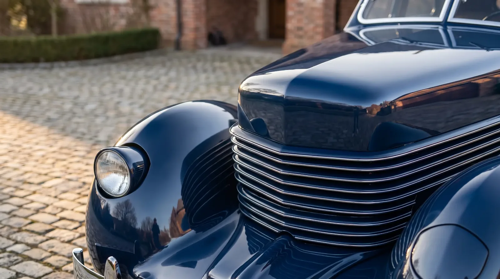
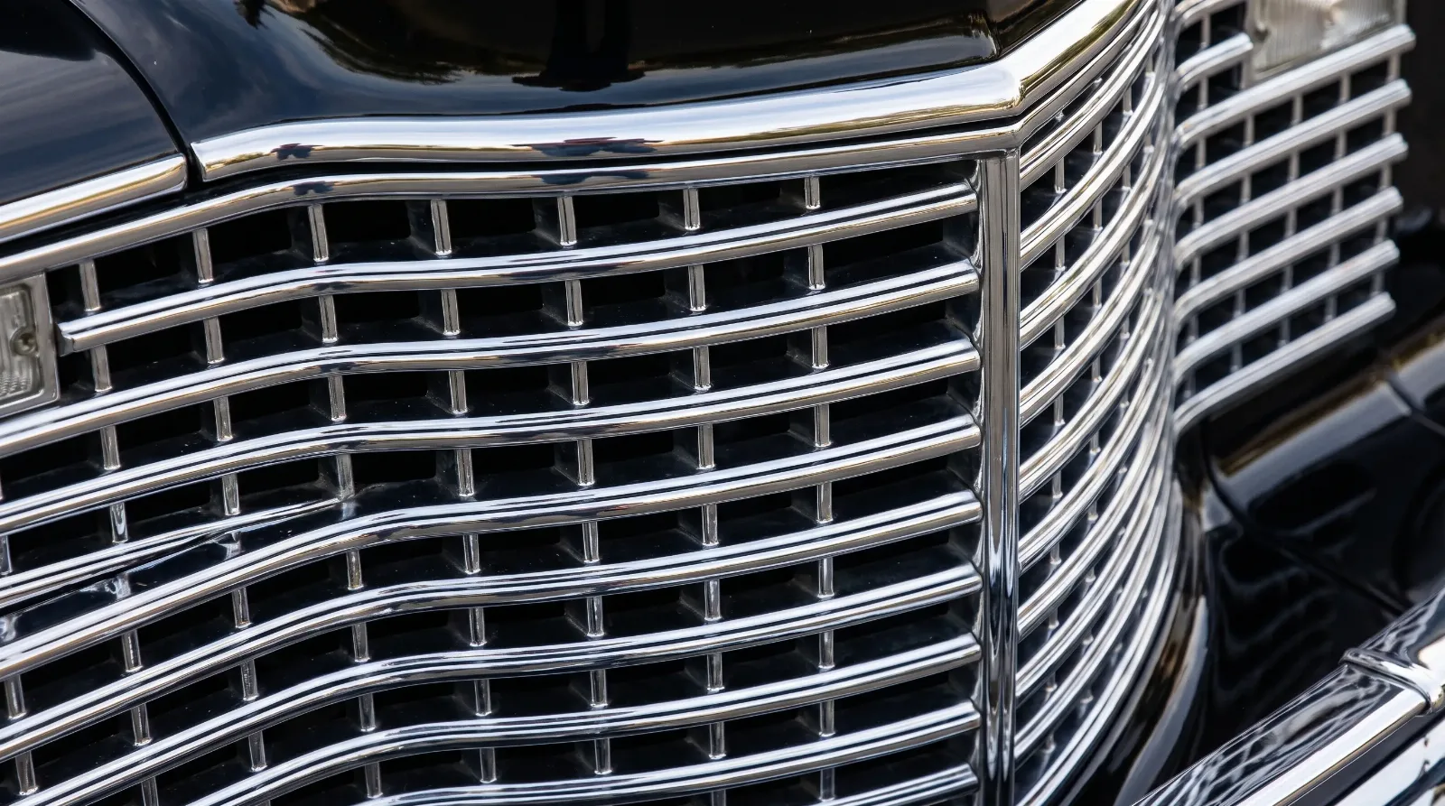
The front of a luxury car is its face, and the designers knew it. The grille is the single most brand-defining element on most classics, which is why manufacturers guarded their grille identity so jealously. A Rolls-Royce wears its temple-front radiator shell. A pre-war Packard wears its distinctive shouldered grille. A 1950s Cadillac announces itself through its eggcrate pattern and, on certain years, the conical bumper guards enthusiasts nicknamed dagmars.
These were deliberate signatures. A designer could change almost everything else about a car year to year, but the grille had to remain recognizable at a distance, because recognition was the whole commercial point. When you approach a classic, read the grille first. It usually tells you the marque before any badge does.
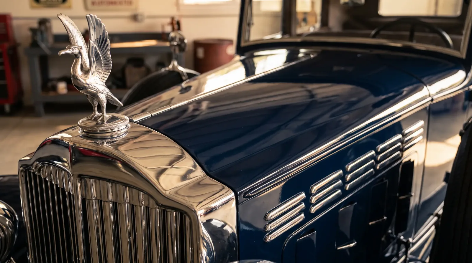
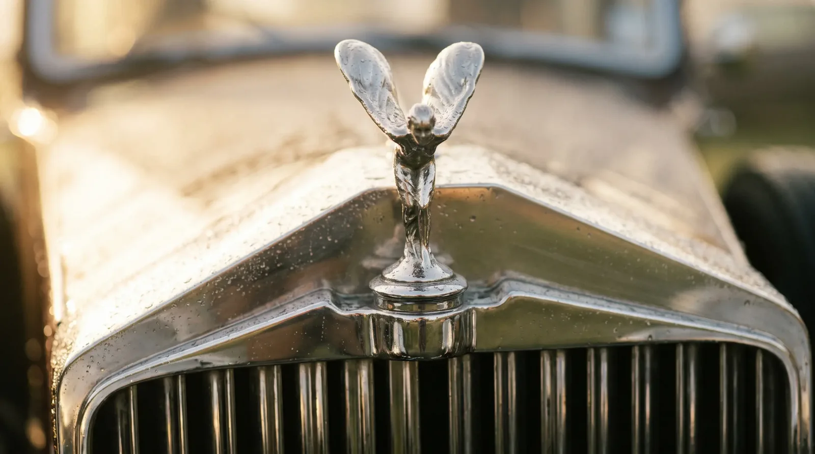
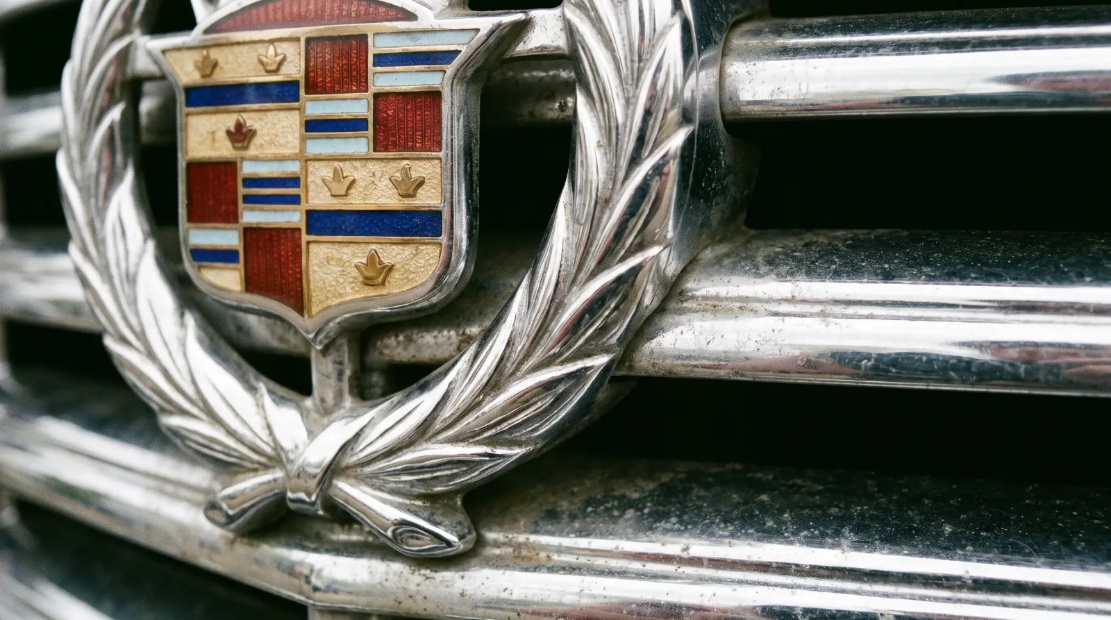
Above the grille sat the hood mascot, the small sculpture that turned a radiator cap into a piece of jewelry. Rolls-Royce fitted the Spirit of Ecstasy, introduced around 1911 and still in use, the most famous automotive figure ever made. Packard used a pelican, often called a cormorant, and Cadillac ran a series of goddess and heron figures across the pre-war years. These mascots were not decoration for its own sake. They were the marque's crest, a heraldic touch that told an approaching pedestrian what had just pulled up, and their correctness is now one of the details a concours judge checks first.
The rise of the tail fin
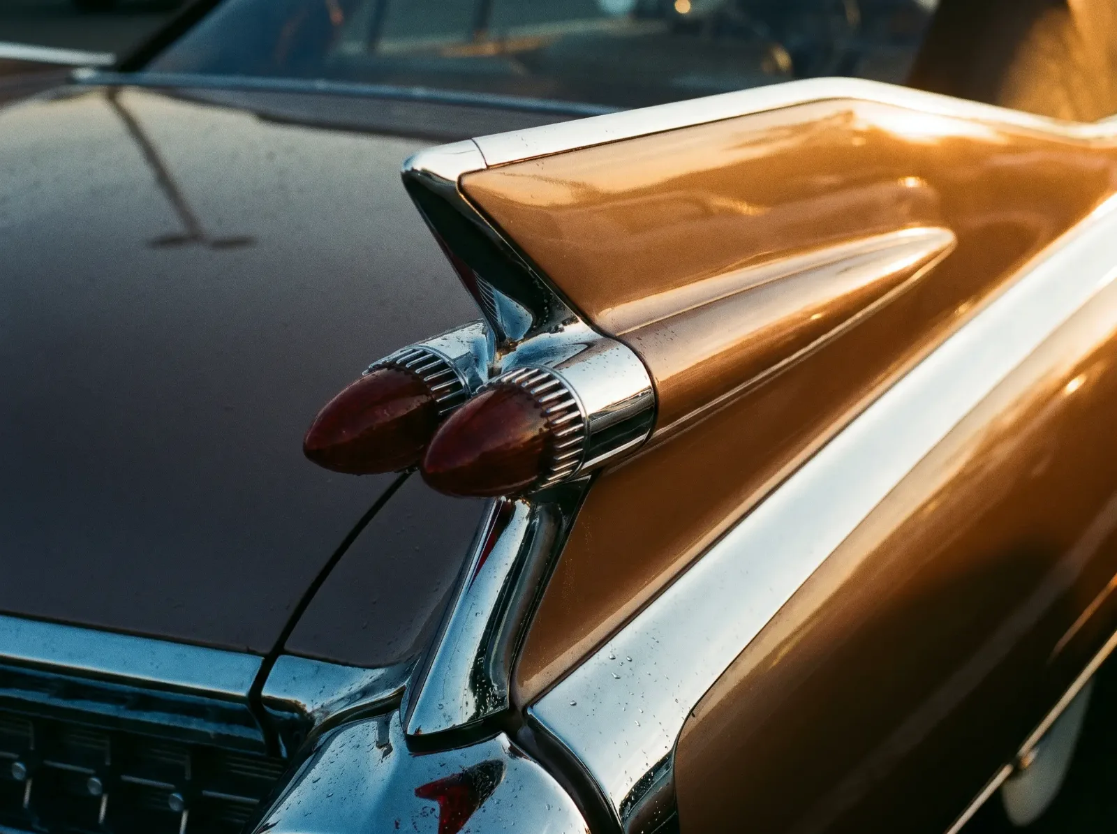
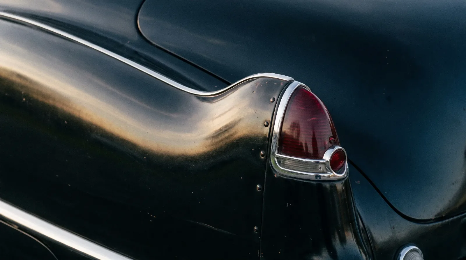
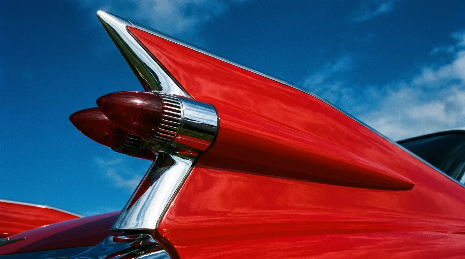
The tail fin is the most storied shape in American automotive design, and its origin is well documented. Harley Earl, who ran General Motors styling, drew inspiration from military aircraft, specifically the twin-boom tail of the Lockheed P-38 Lightning fighter. The first modest fins appeared on the 1948 Cadillac, small and tentative, more suggestion than statement.
From there the fin grew, year by year, until it reached its towering peak at the end of the 1950s. What began as a subtle raised edge became a soaring vertical blade with the taillight built into it. The escalation mirrored the cars themselves, which were also growing in every dimension over the same period. The fin and the land yacht rose together, each feeding the other's ambition.
| Design element | Rough era of peak use | What it signaled |
|---|---|---|
| Tail fin | 1948-1961 | Modernity, aviation, forward motion |
| Wraparound windshield | Mid-1950s | Panoramic openness, jet-age styling |
| Pillarless hardtop roof | Late 1940s-1960s | Airiness, the look of a convertible with a roof |
| Two-tone paint | 1950s | Playfulness, visual length, expense |
Chrome as jewelry
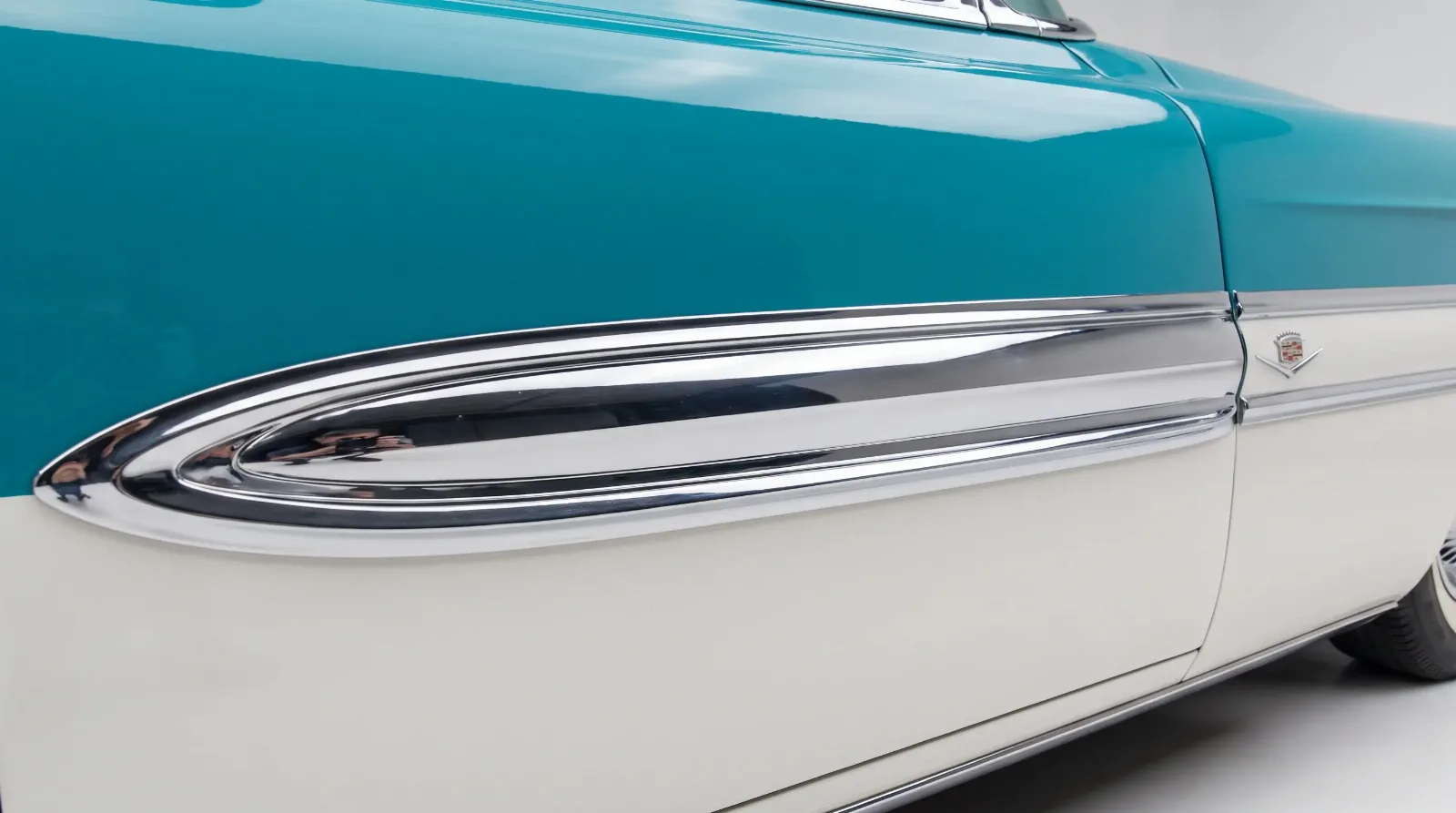
Brightwork on a classic luxury car functioned the way jewelry functions on a person. It was applied where the designer wanted the eye to travel, and its quantity signaled cost. Chrome and polished stainless framed the windows, capped the fenders, ran the length of the body as spears, and gathered in mass around the grille and bumpers.
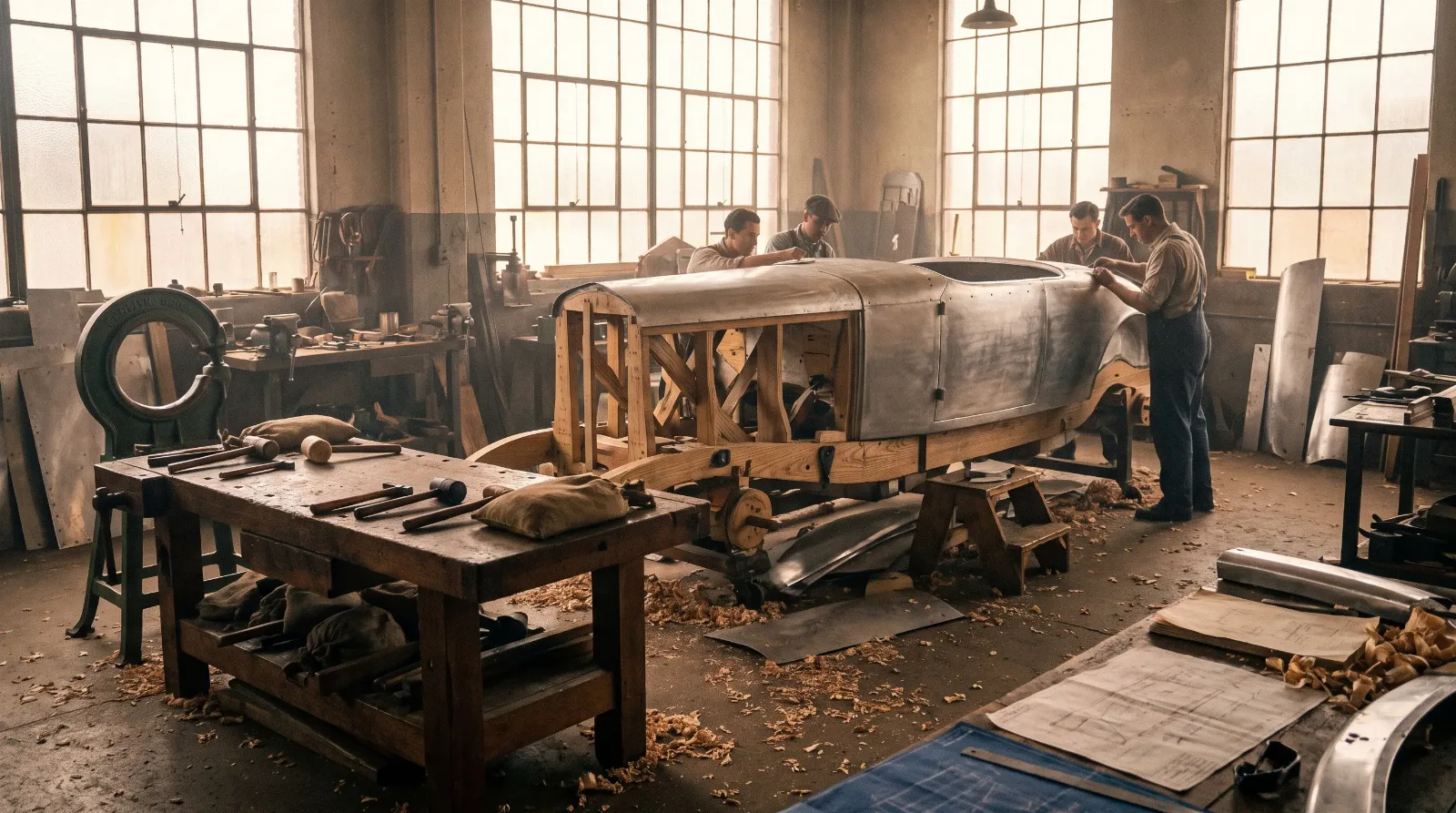
There is craft in this that a modern car cannot replicate, because so much of it was hand-fitted. On the best cars the brightwork lines up seam to seam across panel gaps, a discipline that photographs poorly and reads clearly in person. When you inspect a classic, the alignment and condition of the trim tells you as much about the original build quality, and the honesty of any restoration, as the paint does. Pitted or mismatched chrome is expensive to correct and often nearly impossible to source.
Paint worked alongside the chrome to shape how the eye read the body. Two-tone schemes, hugely popular through the 1950s, used a contrasting color along a spear or sweep of trim to make a long car look even longer and to break up an expanse of sheet metal that might otherwise read as slab-sided. The chrome divider between the two colors was itself a design line, placed where the stylist wanted the eye to travel. Getting a two-tone right on a restoration is genuinely difficult, because the break line has to fall exactly where the factory put it, and a hair's deviation reads as wrong even to an untrained viewer who cannot say why.
Proportion and the long hood
Underneath the ornament sits proportion, which is where luxury design does its most serious work. The classic luxury car almost always carries a long hood and a cabin set well back, a proportion inherited directly from the coachbuilt era when a large engine, often a straight-eight or a V12, genuinely required that length. The long hood said power and expense, and it persisted as a styling cue even after engineering no longer demanded it.
This is the difference between a luxury car and an ordinary one that has been decorated. You can add chrome to anything. You cannot easily fake proportion. The relationship between wheelbase, hood length, and cabin position is set at the design stage, and it is the first thing a trained eye reads, usually without consciously naming it.
Wheelbase itself became a status marker within a single model line. Manufacturers offered a standard car and then a long-wheelbase version, the extra length inserted into the rear compartment for the owner who was driven rather than driving. The stretched formal sedan and the limousine used exactly this trick, and the added rear-door length is one of the quickest ways to identify the top of a range. When two cars share a body but one carries a longer wheelbase, the longer one almost always sat higher in the catalog and costs more to find in good order today.
"People remember the fins and the chrome, because those are loud. But stand a great classic next to a merely decorated one and the difference is proportion, the length of the hood against the set of the cabin. The ornament is what you notice. The proportion is what you feel, and it is the part that cannot be added later."
Sarah Whitfield
The hardtop and the wraparound windshield
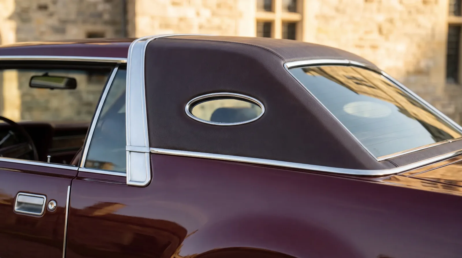
Two roof-and-glass innovations defined the look of the 1950s luxury car. The pillarless hardtop removed the fixed post between the front and rear side windows, so that with the glass lowered the car had the open, airy profile of a convertible while keeping a fixed steel roof. It was pure style, and it was enormously popular.
The wraparound windshield curved the glass around into the door frame, a jet-age flourish that gave a panoramic view and a distinctly modern face. Both features dated quickly, which is part of why they are such reliable markers of the mid-1950s today. When you see a curved wraparound screen and a pillarless roof, you are looking at a very specific window of years, and the design tells you the era before the title does.
How design language signals status
Every element discussed here served one underlying purpose, which was to communicate rank. The grille established identity. The fins projected modernity and forward motion. The chrome demonstrated expense. The proportion asserted power. The roofline and glass claimed to be up to date. Together they formed a legible language, and buyers of the period read it fluently, which is exactly why manufacturers invested so heavily in it.
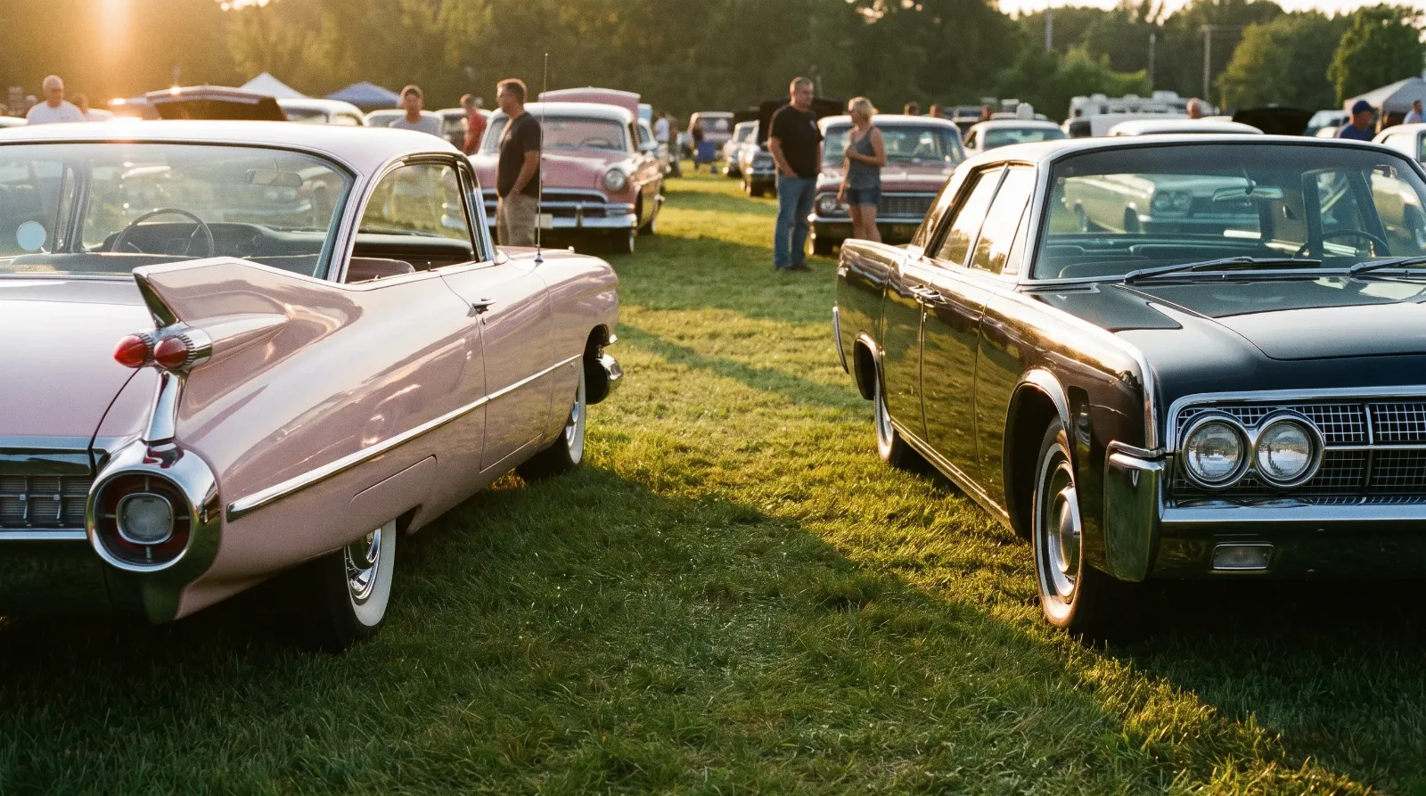
That competition between marques for the most persuasive design was fierce, and nowhere fiercer than between the two American giants. The full account of that fight runs onward to Cadillac vs Lincoln, where the design decisions covered here became weapons in a decades-long commercial war.
What the details tell a collector
For a buyer, design literacy is a practical tool, not just an appreciation. The originality of a car's design details, the correct trim, the right grille pattern for the year, the proper hood ornament, is central to how concours judges score it and how the market values it. A car wearing the wrong-year brightwork or an incorrect roof treatment is a different, lesser proposition than a correct one, however good it looks at a glance.
So learn the vocabulary before you shop. Know which fin belongs to which year, which grille is correct, what the proportion should be. Then browse the current classic luxury cars for sale with those details in mind, because in this part of the hobby the design is not decoration laid over the value. It largely is the value.
Related Reading
Article
The Classic Luxury Car Story
Article
The Land Yacht Era: Why American Luxury Cars Got So Big
Article
Cadillac vs Lincoln: America's Luxury War
Article
The Tail Fin Story: How Harley Earl Changed Car Design
Article
Cadillac's 1948 Tail Fin and the Fin Arms Race That Followed
Article
Who Did Tail Fins Best (and Worst)? A Design Retrospective
Article
Chrome Trim Culture: Why Luxury Cars Wore So Much Metal
Article
Opera Windows and Formal Roofs: A Luxury Design Signature
Article
Vinyl Tops, Padded Roofs, and Landau Bars Explained
Article
Hood Ornaments as Luxury Signaling: From Flying Ladies to Crests
Article
What “Coachbuilt” Actually Meant vs. Mass-Production Styling
Article
Luxury Car Color Palettes and the Two-Tone Paint Era
Article
Hidden Headlamps: The Secret Luxury Design Signature
Article
Grille Design Evolution: Egg-Crate, Waterfall, and Split Grilles
Article
Leather vs. Woodgrain: The Truth About Luxury Car Interiors
Article
Luxury Car Badges and the History Behind the Emblems
Article
Formal Roofline vs. Fastback: The Great Luxury Design Debate
Article
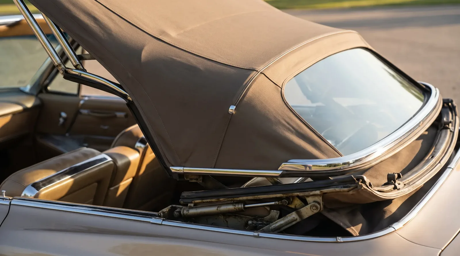
Convertible Top Craftsmanship in Classic Luxury Cars
Article
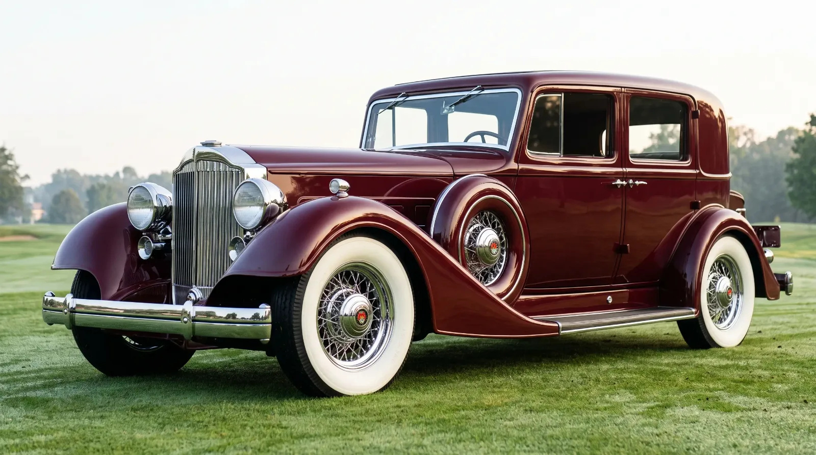
Whitewalls and Wire Wheels: The Styling Signatures of Luxury Cars
Article
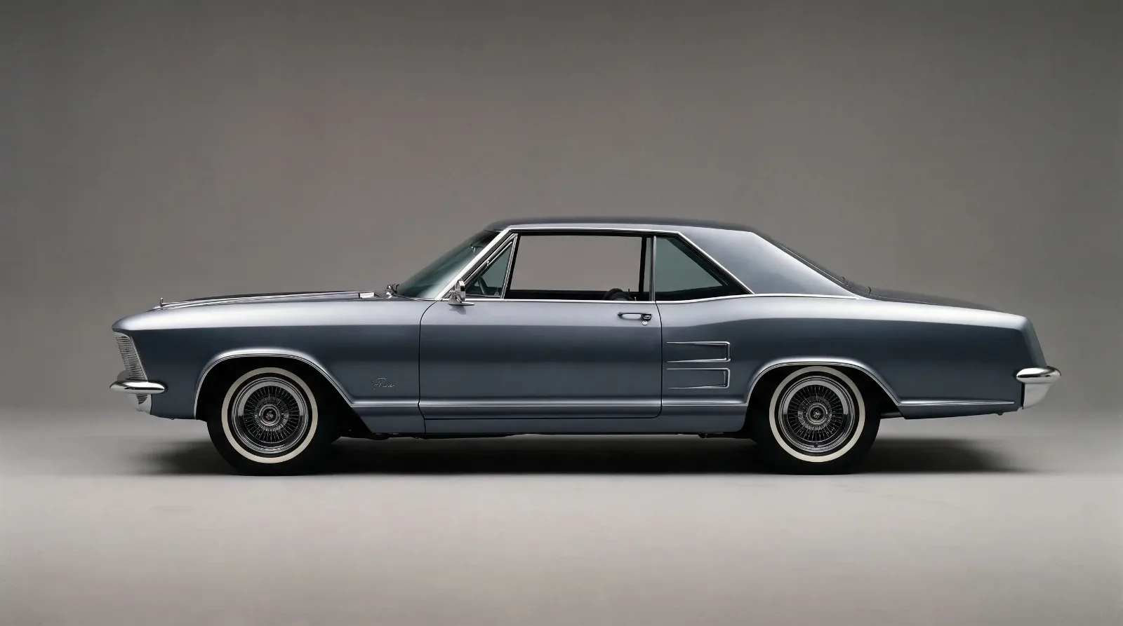
The Personal Luxury Coupe Silhouette, Explained
Article
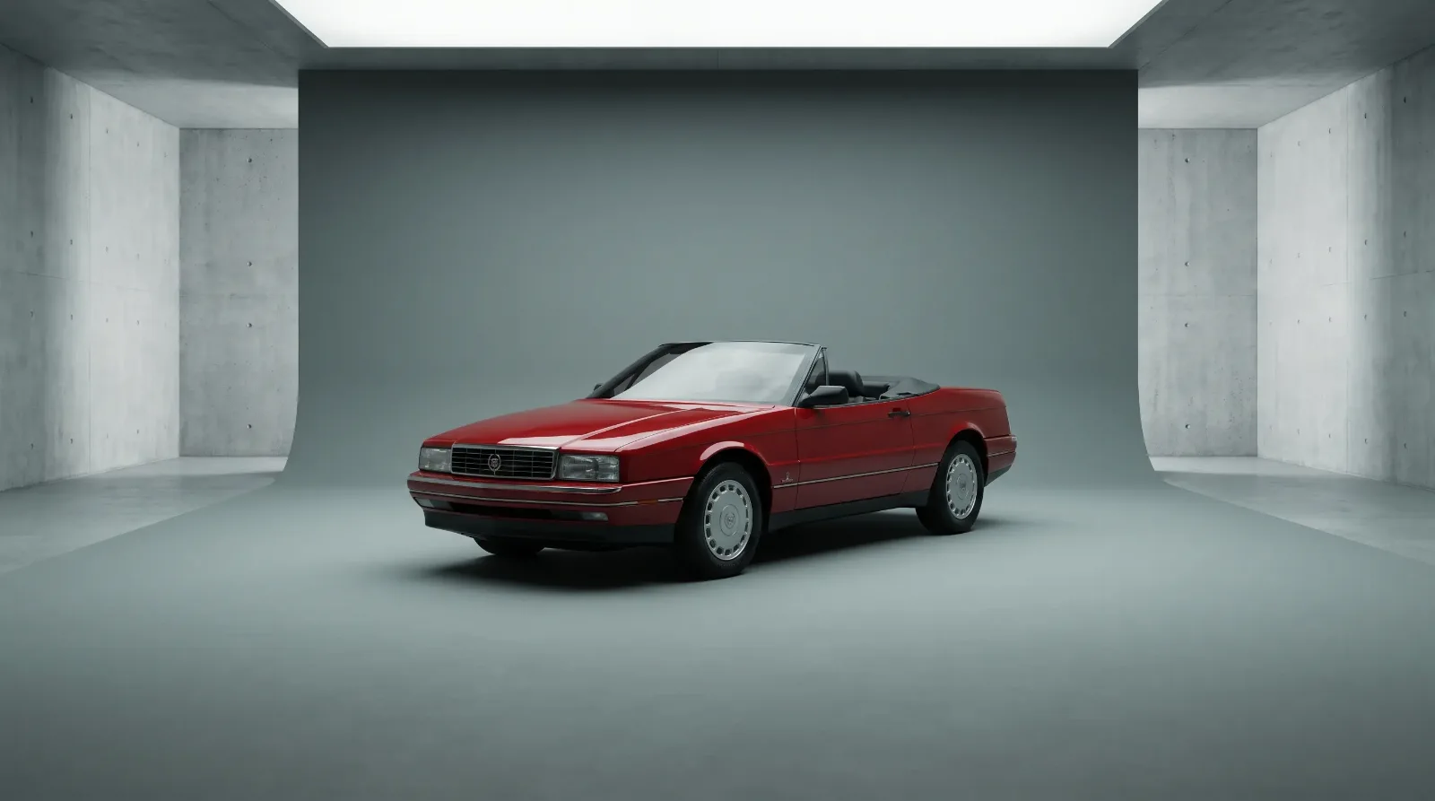
How Pininfarina and Mulliner Shaped American Luxury Car Design
Article
Luxury Car Dashboard Design Through the Decades
Article
The Death of Chrome: How the Malaise Era Changed Luxury Design
Have a
Classic Car
for Sale?
Reach thousands of serious classic car collectors across the US.
Sell It Here →
Are You a Classic Car Dealer?
List your full inventory and connect with targeted classic car buyers.
Join as a Dealer →
#classic cars
#harley earl
#chrome era
#classic car tail fins
#automotive design
#luxury car styling

About the author
Sarah Whitfield
Third-generation classic car collector specializing in pre-war American and European coachbuilt automobiles. Researcher and concours enthusiast.
Comments (1)
G
Gene Przybylski
1 month ago
Exactly the kind of breakdown I was looking for. Bookmarked for when I'm ready to start looking seriously.