
A badge is the smallest expensive thing on a car and often the oldest. Long before a marque settled its grille or its silhouette, it chose a mark, a crest or a star or a set of initials, and that mark usually outlived every body style the company ever built. The emblem on the nose of a classic luxury car is not decoration. It is a claim of lineage, sometimes borrowed, sometimes invented, and the history behind it is frequently stranger than the polished metal suggests.
Car Features
6 min read
Luxury Car Badges and the History Behind the Emblems
The real history behind classic luxury car badges, from Cadillac's borrowed crest to the Mercedes star, BMW roundel, and Packard hexagon.
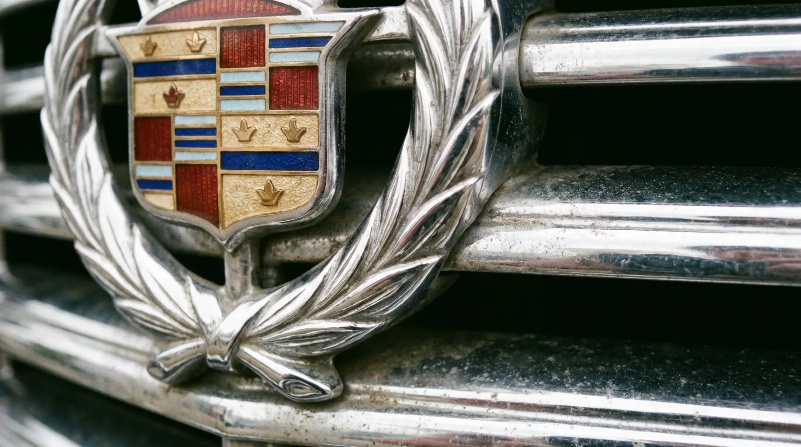
Understanding where these symbols came from changes how you read the cars. A crest that references a French explorer, a star that promised dominance of land, sea, and air, a hexagon tied to a slogan about ownership itself, each one was a deliberate act of positioning. The emblems sit inside the larger vocabulary of status covered in the classic luxury design language story, and they are the most concentrated version of it.
Crests borrowed from heraldry
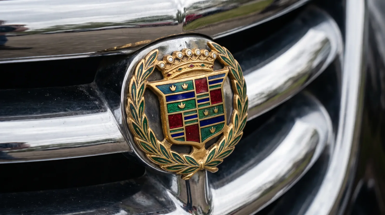
The Cadillac crest is the clearest case of a company buying itself a bloodline. It is based on the coat of arms attributed to Antoine de la Mothe Cadillac, the French officer who founded Detroit in 1701 and whose name the company adopted. The wreath that surrounds the crest was added later, and the crest itself has been redrawn many times across the decades, losing and simplifying its heraldic birds and bands as tastes changed. What never changed was the intent. A young American car company reached across two centuries and an ocean to attach itself to French nobility, and it worked.
Buick did something similar with its tri-shield, three shields drawn from a coat of arms associated with the Buick family name, adopted as the divisional emblem around 1959. Heraldry gave an industrial product an air of inherited legitimacy that no amount of engineering could buy on its own. The shield, the crest, and the wreath all said the same thing in the old visual language of European aristocracy. This is a family. This has history.
Stars, initials, and pure invention
Not every marque reached for a coat of arms. Mercedes-Benz chose a three-pointed star, adopted around 1909 and tied to a Daimler ambition that the company's engines would dominate land, sea, and air. It was a statement of scope rather than ancestry, and its geometric simplicity is exactly why it still reads cleanly at any size on any surface. Rolls-Royce took the opposite route with its interlocked RR monogram, a mark of restraint that trusted the buyer already knew the name.
The BMW roundel is the most misunderstood of all. The blue and white quartered circle takes its colors from the flag of Bavaria, the company's home state, and the familiar story that it depicts a spinning aircraft propeller came later, from a 1920s advertisement, rather than from the badge's actual origin. Packard, for its part, built an entire identity around a red hexagon and a bird mascot, paired with one of the most confident slogans the industry ever produced, a line that dared you to ask an existing owner what he thought.
Other marques split the difference between borrowed heraldry and pure invention. Lincoln settled on a four-pointed star inside a circle, a clean modern mark with no aristocratic pretense at all, trusting geometry and the Lincoln name to do the work. Bentley chose a winged B, wrapping the founder's initial in wings that nodded to speed and to the aero engines W. O. Bentley had built during the First World War. Alfa Romeo went the opposite way and loaded its badge with civic history, combining a red cross from the arms of Milan with a crowned serpent from the Visconti dynasty that once ruled the city. Each solution was a different answer to the same question every luxury maker faced, how to say prestige in a mark small enough to fit on a nose.
How to read a badge on a car you are inspecting
For a buyer, badges are also evidence. The correct emblem, in the correct finish, mounted in the factory location, is part of a car's originality, and reproduction badges are common because they are among the easiest parts to counterfeit. A crest that is too crisp, enamel that is too even, or a mounting that does not match period photographs is a small warning that the car has been apart. On the most valuable coachbuilt cars, the coachbuilder's own small plaque matters as much as the marque badge, because it authenticates who actually built the body.
| Marque | Emblem | Origin |
|---|---|---|
| Cadillac | Crest and wreath | Arms of Antoine de la Mothe Cadillac |
| Mercedes-Benz | Three-pointed star | Land, sea, and air ambition (c. 1909) |
| BMW | Blue and white roundel | Colors of the Bavarian flag |
| Buick | Tri-shield | Buick family coat of arms (c. 1959) |
| Packard | Red hexagon and mascot | Company house style and slogan |
Why the emblem outlived everything else
Body styles came and went. Grilles widened and narrowed. Whole model lines were killed and revived. The badge, in most cases, simply endured, refined but recognizable, because it was the one asset a company could not afford to abandon. Change the emblem and you sever the line back to every car that wore it before. That is why marques treat these marks almost as constitutional documents, updating the drawing but never the idea.
"I tell people to spend a minute on the badge before they spend an hour on the car. It is the most concentrated piece of a marque's history, and it is also the part most often replaced or faked. A correct, period emblem in its proper place tells you the maker cared and the car has been respected. A shiny reproduction crest tells you to start asking harder questions."
Sarah Whitfield
The emblem is where a luxury car states, in the fewest possible square inches, who it claims to be. Some borrowed nobility from heraldry, some invented ambition from geometry, and a few simply trusted their own name to carry the weight. Read the badge and you have read the marque's opening argument. From the mark on the nose, the debate moves to the shape of the roof above it, and to one of the oldest arguments in luxury styling, which is next: Formal Roofline vs. Fastback.
Related Reading
Have a
Classic Car
for Sale?
Reach thousands of serious classic car collectors across the US.
Sell It Here →
Are You a Classic Car Dealer?
List your full inventory and connect with targeted classic car buyers.
Join as a Dealer →

About the author
Sarah Whitfield
Third-generation classic car collector specializing in pre-war American and European coachbuilt automobiles. Researcher and concours enthusiast.


Comments
Be the first to comment on this article.