
Color is the first thing anyone reads on a car, and for a long stretch of the twentieth century the luxury makers understood that better than anyone. The right color, and increasingly the right pair of colors, said as much about a car as its chrome or its engine. The two-tone era in particular, roughly the mid-1950s into the early 1960s, produced some of the most confident color combinations the American industry ever offered, and it did not happen by accident.
Car Features
6 min read
Luxury Car Color Palettes and the Two-Tone Paint Era
The two-tone paint era gave classic luxury cars their most confident color schemes. How the palettes worked, where the color split, and how to read original paint.
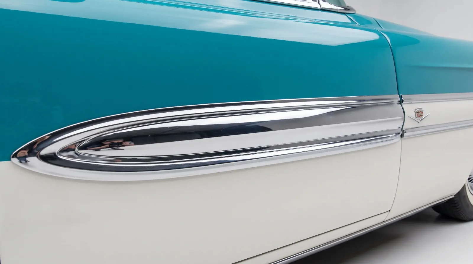
Behind it sat a genuine shift in how manufacturers thought about paint. Color went from an afterthought to a marketing department in its own right, complete with named shades, seasonal palettes, and stylists whose whole job was deciding what looked expensive. To see where this fits among the era's other signatures, it helps to read the classic luxury design language story alongside it.
When color became a selling point
For the first quarter of the century most cars were dark, and many were black, largely because early paints were slow to dry and dark colors were durable and cheap. That changed in the mid-1920s when faster-drying nitrocellulose lacquer, marketed by DuPont as Duco, made a real range of colors practical on a production line. Once a factory could offer color without slowing the line, color became something to sell.
General Motors moved fastest. Its Art and Colour Section, set up in 1927, put color on equal footing with shape. By the 1930s a luxury buyer expected choice, and the makers responded with named shades that sounded like anything but paint. Cars wore colors called things like Regal Maroon or Cotswold Gray, names chosen to make a can of pigment sound like a fashion statement.
How the two-tone scheme worked
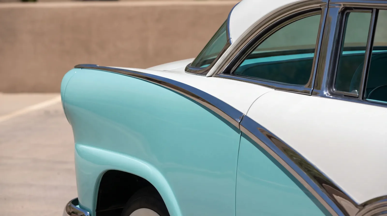
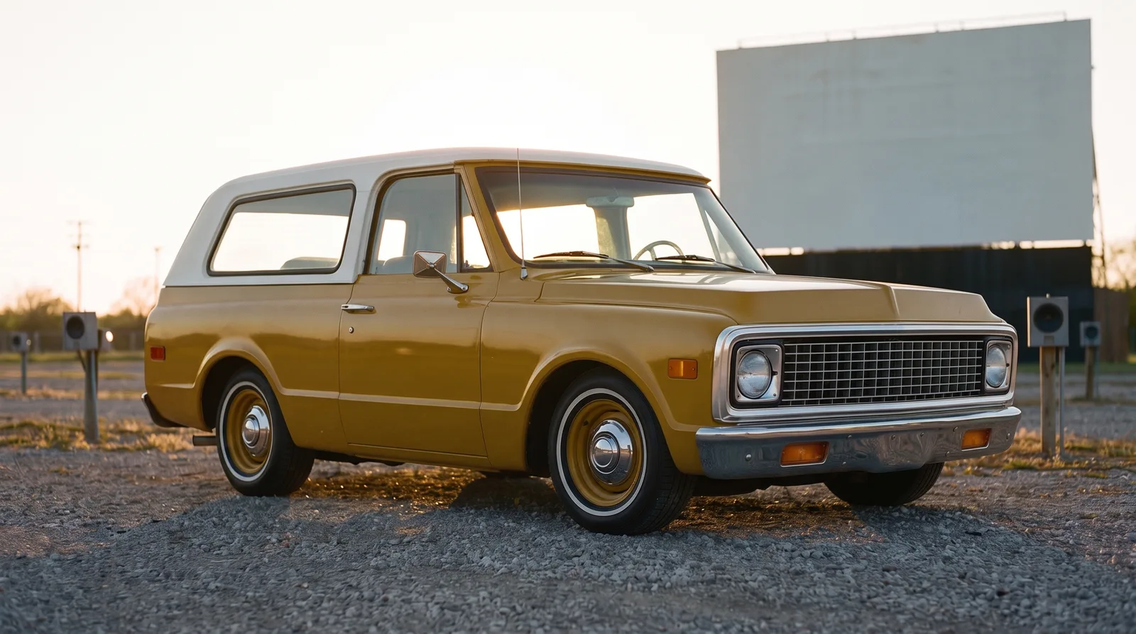
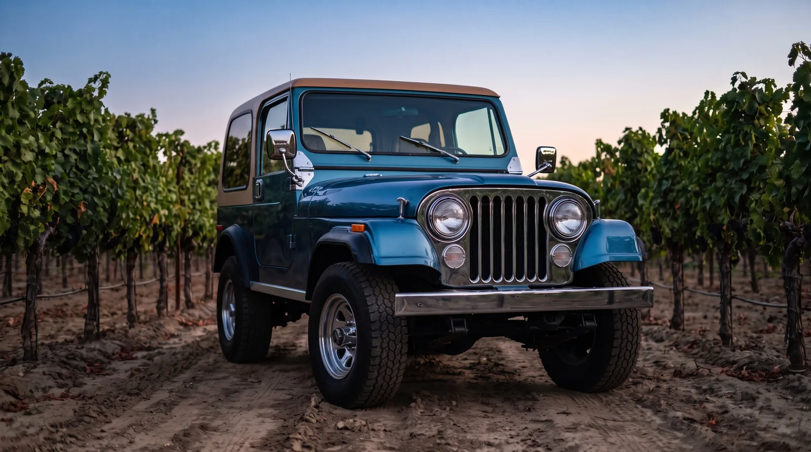
The two-tone treatment split the body into two colors, and where the split fell was a design decision that changed the whole feel of the car. A common approach put a lighter roof over a darker body, which visually lowered the car and lightened the greenhouse. Another ran a contrasting color along a side panel bounded by chrome trim, breaking up the length of a big sedan and pointing the eye front to back.
The chrome spear mattered here. A two-tone scheme almost always used a bright molding as the dividing line, because a hard color break needs a clean edge and chrome gave it one. That is why the two-tone era and the heavy-chrome era arrived together. The trim was not just decoration, it was the boundary that made the color split look deliberate rather than sloppy.
"A good two-tone scheme is really an exercise in proportion. Where you place the color break decides whether a long sedan looks graceful or heavy, and the best stylists of the 1950s understood they were drawing with paint, not just filling panels."
Sarah Whitfield
The palettes that defined the fifties
The mid-1950s palette was pastel and confident. Soft turquoise, coral pink, pale yellow, and mint green appeared on luxury and near-luxury cars in a way that would look startling on a car today. These were optimistic colors for an optimistic market, and the two-tone pairings amplified them: a pink body with a charcoal roof, a turquoise lower with a white upper. The combinations were bold because the era rewarded standing out.
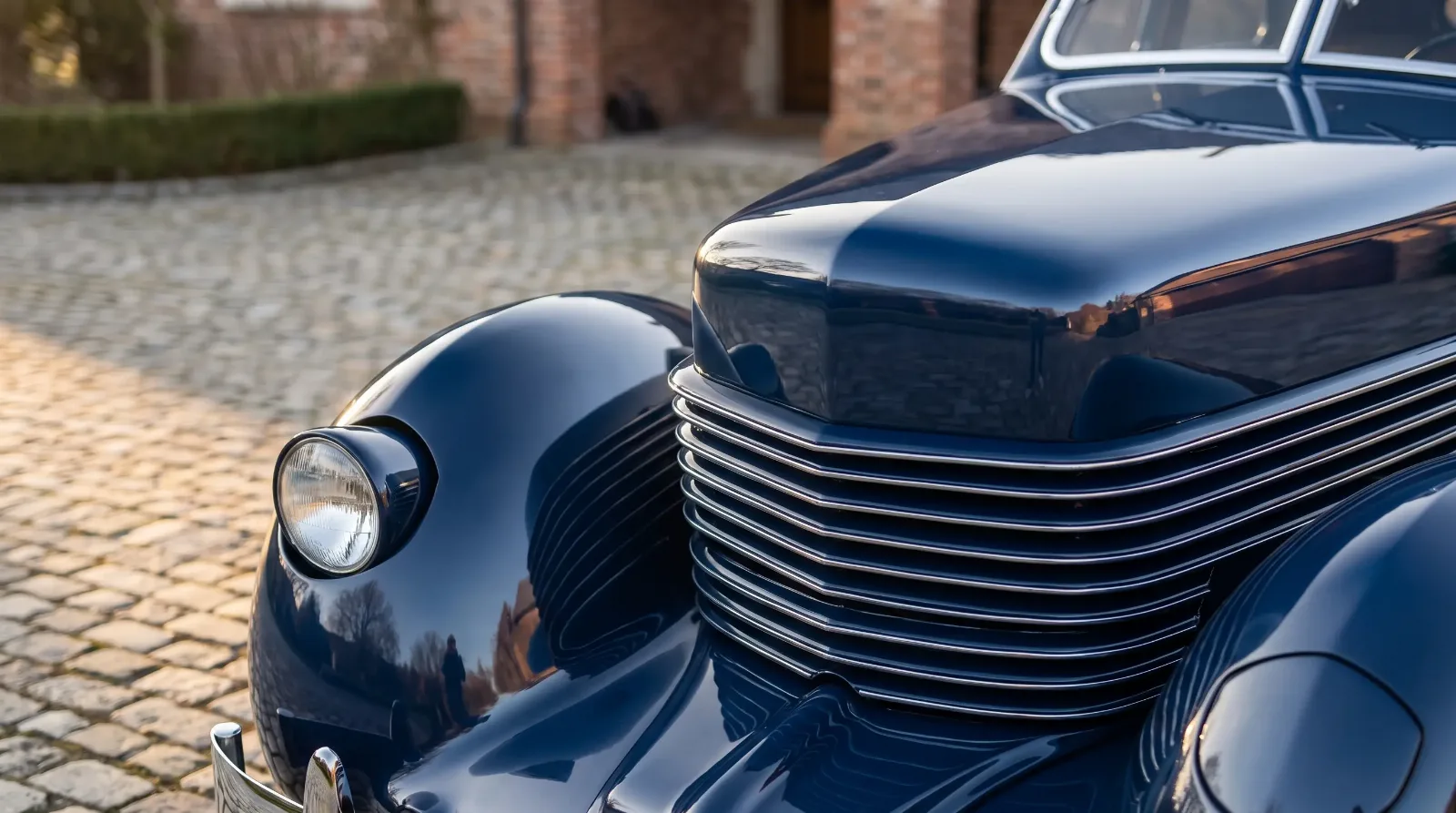
Even the darker luxury palette had range. Deep metallics, introduced as metallic flake became reliable in paint, gave sedans a richer surface under direct light. The metallics photographed as one color and shifted in person, which is exactly the kind of detail a stylist chose on purpose. By the early 1960s taste began to cool toward cleaner single colors and restrained metallics, and the wilder two-tone pairings faded.
The naming itself was part of the sell. A stylist did not put yellow on the order sheet, they put Coronado Yellow or Sun Gold, and the customer felt they were choosing something considered rather than picking from a can. Some makers rotated their color names year to year so a shade felt current, and a few tied colors to specific models so a particular hue read as belonging to the top of the range. This is why matching a car to its exact factory color name, not just its general shade, is part of getting a restoration right.
Reading original paint on a classic
For a collector, factory color is a real part of a car's identity, and it is documented. Most classic-era cars carried a paint or trim code on a data plate that records the exact factory color and, on a two-tone car, the specific combination. A car repainted in a non-original color, or a two-tone changed to a single tone, has lost something a knowledgeable buyer will notice and price accordingly.
Original lacquer also ages in ways modern paint does not. It checks, it thins on the high edges, and it takes on a particular depth that a fresh repaint rarely matches. None of that means a repaint is wrong, but an honest original finish, correct to the code on the plate, is worth confirming before you assume a car is what it appears to be.
| Scheme | Where the color splits | Visual effect |
|---|---|---|
| Contrasting roof | Roof one color, body another | Lowers the car, lightens the greenhouse |
| Side-panel two-tone | Contrast panel bounded by chrome | Breaks up length, adds motion |
| Sweep or spear | Color follows a chrome molding | Emphasizes a long, flowing line |
| Single metallic | One color, flake finish | Shifts with light, reads as rich |
Why the two-tone look still reads as luxury
The two-tone car is one of the most evocative shorthand images of postwar American prosperity, and that association still holds at shows and auctions. A correctly finished two-tone luxury car from the peak years draws a crowd because the color does the talking before anyone reads the badge. It is confident in a way modern paint options rarely are.
The color story sits alongside the era's other quiet luxury signals, and one of the most subtle was how a car hid its lights. Read on for next: Hidden Headlamps.
Related Reading
Have a
Classic Car
for Sale?
Reach thousands of serious classic car collectors across the US.
Sell It Here →
Are You a Classic Car Dealer?
List your full inventory and connect with targeted classic car buyers.
Join as a Dealer →

About the author
Sarah Whitfield
Third-generation classic car collector specializing in pre-war American and European coachbuilt automobiles. Researcher and concours enthusiast.
Comments
Be the first to comment on this article.