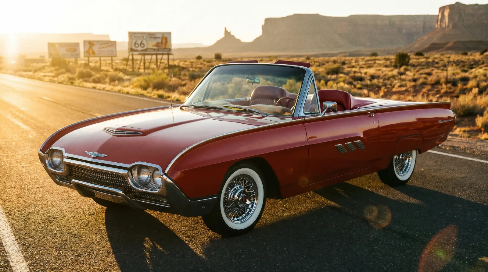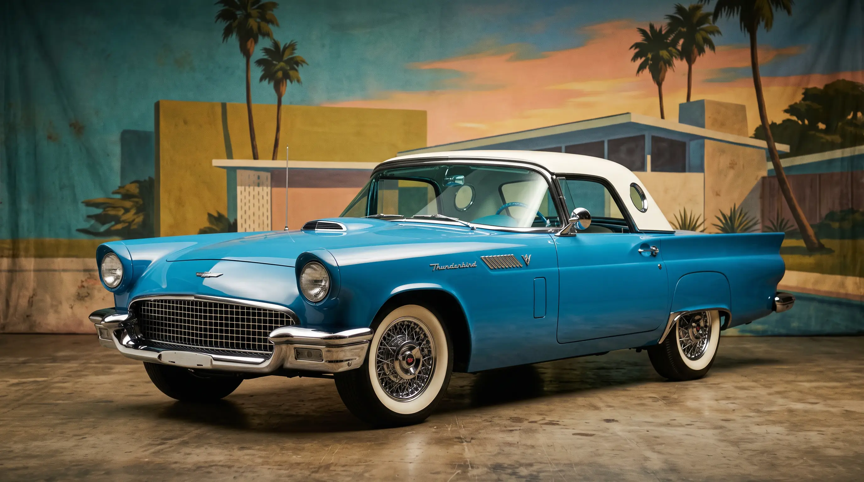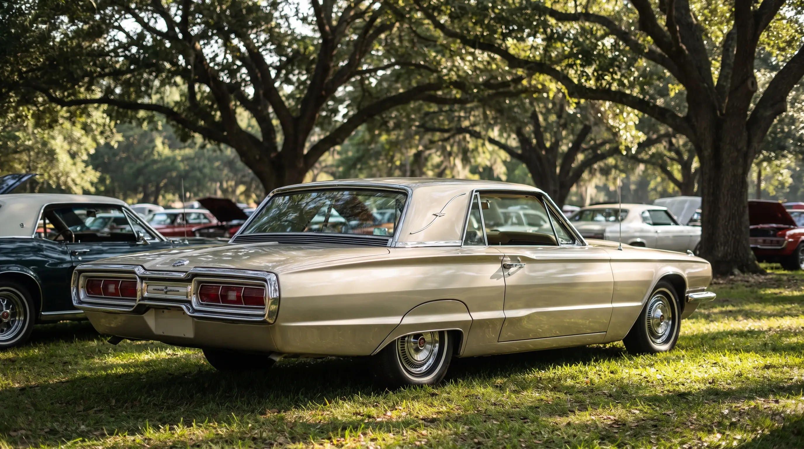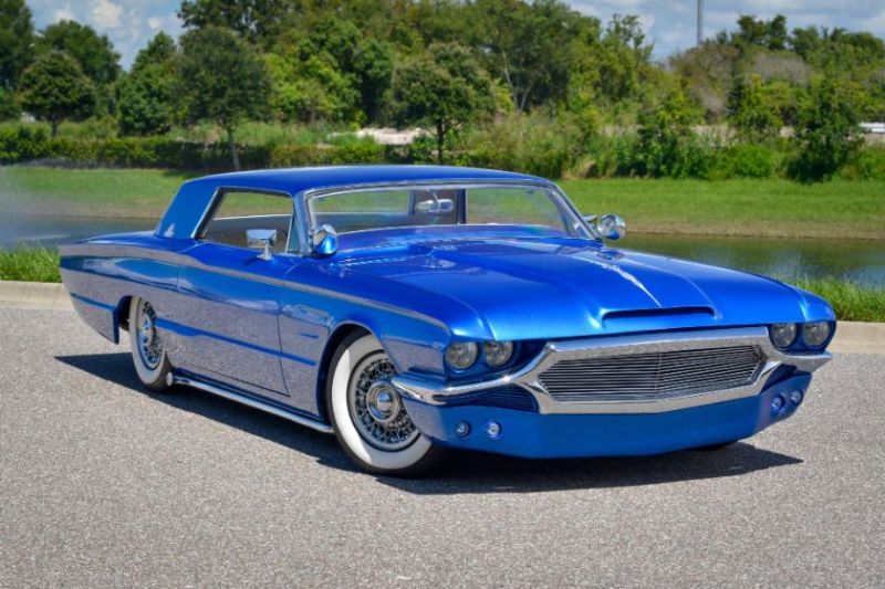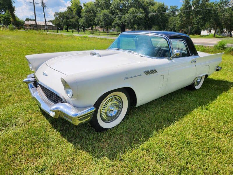

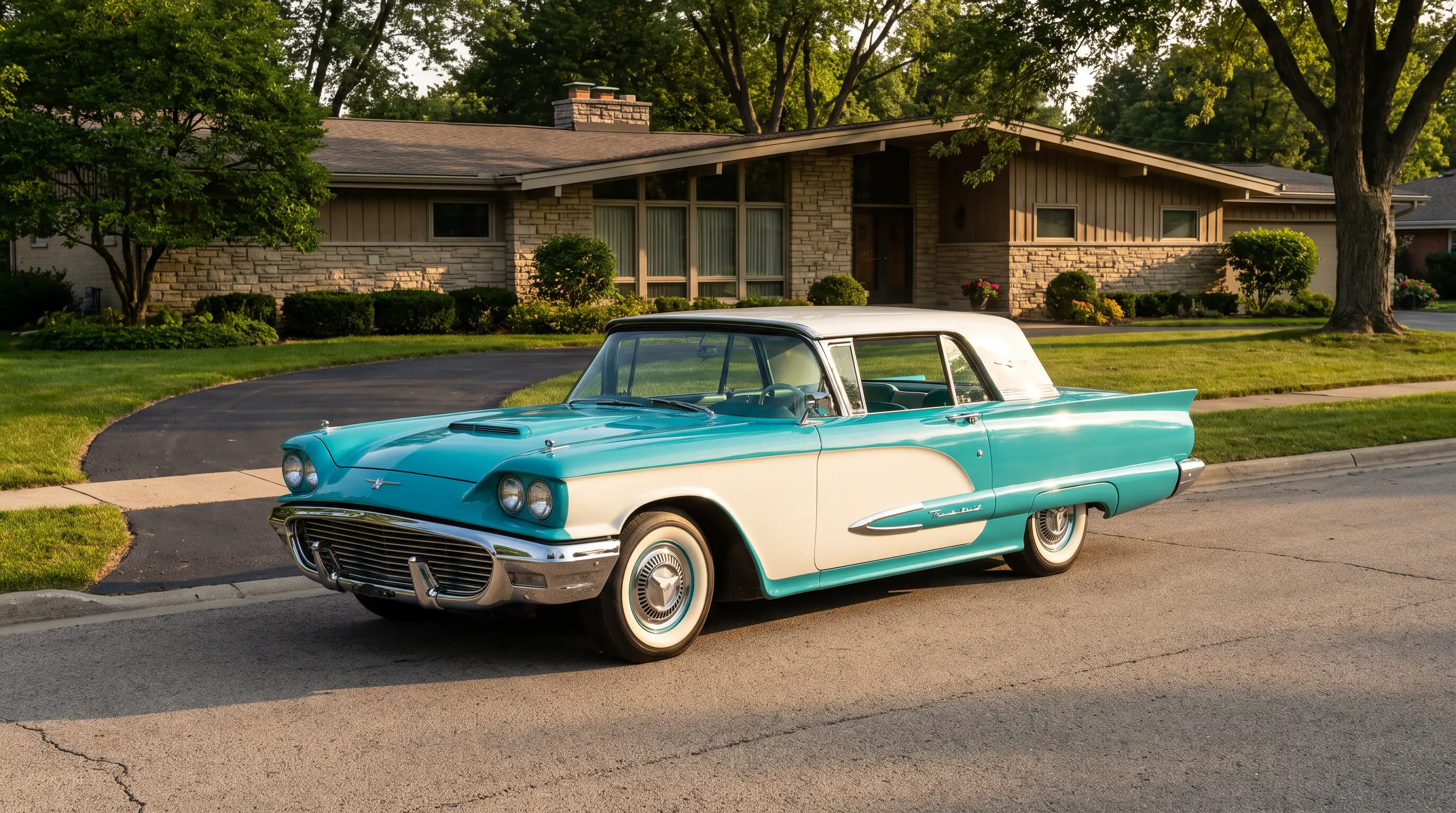
There is a photograph, the kind that turns up in family shoeboxes across the country, of a woman standing beside a Thunderbird in a driveway sometime around 1958, one hand resting on a fender that is white above the beltline and a deep coral below it. Nobody remembers her name in the version I saw, tucked into an estate sale box of loose snapshots, but everybody who looks at that picture remembers the paint. Thunderbird two tone paint did that. It turned an ordinary Tuesday driveway into something worth photographing, and it did it on tens of thousands of cars across more than a decade of production.
A color scheme built for the driveway, not the freeway
Two-tone paint was not a Thunderbird invention. Detroit had been playing with split color schemes since the early fifties, and by the time the Squarebird arrived in 1958, plenty of manufacturers offered some version of a contrast roof or a contrast lower panel. What set the Thunderbird's approach apart was how deliberately the factory treated color as part of the car's personality rather than an afterthought bolted onto a base model. The two-seat cars from 1955 through 1957 kept things relatively simple, mostly single colors with the occasional contrast insert, but once the Squarebird introduced a formal roofline and a longer flank of sheet metal to work with, Ford's color planners had real canvas to work with, and they used it.
A roof in one shade, a body in another, sometimes a third color worked into the interior upholstery to tie the whole composition together. It read less like an options list and more like something a person had chosen the way they might choose a dress for an evening out, which is exactly the sensibility Ford's marketing wanted buyers to feel.
Dealers understood this too, and showroom floors during the Squarebird years were arranged to show off the color range rather than hide it behind a single demonstrator model. A buyer walking in on a Saturday afternoon might see four or five different two-tone combinations parked side by side, each catching the light differently, and that visual variety did real work in a showroom where the mechanical differences between trim levels were often modest. Color became the easiest, most immediate way to differentiate one Thunderbird from the next, long before options packages grew complicated enough to need a printed sheet to explain them.
Style as a kind of language
Color in this period was doing more work than most people give it credit for now. A pastel two-tone Thunderbird parked outside a suburban home in 1959 said something specific about who lived there, their income, their taste, their willingness to be noticed, in a way that is easy to lose sight of decades later when most surviving examples have been repainted, restored, or reimagined by owners with their own preferences. The original color combinations were not random. Ford's stylists studied what buyers responded to and adjusted offerings accordingly year to year, dropping combinations that did not sell and pushing the ones that did into heavier advertising rotation.
By the Bullet Bird years of the early sixties, two-tone treatments had become more restrained, often limited to a contrast roof against a single body color rather than the more elaborate combinations of the late fifties. Tastes were shifting toward cleaner lines across the industry, and the Thunderbird moved with them, though it never entirely abandoned the idea that color could carry emotional weight on a personal luxury car.
Interior colors followed a similar arc of restraint through the sixties, with upholstery choices settling into a narrower band of coordinated tones rather than the boldly contrasting combinations available on earlier models. It is a subtle shift, easy to miss unless you are looking at brochures from consecutive years side by side, but it tracks a broader move in American taste away from the exuberant palette of the late fifties toward something calmer and more tailored as the decade wore on.
"People forget how much a paint scheme could say about a household in 1959. That two-tone Thunderbird in a driveway was doing the same work a new dress did at a party. It announced something before anyone said a word."
- Nora Beckett
What restorers face today
I think about that driveway photograph often when I hear restorers debate whether a given color pairing is "correct." Correct according to what, exactly? A factory order sheet tells you what left the assembly line, but it does not tell you what that combination meant to the person who chose it, standing in a dealership in 1959 weighing a coral lower panel against a turquoise one, thinking about how it would look parked in front of a particular house on a particular street. That meaning is harder to restore than the paint itself, and most restorers, understandably, do not try.
Anyone chasing an accurate two-tone restoration now runs into a genuinely difficult research problem. Original color codes exist in Ford documentation, but matching a faded, sun-baked panel to its factory-correct partner shade sixty years later requires real detective work, cross-referencing build sheets, paint chip charts, and surviving unrestored examples to be sure a combination is period-correct rather than an owner's later improvisation. Plenty of Thunderbirds on the road today wear two-tone schemes that never left a Ford factory in that configuration, repainted by an owner decades ago who liked the look without checking whether it was ever officially offered. That is not necessarily a criticism. Some of those unofficial combinations are lovely. But it does mean provenance matters more than most casual observers assume when a two-tone Thunderbird claims to be original.
The broader arc of how the Thunderbird moved through American taste across its whole production run, color schemes included, gets fuller treatment in the ford thunderbird history story, and the model's earliest years specifically are covered in the full story of how the car came to exist in the first place.
Why the colors still matter
A two-tone Thunderbird, done right, remains one of the more quietly moving things you can see at a car show. It is not the horsepower or the chrome that stops people, most of the time. It is the paint, the specific pairing of a roof shade against a body color that someone in a design studio decided, sixty-some years ago, belonged together. That decision has outlasted the person in the driveway photograph, outlasted the dealership that sold the car, and in a lot of cases outlasted the original owner entirely. If that kind of detail speaks to you the way it speaks to me, it is worth spending an afternoon looking through classic Thunderbirds on the market to see how many of those old color pairings survive, faithfully or otherwise, on cars still out there today.