
A land yacht communicated before it moved. Long before a passerby could hear the quiet V8 or feel the soft ride, the car had already made its argument through a carefully assembled visual language. Whitewall tires and bright chrome were the two loudest words in that vocabulary, and reading them tells you a great deal about how American luxury signaled status in the postwar decades.
Car Features
6 min read
Whitewalls and Chrome: The Visual Language of Land Yacht Status
How whitewall tires and chrome became the visual language of land yacht status, and how to read them to date and rank a classic luxury car.
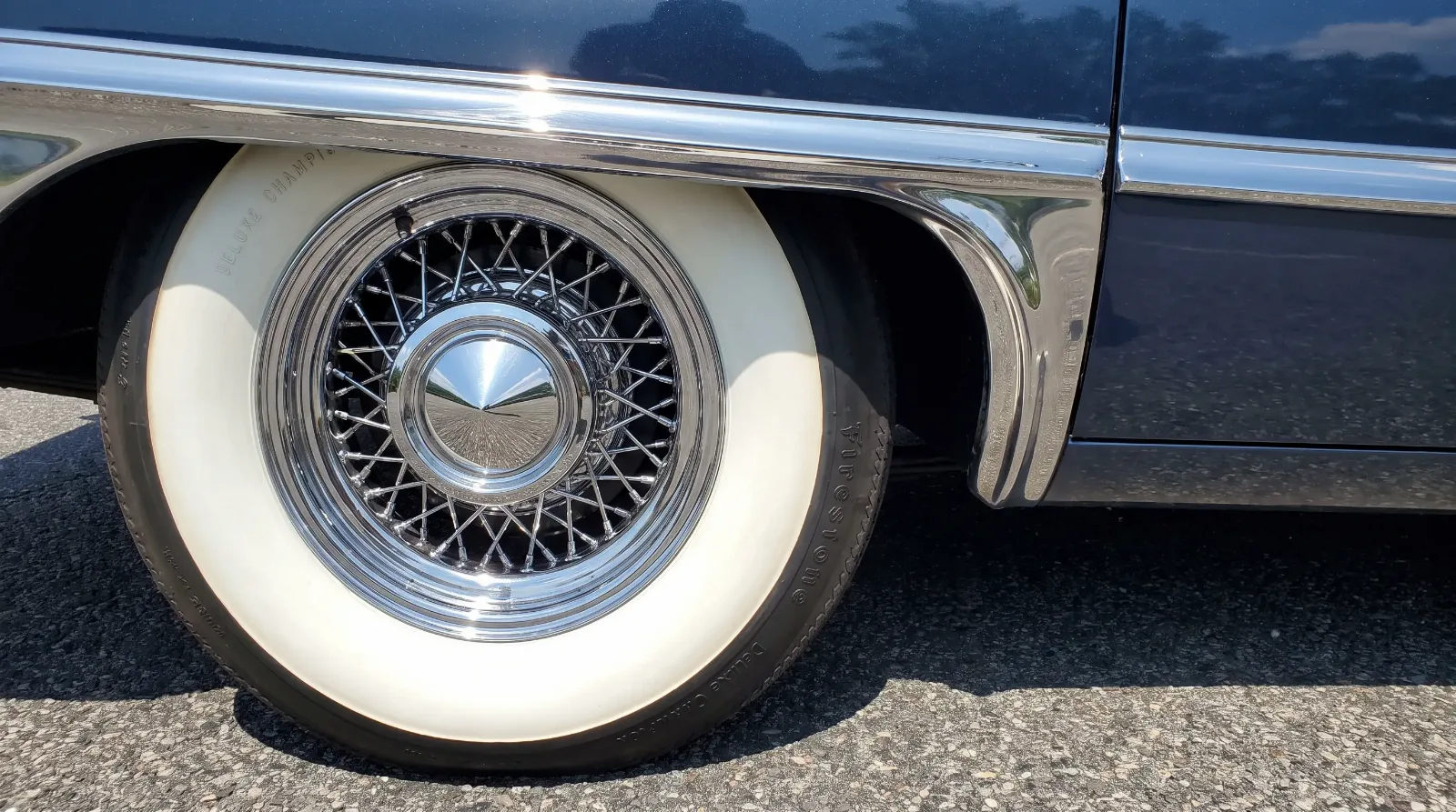
These were not random decorative choices. Each element carried a specific meaning that buyers and onlookers understood without being told. The width of a whitewall, the acreage of brightwork, the presence of a hood ornament, all of it added up to a legible statement about where the owner stood.
The changing whitewall
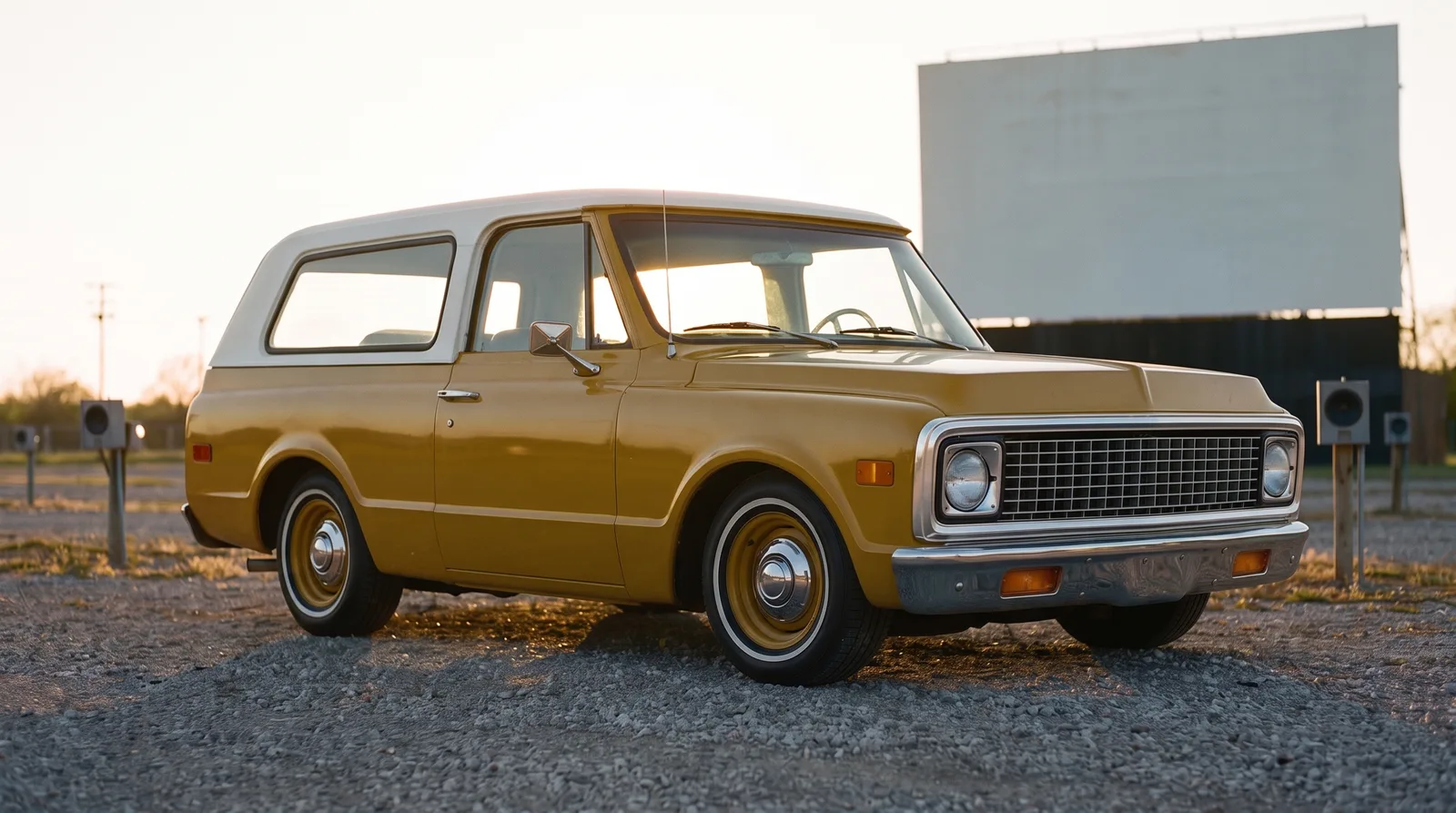
The whitewall tire is one of the clearest dating tools on any American classic, because its width shifted steadily across the decades in a way collectors can read at a glance. In the 1950s, the whitewall was wide, often two and a half to three inches of bright white sidewall, a bold band that read clearly from across a parking lot. It was the era of maximum contrast and maximum display.
By the early 1960s the fashion had turned. The wide whitewall came to look dated, and manufacturers moved toward a narrower band, often around one inch, that read as more restrained and modern. Through the 1970s the trend continued toward the thin pinstripe whitewall, sometimes just a fine white line, which suited the more formal styling of the land yacht era. A car wearing wide whitewalls in 1975 looked as out of step as one wearing pinstripes in 1955.
Chrome as a class marker
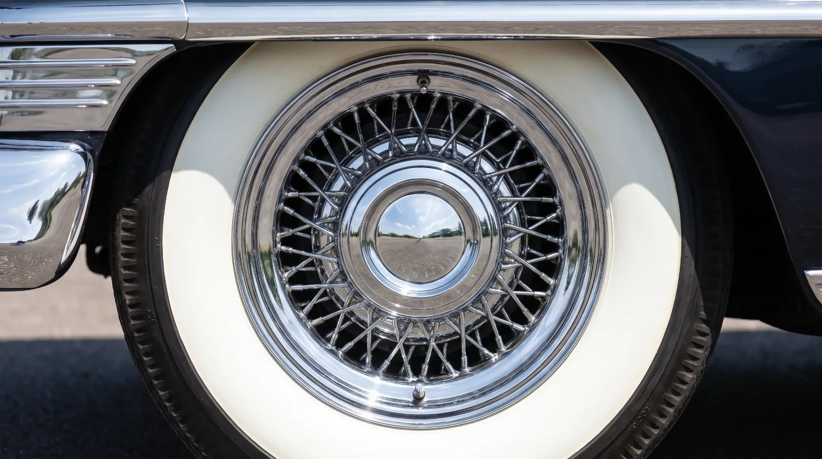
If whitewalls dated the car, chrome ranked it. The amount and quality of brightwork on an American car mapped closely to its price and prestige. Entry-level models wore modest trim. Move up the range and the chrome multiplied, across the grille, the bumpers, the window surrounds, the rocker panels, and the wheel covers. A fully optioned Cadillac or Lincoln glittered with far more brightwork than a base sedan on a related platform.
The wire wheel cover deserves special mention, because it did precisely the same imitative work as the vinyl roof. A stamped or spun cover mimicked the look of a genuine wire wheel, an expensive item associated with prewar coachbuilt cars and European sports cars, at a fraction of the cost. It was luxury by reference, and it fit the land yacht philosophy perfectly. The whole approach to size and display that produced this brightwork is covered in the land yacht era.
Hood ornaments worked the same way. Cadillac's wreath and crest, Lincoln's four-pointed star, and the stand-up mascots that topped the more formal cars were small pieces of jewelry that identified the marque from a distance and echoed the radiator mascots of the coachbuilt era. On the most expensive cars these details were finely finished, sometimes with cloisonné color in the crest, and their quality tracked the price of the car as reliably as the brightwork around them.
"Chrome on these cars functioned exactly the way silver service functioned in a dining room. It was a display of surface, of light, of the ability to maintain something that took effort to keep bright. A neglected chrome bumper pits and dulls quickly, so gleaming brightwork was itself a small proof that the owner had the means to care for the car."
Sarah Whitfield
The federal bumper era
Chrome's story took a sharp turn in the early 1970s. Federal bumper standards phased in for 1973 and 1974 required bumpers to withstand low-speed impacts without damage, and the result was a generation of massive, protruding chrome bumpers, often with black rubber impact strips and prominent guards. On some cars these battering-ram bumpers looked awkward, but on a large formal luxury car they read as substantial and even imposing, in keeping with the car's overall bulk.
For anyone learning to date these cars, the bumper is a reliable clue. A slim, elegant chrome bumper generally means pre-1973. A heavy, deep bumper with rubber inserts and a noticeable gap from the body generally means 1973 or later. The transition happened quickly and left a clear line down the middle of the decade.
Reading the visual language
Why the language mattered
Taken together, whitewalls and chrome made the land yacht instantly readable to anyone who saw it. This was the point. These cars were bought in large part to be seen, and their styling gave observers a clear, immediate sense of the owner's standing. The visual code was so well understood that it required no explanation, which is exactly what made it effective.
The code also had a practical dimension that is easy to overlook. Bright trim and white sidewalls demanded maintenance. Chrome pitted if it was not cleaned and waxed, whitewalls yellowed and scuffed against curbs, and both showed neglect quickly and unmistakably. A car kept gleaming was proof of an owner with the time, the help, or the money to keep it that way. The display was never only about the initial purchase. It was an ongoing statement, renewed every time the car was cleaned, and that upkeep was part of what the styling communicated.
The same impulse to signal comfort and status carried straight into how these cars were sold and how their interiors were described. Detroit's marketing turned roominess itself into a selling point, which is a natural place to continue, so go next: “Six-Passenger Comfort”.
Related Reading
Have a
Classic Car
for Sale?
Reach thousands of serious classic car collectors across the US.
Sell It Here →
Are You a Classic Car Dealer?
List your full inventory and connect with targeted classic car buyers.
Join as a Dealer →

About the author
Sarah Whitfield
Third-generation classic car collector specializing in pre-war American and European coachbuilt automobiles. Researcher and concours enthusiast.

Comments
Be the first to comment on this article.