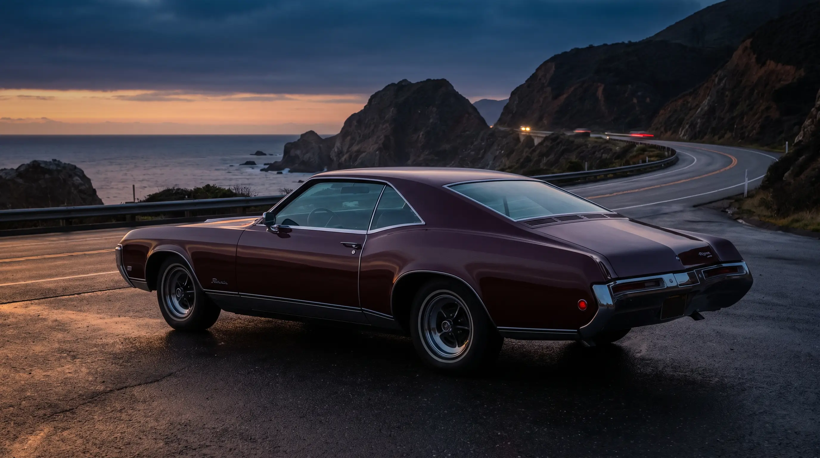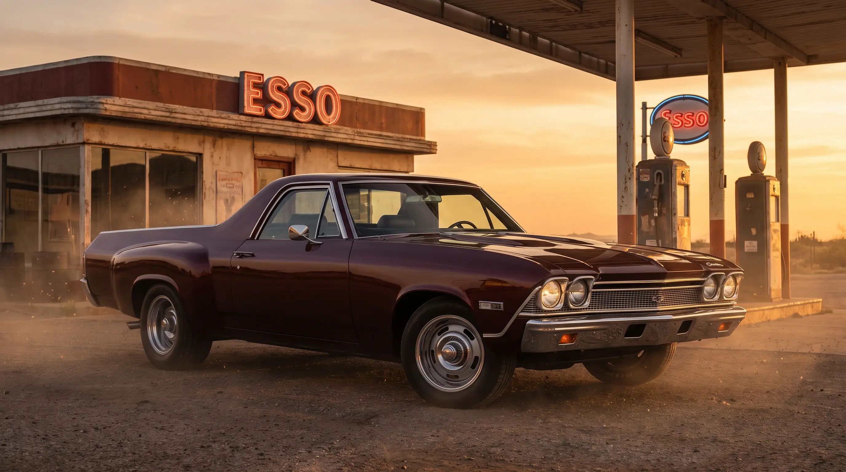

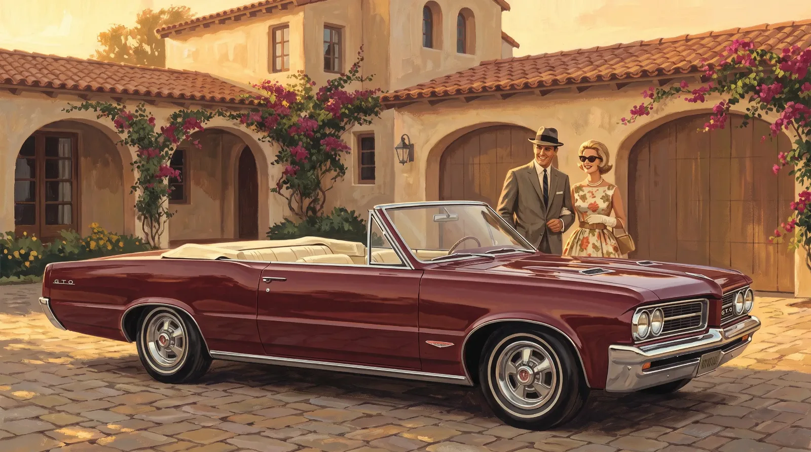
Before most Americans ever stood next to a real GTO, they met it on glossy paper: a car painted in impossible light, parked outside a villa that did not exist, next to people who looked like they had never worried about a car payment in their lives. The car in those illustrations was longer than the real one, lower than the real one, and somehow more itself than the actual steel object rolling off the line in Pontiac, Michigan. That illusion had a name. Art Fitzpatrick painted it.
A painter selling a promise
Fitzpatrick worked with a collaborator, Van Kaufman, who typically handled the backgrounds and settings while Fitzpatrick focused on the cars themselves, rendered with an exaggeration that became instantly recognizable across Pontiac's advertising in the 1960s. Their cars sat lower to the ground than any real Pontiac ever could, stretched slightly in length, painted with a glow that no factory finish actually produced. Purists sometimes call this dishonest. It was not meant to be honest in a literal sense. It was meant to sell a feeling, and in that job it succeeded almost too well.
The GTO gave Fitzpatrick a subject that matched his instincts. Here was a car built on a small budget, dressed up with big ambitions, exactly the kind of gap between reality and aspiration his illustrations were built to close. The brochures did not lie about what the car could do at a stoplight. They lied, gently, about what owning one might feel like, and that gap between the two is where a lot of automotive advertising quietly lives.
Fitzpatrick had not spent his career on cars alone before Pontiac found him. He came up through commercial illustration more broadly, the kind of work where a painter learns to sell a mood in a single frame because there is no second page to explain it. That background shows in the GTO pieces. Nothing in a Fitzpatrick illustration needs a caption to work. The angle of the car, the tilt of a woman's head toward the passenger window, the exact shade of afternoon light on a stucco wall, all of it is doing the same job a well-placed sentence does in a short story: setting a scene the reader steps into without being told to.
Van Kaufman's contribution mattered just as much, even if his name gets mentioned second more often than not. The settings Kaufman painted, coastal roads, quiet plazas, driveways in front of houses that looked like nobody actually lived in them, gave Fitzpatrick's cars somewhere believable to exist. A stretched, glowing GTO parked against a flat, generic background would have read as a cartoon. Set against Kaufman's carefully lit, specific-feeling locations, the same exaggerated car reads as aspirational rather than false.
Selling a car before it had a reputation
The tricky part of the GTO launch, from a marketing standpoint, was that the car had no history to lean on. It was not a redesign of something beloved. It did not carry a racing pedigree the way some European names did. Fitzpatrick's illustrations gave the car a visual identity before it had earned one on the street or at the strip. People saw the painted version first, then went looking for the real thing, and the real thing had to live up to an image that was, quite literally, painted a little larger than life.
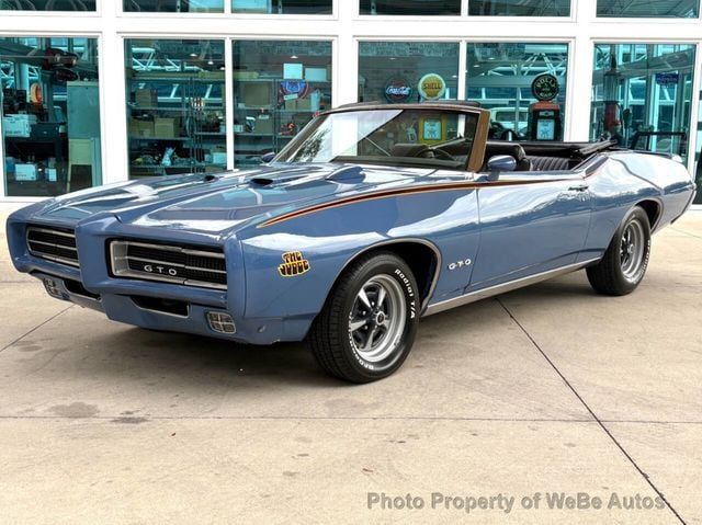
That kind of advance mythology only works if the product underneath can eventually hold its own weight. Read the birth of the GTO for the fuller account of how the actual car, built on borrowed Tempest bones with an engine pulled from Pontiac's full-size line, managed to close that gap once buyers got behind the wheel.
What the illustrations still tell us
Look at an original GTO brochure today and you are looking at more than period advertising. You are looking at how Pontiac wanted a certain kind of American buyer to see themselves: a little younger than they actually were, a little more adventurous, standing somewhere sunlit and unhurried next to a car that promised speed without demanding an explanation for why they needed it. The illustrations sold a version of freedom that had very little to do with horsepower figures and a great deal to do with who the buyer imagined becoming.
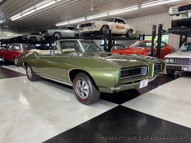
There is a quiet honesty buried inside that exaggeration, even now. The GTO really did let an ordinary income buy an extraordinary feeling, even if the car in the driveway sat a little higher and a little shorter than the one in the magazine.
What strikes me most, looking at these images now, is how little urgency they actually convey. Nobody in a Fitzpatrick painting looks like they are late for anything. The cars sit at rest as often as they move, and the people around them look settled rather than restless. That was a choice, and it was the opposite of what the actual GTO delivered on a Saturday night at a stoplight. The advertising sold calm confidence. The car itself sold noise and motion. Both things were true about owning one, just at different hours of the day.
A note on collecting the art
Original Fitzpatrick and Kaufman brochures and dealer showroom pieces have become collectible in their own right, sought after separately from the cars they advertised. Condition matters enormously here, as it does with the cars: sun-faded paper and dog-eared corners drop value quickly, while a crisp, complete brochure from a reputable estate or dealer archive holds real interest among collectors who never plan to own the actual automobile.
A few of Fitzpatrick's original gouache paintings, the source art behind the printed brochures, have surfaced at auction and among private collectors over the years, and they draw a very different kind of buyer than the printed ephemera does. Someone chasing a GTO brochure wants a piece of the period, something they can hold in their hands the way a 1964 buyer once did. Someone chasing an original painting wants the artwork itself, independent of the car it happened to advertise. Both are collecting the same image. They are collecting it for almost opposite reasons.
A partnership that outlasted the GTO
Fitzpatrick and Kaufman's work for Pontiac did not begin or end with the GTO. Their partnership stretched across much of the 1960s and into the following decade, covering the division's full lineup, from family sedans to the GTO's later, more aggressive successors. What made the GTO material distinct within that larger body of work was the tone. Where a Bonneville ad might lean toward comfort and status, the GTO illustrations leaned into motion and youth, cars caught mid-corner or parked in a way that suggested they had just arrived somewhere interesting, or were about to leave.
Looking back at the full run of their Pontiac work, the GTO pieces stand out as the moment the pair's stylized approach found its most natural subject. A slow, comfortable car painted with that same glowing exaggeration would have looked strange, almost dishonest in a different way. Applied to a car built specifically to be fast and a little brash, the technique finally matched the product, and that alignment between artistic style and actual car is part of why those particular pieces are remembered so fondly decades later.
"I think about the woman in one of those brochures, standing beside a car that doesn't quite exist as painted, and I understand exactly what Pontiac was selling. It wasn't a car. It was a version of a life someone hadn't lived yet."
— Nora Beckett
The gap between what the brochures promised and what the factory actually built is easier to measure once you know the real numbers. read on for how many of these cars Pontiac actually expected to sell, and how badly that early guess undersold what buyers did once they saw one in person.