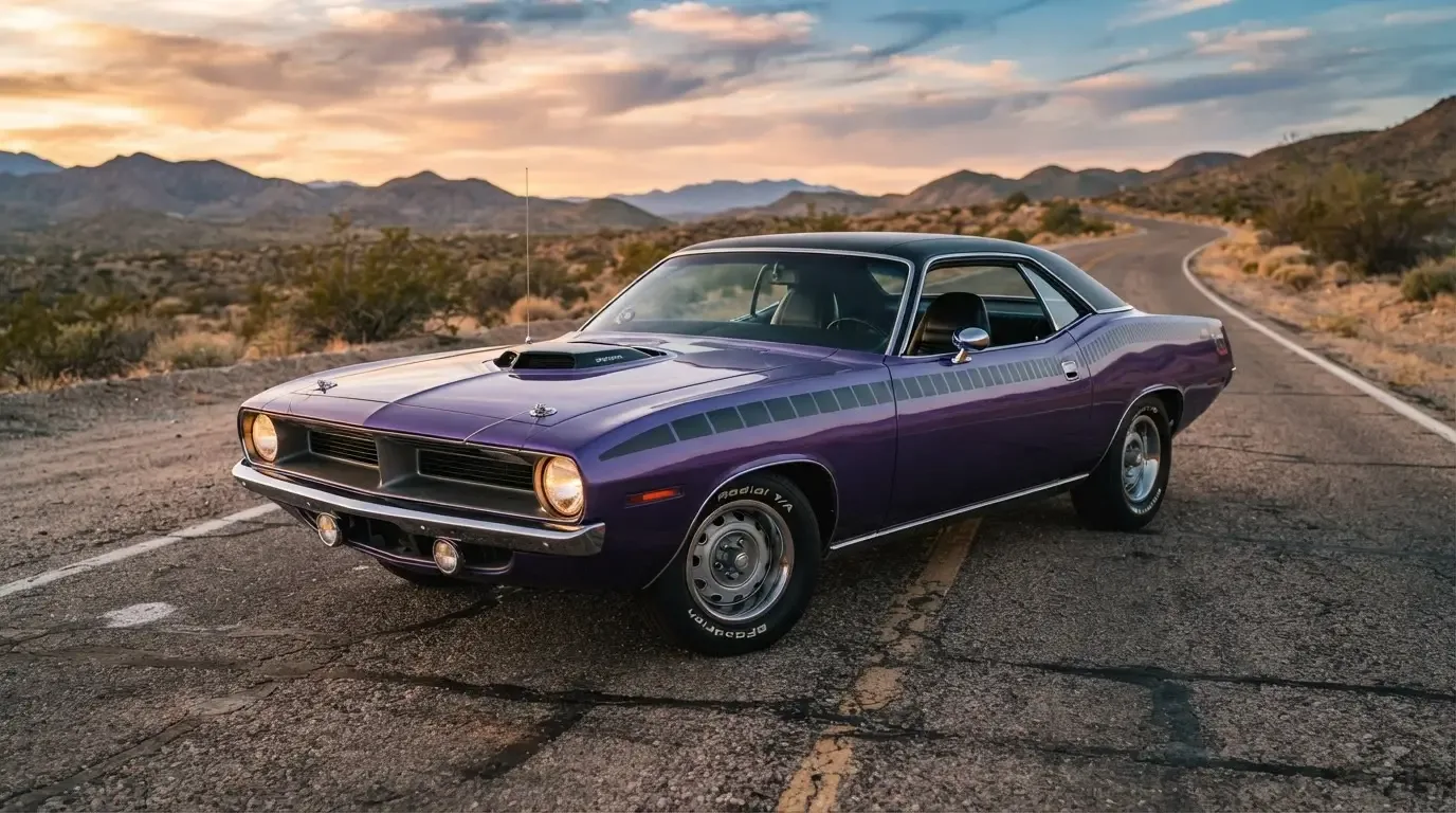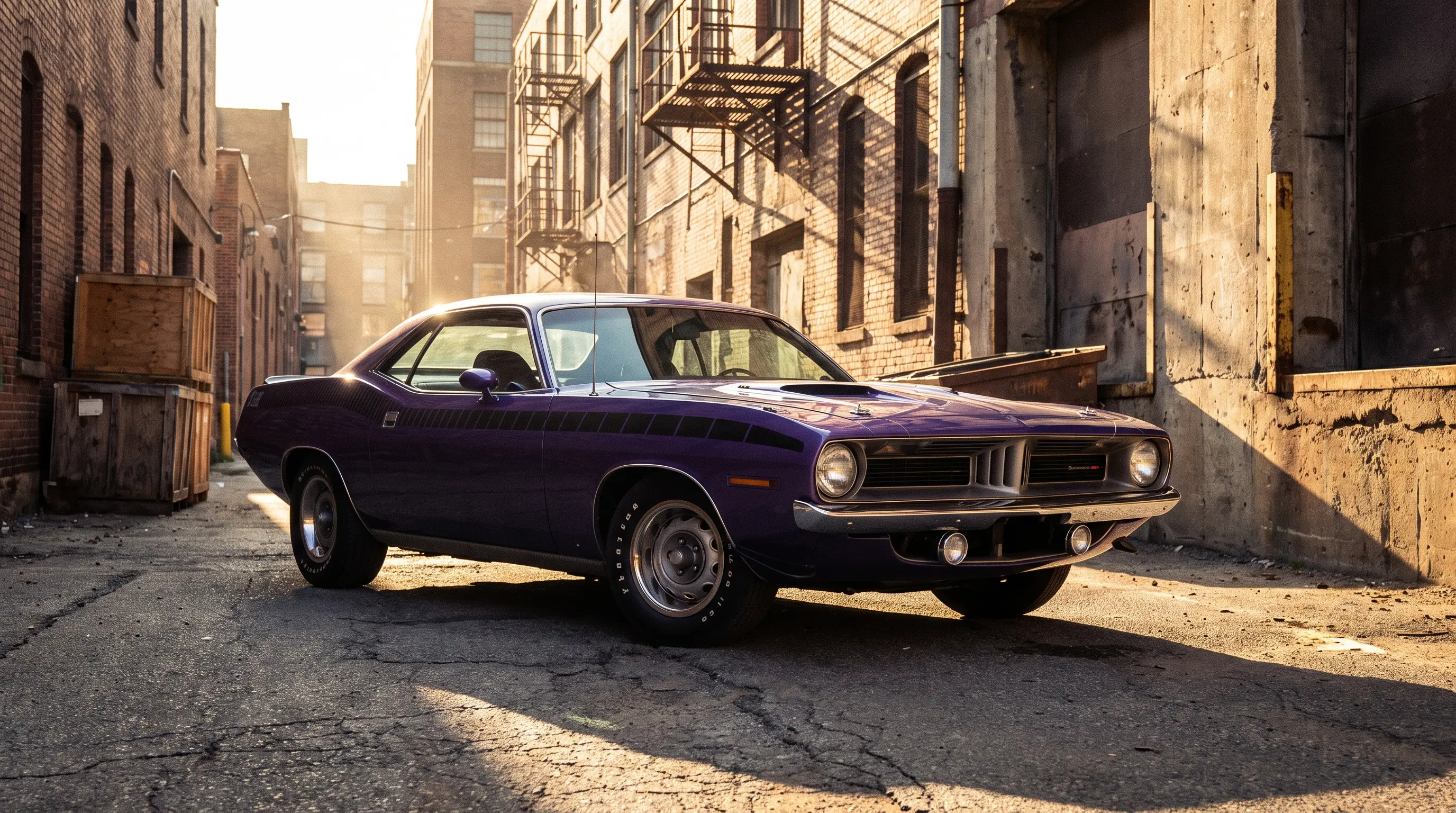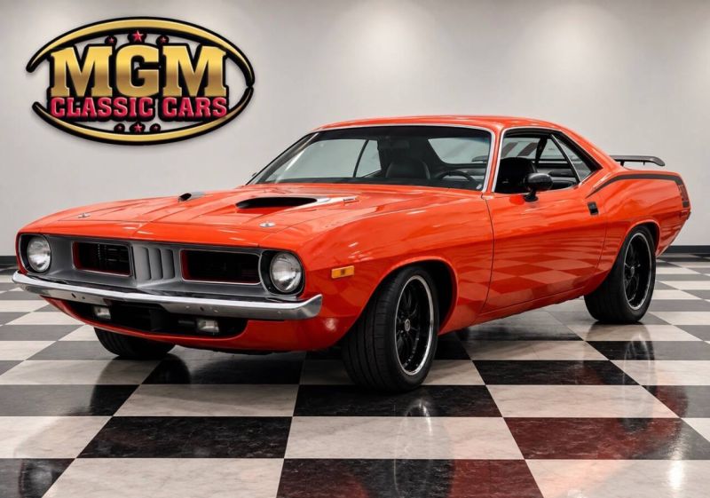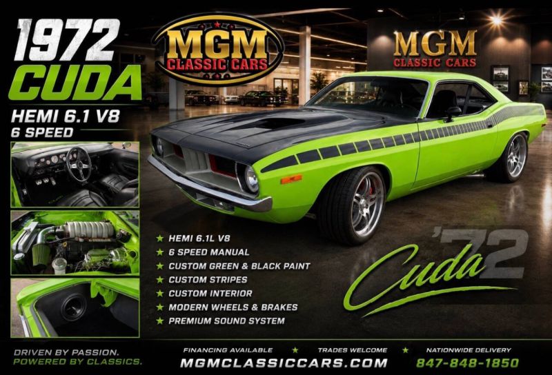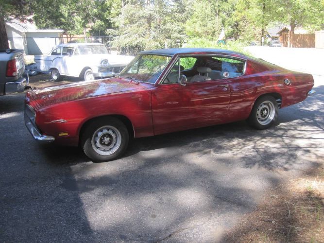

Walk any big Mopar show and you can spot a 1971 Plymouth 'Cuda from the far end of the row before you can read the badge. That is the point of the cuda billboard stripes, the wide graphic that runs across the rear quarter panel and calls out the engine displacement in numbers big enough to read from the parking lot. I have repainted this stripe more times than I can count, and every single time it teaches me something new about how Highland Park built these cars to be seen, not just driven.
What the billboard stripe actually is
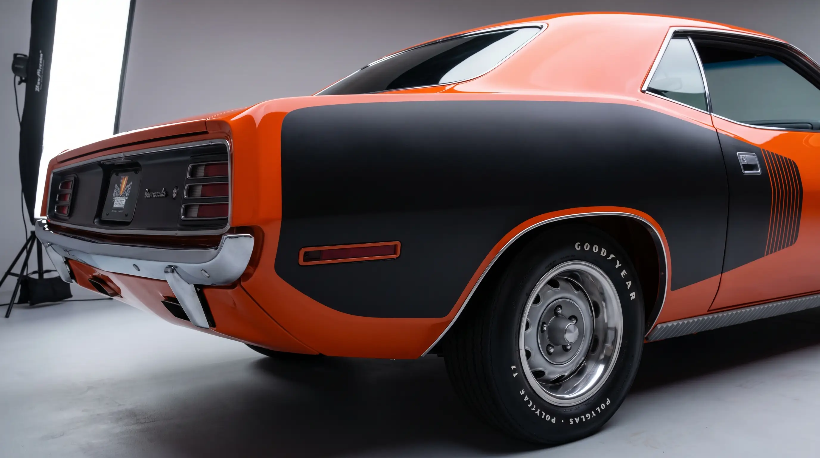
The billboard stripe is not a single decal. On the cars I have stripped down to bare metal, it is a two-piece graphic, a wide color band that wraps from the door to the rear of the quarter panel, broken by a bold outline that frames the engine size, like "340" or "440 SIX PACK" or the AAR script. The stripe sits low on the body, right over the wheel arch, which is a deliberate placement. It draws the eye along the character line Plymouth's designers cut into the E-body sheet metal, so the graphic and the shape of the car are working together instead of fighting each other.
Original tape was a vinyl film, not paint, applied at the factory or at the dealer depending on the order sheet and the plant. That distinction matters enormously to anyone doing this restoration correctly. A repaint with the wrong gloss level or the wrong font weight on the numbers reads as fake from ten feet away to anyone who has handled an original piece. I tell customers this constantly: the stripe is not decoration you add at the end, it is a graphic element with its own tolerances, and getting the layout wrong is the fastest way to turn a real cuda billboard stripes car into something that looks like a tribute build.
1970 versus 1971, and why builders argue about it
The billboard stripe was a 1971-only option. It replaced the narrower "hockey stick" quarter panel stripe that the 1970 'Cuda wore, which called out the same engine displacements, 340, 383, 440, or Hemi, but in a much smaller graphic tucked along the character line rather than a broad band. For 1971 Plymouth's designers went bolder, and the result was the billboard, a wide, high-contrast graphic offered in matte black or white depending on body color. That is exactly why a 1971 car wearing a billboard stripe reads so differently from a 1970 car at a glance, on top of the quad headlight arrangement and other trim changes that shifted the visual balance of the whole front half of the car for 1971.
I have had customers insist their 1970 needs a billboard stripe kit because that is what shows up first in a parts catalog search, and that is a mistake I correct on every one of those jobs. The two model years are not interchangeable in this detail, a 1970 car wearing a billboard stripe has the wrong graphic for its year, and a builder who does not know that is not someone I would trust with a numbers-matching restoration. If you want the full story on how these two years diverged in styling and options, it is worth reading before you commit to a stripe kit.
Why the stripe called out the engine
Putting the displacement number directly on the body was a muscle car era habit, and Plymouth leaned into it harder than most. A 340 was proud of being a 340. A 440 Six Pack wanted you to know it before the driver ever touched the throttle. This was advertising painted onto the car itself, aimed at anyone standing at a stoplight, and it fits the broader personality of the era's high impact colors and screaming graphics package. The stripe was never subtle, and it was never meant to be.
From a builder's chair, the stripe also tells a story about how the car was ordered. A base six-cylinder Cuda with a billboard stripe calling out a big-block it does not have is either a clone, a mistake from a prior restoration, or a fraud in progress, and I have seen all three. Reading the stripe correctly against the fender tag and the broadcast sheet is one of the first things I check on any car that comes into my shop claiming period-correct trim.
The callouts themselves varied more than people assume
Not every stripe said the same thing, and that is a detail a lot of newer collectors miss. The lettering inside the stripe changed depending on what sat under the hood, so a car could wear "340", "383", "440", "440 SIX PACK", or the AAR script, and each of those callouts had its own proportions and spacing worked out by the factory art department. I have laid out enough of these kits to know the letterforms are not interchangeable between callouts either, the "SIX PACK" lettering is set differently than a simple three-digit number, because the sign painters who developed these templates were solving a different visual problem each time, fitting more characters into the same vertical space without shrinking the type so much it lost its punch from a distance.
That variation is exactly why a shop with a single generic "billboard stripe kit" in stock should raise a flag for anyone shopping a restoration. I have turned away requests to slap a 440 callout on a car that left the factory with a 383, because doing so without disclosing it turns a repaint into a fabrication, whatever the customer's intentions. The honest version of this work always starts with confirming the original engine code on the fender tag before a single template goes on the panel, and that step should never get skipped just because a customer is in a hurry to get the car back on the road for a show.
Aging is its own tell too. Original vinyl from this era yellows and shrinks in a specific, gradual way, and the edges lift first at the corners long before the center of the graphic shows any wear. A stripe that looks uniformly aged across its entire surface, with no edge lift at all, is usually a tell that somebody has already redone it once and is trying to pass it off as original. I check corners and trailing edges first on every car that comes in claiming factory-original trim, because that is where the truth usually shows up before anywhere else on the panel.
Getting a repaint right
Vinyl versus paint is the first decision, and I push most customers toward reproduction vinyl if the goal is a driver-quality car, because it is removable and forgiving if you get the layout slightly wrong the first time. For a concours build chasing originality points, painted stripes done with proper masking and the correct edge treatment are the harder, more honest path, and they hold up to close judging in a way that some vinyl kits do not.
Either way, the layout has to respect the factory template. I lay out centerlines from the wheel opening and the rear marker light before anything touches the panel, because eyeballing it against "what looks right" always ends up a half inch off from where the factory jig put it. Small as that sounds, judges and serious buyers notice. So does anyone who has stood next to an original car and studied it long enough to know the proportions by feel.
"The stripe is not trim, it is a spec sheet painted on the car. Get the layout wrong and you have built a costume, not a restoration."
- Jim Vasquez
What it means for value today
Original, factory-correct billboard stripes in good condition add real weight to a car's story at sale time, especially on the bigger engine cars where the stripe is doing exactly the job it was designed to do, announcing the motor. Buyers shopping seriously for one of these cars should look hard at stripe condition and correctness before anything else on the rear quarter, because a poorly executed repaint is one of the fastest tells that a car has had inexpert hands on it somewhere in its history. Anyone hunting for a solid example, whether stripe-equipped from the factory or a documented later addition, can find a classic Barracuda for sale and start comparing real cars against everything covered here.
The billboard stripe endures because it did what Chrysler wanted it to do for that one model year in 1971: turn a fast car into a loud statement, and it still turns heads in a parking lot full of far newer machines. That is a rare kind of graphic design, one built to be understood in half a second from across a street, and it has aged into one of the most recognizable design cues to come out of Highland Park in that entire era.
Sources and notes
- Mopar Connection Magazine: Plymouth's Big, Bold Billboards on the 'Cuda
- Phoenix Graphix: 1971 Plymouth 'Cuda Billboard Side Stripe Kit
- Phoenix Graphix: 1970 Plymouth AAR 'Cuda Stripe Kit
- Classic Industries: 1970 Plymouth 'Cuda Hemi Black Hockey Stick Stripe Set
- autoevolution: 1970 Plymouth AAR 'Cuda, a One-Year Gem