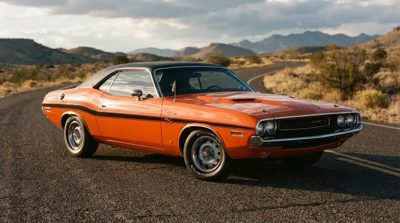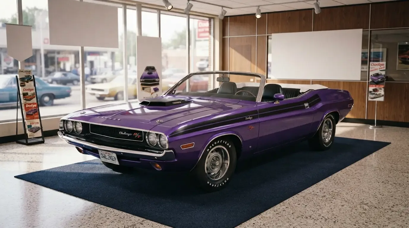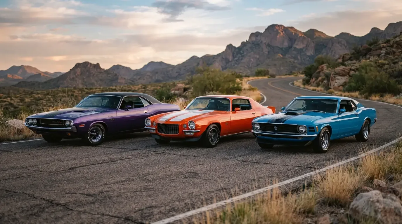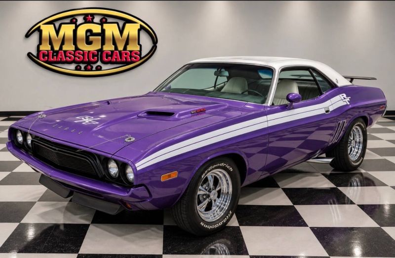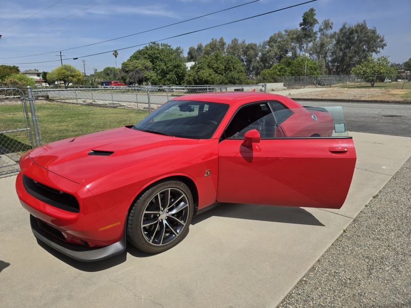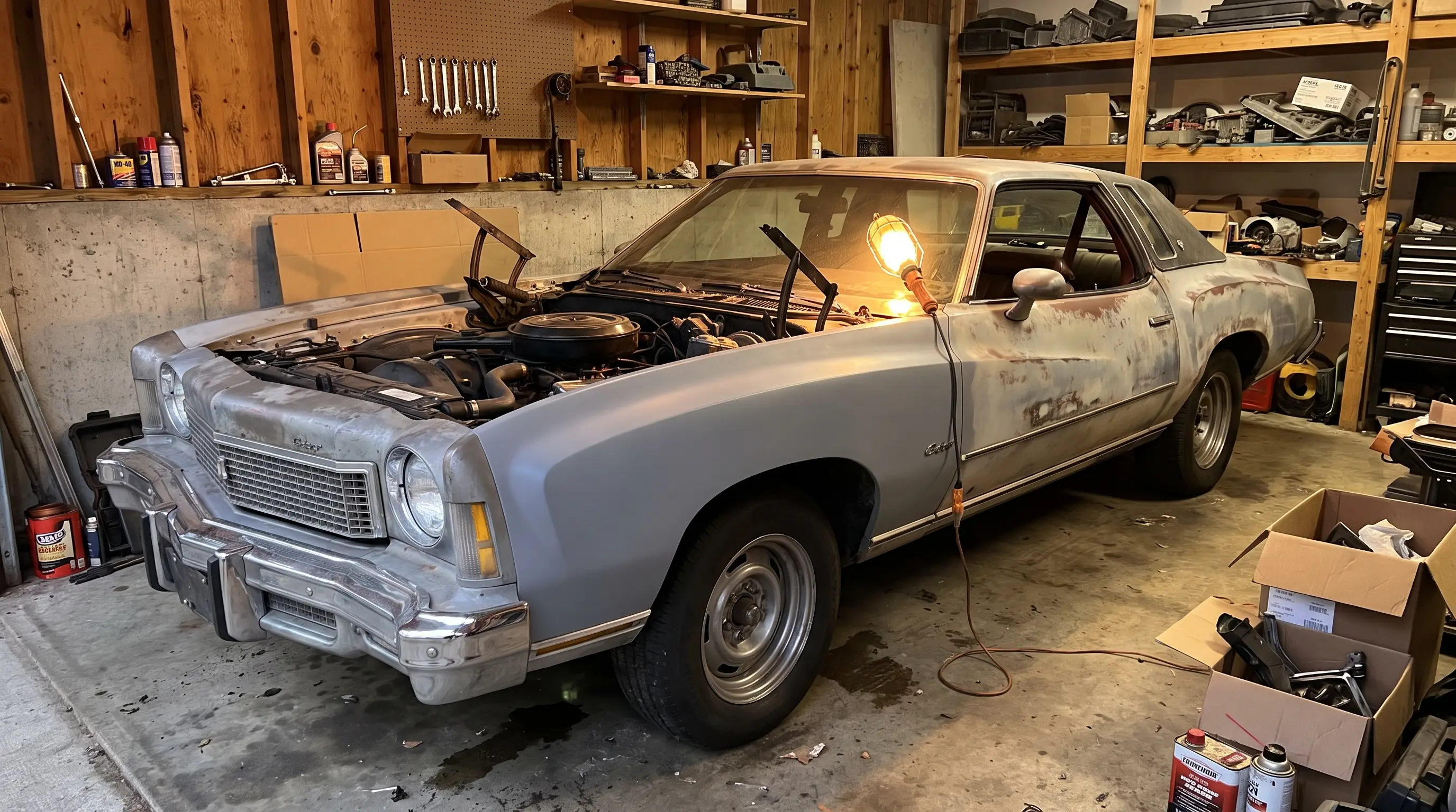

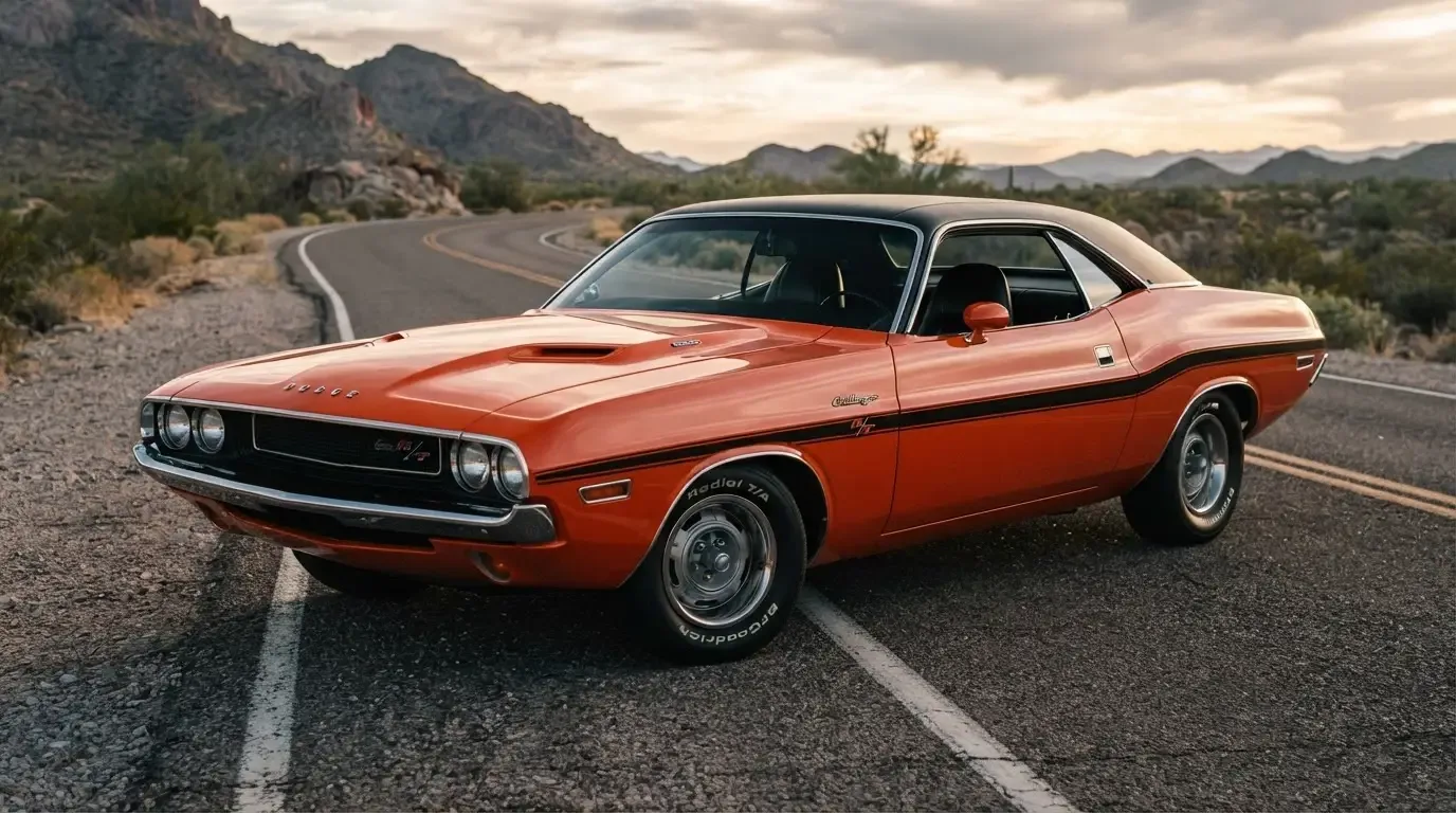
The 1970 Challenger design is built on a single idea executed with unusual discipline: a long hood, a short deck, and a body that curves rather than creases its way from front fender to rear quarter. Dodge's stylists had the Barracuda's E-body underpinnings to work with, the same wheelbase family and cowl point as Plymouth's car, and from that shared starting point they produced something that reads as its own object rather than a badge exercise. Fifty-plus years on, the 1970 Challenger still gets pulled out as a reference point when people talk about what a coke-bottle profile is supposed to look like.
The coke-bottle shape, explained
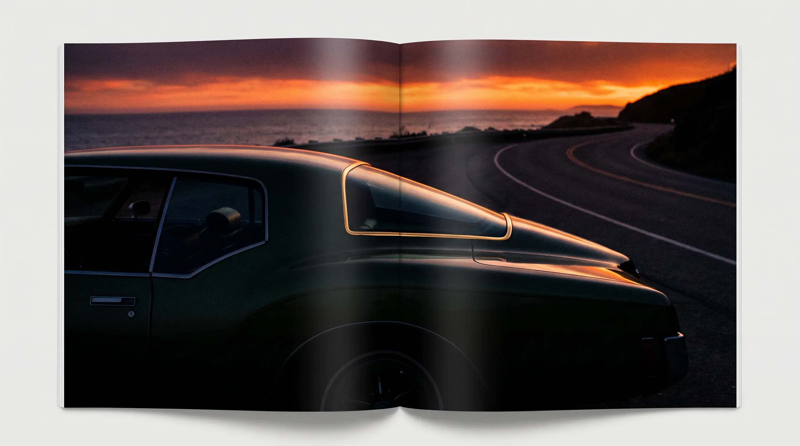
The term describes the way the body narrows through the doors and then flares out again over the rear wheels, a shape borrowed loosely from the silhouette of a glass soda bottle. On the Challenger this shows up most clearly if you stand at the rear three-quarter and look down the flank toward the front fender. The sheet metal pinches in behind the front wheel opening, then swells again as it reaches the rear haunch, giving the car visual muscle over the back tires without any actual change in track width. It is a trick of surfacing, not engineering, and it is one of the harder things to execute well in sheet steel because the transitions have to stay smooth under changing light or the whole effect falls apart into a series of odd reflections.
Dodge's designers pulled it off with a single strong character line running the length of the car, picking up light along the doors and giving the profile a sense of forward motion even parked at the curb. The Barracuda used a related but distinct treatment of the same basic theme, which is part of why the two E-body siblings look like cousins rather than twins despite sharing a platform underneath.
Front and rear treatments that set it apart
The Challenger's face centers on a full-width grille recessed into the nose, flanked by hidden or exposed headlights depending on trim and options, with a shape that reads aggressive without relying on excessive chrome. The rear end carries wide, horizontal taillights spanning nearly the full width of the car on many trims, a detail that gave the Challenger a distinct nighttime signature different from the Barracuda's round units and different again from the Mustang and Camaro's own lighting approaches that model year.
Hood treatments varied by trim and option package, with performance-oriented cars getting functional or non-functional scoops depending on engine choice, and the SE trim's smaller rear window and vinyl roof gave that version a noticeably more formal profile compared to the standard coupe's greenhouse. These were not small tweaks. Changing the rear glass shape and roofline on the SE meant real tooling investment for a trim level Dodge expected to sell in smaller numbers than the mainstream coupe, which says something about how seriously the company took differentiating its trim ladder visually as well as mechanically.
How it compared to the Barracuda underneath
Because the two cars shared the E-body platform, the differences in our complete history of the 1970 Challenger are worth reading alongside a close look at the Barracuda's sheet metal to appreciate how much Dodge's design team changed while keeping the same hard points. The Challenger rode on a two-inch longer wheelbase, which gave stylists a bit more room to stretch the proportions and produce a slightly more elongated hood-to-cowl relationship than the tighter, more compact-looking Barracuda achieved on the shorter chassis.
Interior design followed a similar logic. The Challenger's dashboard and instrument cluster took a more conventional, driver-focused layout compared to some of Plymouth's flourishes, with clear primary gauges and simple, legible switchgear that reflected Dodge's positioning of the car as the more comfortable, more livable option in the segment.
Color and trim as part of the design statement
Dodge leaned into the "High Impact" color palette for 1970, offering shades with names like Plum Crazy and Go Mango that turned the Challenger's exterior into as much a statement as its shape. These colors were not subtle, and they were not meant to be. They were part of a broader strategy across Chrysler's performance lineup to make cars that photographed well, stood out in a parking lot, and gave younger buyers something loud to associate with the brand. Paired with black or white contrasting stripes on R/T and T/A models, the color program did as much to define the 1970 challenger design in popular memory as the sheet metal shape itself.
| Design element | Detail |
|---|---|
| Body theme | Coke-bottle profile, long hood, short deck |
| Wheelbase vs Barracuda | Two inches longer |
| Signature rear detail | Full-width horizontal taillights (trim dependent) |
| SE trim distinction | Vinyl roof, smaller rear window, formal roofline |
| Color program | High Impact palette including Plum Crazy and Go Mango |
"What separates a good coke-bottle shape from a mediocre one is how the surfaces catch light as they transition, and on the 1970 Challenger that transition is nearly seamless. It is a harder trick to pull off in stamped steel than most people realize, and it holds up under close inspection even today."
- Sarah Whitfield
Why the shape still resonates today
Modern retrospectives on American design from this era keep returning to the 1970 Challenger because the proportions were right the first time, without the awkward mid-cycle facelifts that some competitors needed to stay fresh. Collectors and judges at concours events consistently point to the original stamping quality and panel gaps as benchmarks against which reproduction and restoration parts get measured. That consistency is part of why unrestored, well-preserved examples of the 1970 car command such careful attention when they surface, and why buyers researching the model spend real time studying trim-specific styling cues before they go looking to find a classic Challenger of their own.
The design holds together because every element, from the grille to the taillights to the paint names, was pointed at the same goal: making the Challenger look faster and more substantial standing still than its specifications alone might suggest. That is a harder job for a design team than making a car simply look fast in a straight line, and it is the reason the 1970 Challenger's shape still gets referenced whenever the conversation turns to American design from the muscle car era.
There is also a documentation angle worth noting for anyone researching an original car. Because so much of the Challenger's design language depended on trim-specific details, stripe placement, hood treatment, and rear glass shape, correctly identifying an unrestored example often comes down to comparing these small styling cues against factory build records rather than relying on memory or a casual glance. A T/A hood scoop is not interchangeable with a standard R/T piece, and SE roof trim was never meant to appear on a base coupe. Judges and appraisers who specialize in this era treat these details the way a numismatist treats a mint mark, small, easy to overlook, and decisive when authenticity is in question. That level of scrutiny is part of why the styling of the 1970 car remains such a rich subject on its own, separate from the mechanical history that usually gets top billing in broader retrospectives.