
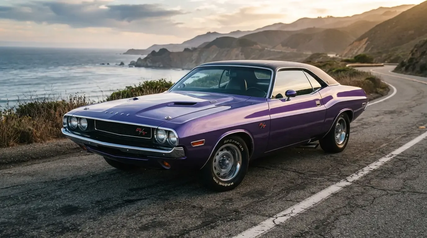
A woman in Toledo once told me she bought her 1970 Dodge Challenger R/T for the color before she ever asked about the engine. It was Plum Crazy, a purple so loud the dealer had warned her father it might not sell. He was wrong. It sold in a week, and forty years later she still owns it. That is the thing about challenger rt colors: they were never an afterthought. They were the argument.
Car Features
8 min read
The Boldest Colors on the Challenger R/T
Dodge's High Impact palette turned the Challenger R/T's paint into a statement, and decades later those loud colors are the ones collectors chase hardest.
Paint as a decision, not a default
By the time the Challenger R/T reached showrooms for 1970, Dodge had learned something from watching Plymouth sell Barracudas in shades that made buyers laugh out loud in the parking lot. Loud paint moved cars. So Dodge built its own answer, a lineup of colors marketed under the name High Impact, and it dared young buyers to pick something their parents would never have chosen for a family sedan. Sublime green. Go Mango orange. Panther Pink, the same shocking magenta that Plymouth sold on its own cars as Moulin Rouge, two names for one FM3 pigment split across Chrysler's divisions. Each one carried a name built for a showroom conversation, not a paint chip catalog.
The strategy worked because it matched the car underneath it. A Challenger R/T already had the big-block presence, the twin hood scoops, the wide stance. Wrapping that shape in a color that practically hummed was not excess. It was honesty. The car looked fast standing still, and the paint made sure nobody missed it.
The names buyers still repeat
Ask a Mopar person to list the era's colors from memory and you will hear the names recited like a small poem. Hemi Orange. Top Banana. Lime Light. Green Go. Some of these read like inside jokes, and in a sense they were, dreamed up by young designers who wanted the color chart itself to feel like part of the counterculture moment. Dodge was not alone in doing this, but the Challenger's High Impact palette became one of the most collected and most discussed of any muscle car generation, in part because so few competitors committed to the bit as fully.
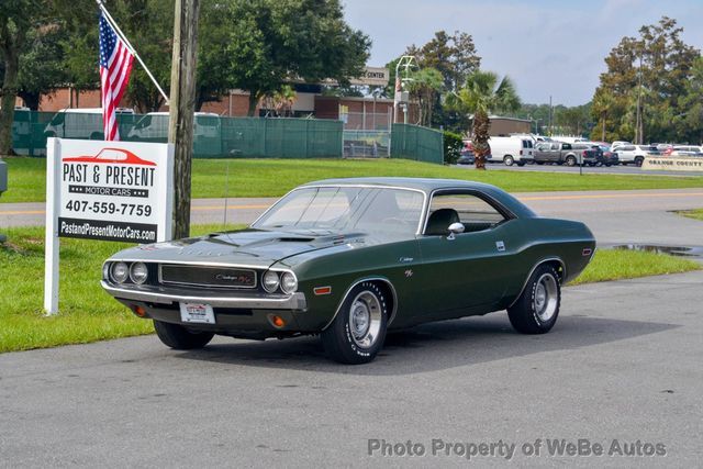
Plum Crazy remains the color most non-enthusiasts recognize, largely because it photographs so well and because it survived into later Dodge marketing as a kind of brand shorthand. But talk to restorers and a different color often comes up as the hardest to source correctly: Green Go, Dodge's name for the FJ6 shade better known under Plymouth's badge as Sassy Grass Green, a yellow-leaning green that faded unevenly and that modern paint suppliers still argue over matching.
Why the loud colors ended up worth more
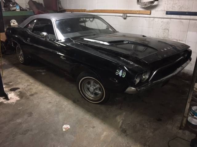
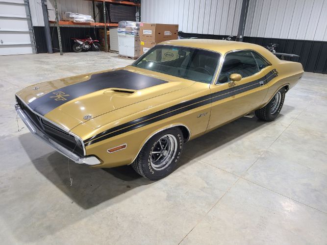
It is a strange twist of collector economics that the colors dealers once struggled to move now carry a real premium at auction. A 1970 Challenger R/T in a muted color like Black or Ivy Green is a fine car. The same R/T in Sublime or Plum Crazy, with factory paperwork to prove it left the plant that way, draws a different kind of bidder, one who wants the car precisely because it is impossible to ignore. Buyers who want the dodge challenger rt story in full will find that the mechanical specification barely changed between color choices. What changed was how the car was remembered, photographed, and eventually valued.
That gap between production reality and collector demand is worth understanding before shopping. High Impact colors were a fraction of total R/T production in any given year, which means original paint documentation matters more here than almost anywhere else in the hobby. A repaint in the right shade still looks striking. It just will not carry the same story.
"People assume the color is decoration. On these cars it was the pitch. Dodge built a fast car and then dared you to be seen in it."
- Nora Beckett
Living with a loud color today
Owners of High Impact Challengers describe a particular kind of attention that muted colors simply do not attract. Gas station conversations. Phones raised at stoplights. It is a different relationship with a car, more performance than possession, and it is not for everyone. Some owners eventually repaint toward something quieter after a few seasons of being flagged down at every stop. Others lean into it entirely, treating the color as part of the car's personality rather than a coat that happens to be on top of the metal.
For anyone weighing a purchase, the paint code stamped on the fender tag is the place to start, cross-referenced against the build sheet if one survives. The color a Challenger wears today is not always the color it left Detroit wearing, and that single detail can separate a documented example from a pretty repaint. Readers who want the mechanical and production background behind these choices can find the full story of how the model came together.
The interior told the same story, quieter
Outside the fender, the High Impact colors were loud enough to carry the whole conversation, but Dodge did not always match that volume inside the cabin. Most Challenger R/Ts left the factory with black, white, or a handful of neutral interior trims regardless of exterior color, which meant a Plum Crazy car often paired that shocking purple with a cabin that looked, by comparison, almost restrained. A few interior colors did lean into the same energy, notably a green vinyl that showed up on select R/Ts, but the pairing rules were narrower than buyers today sometimes assume.
That mismatch matters for anyone restoring a car today. It is tempting to assume a wild exterior deserves an equally wild interior, and some resto-mod builds go that route deliberately. But a numbers-correct restoration has to respect what the factory actually paired, which means checking the interior trim code on the fender tag with the same seriousness as the paint code itself. Getting the exterior right while guessing at the interior is a half-finished restoration, however good the paint looks from the driveway.
How buyers reacted at the time versus now
It is worth remembering that not every 1970 buyer wanted the loudest color on the chart. Plenty of Challenger R/T orders came through in quieter shades, black, white, a handful of blues and greens that would not have turned a single head in a parking lot. Those buyers were not wrong. They simply wanted the performance without the spectacle, and Dodge was happy to sell them that version too. The High Impact colors were an option, prominently marketed, but never the majority of what left the factory.
The market's memory has flattened that nuance somewhat. Because the loud colors photograph so well and generate so much of today's collector conversation, it is easy to forget that a quiet-colored R/T was, and remains, just as mechanically legitimate as a Sublime or Go Mango example. The difference is purely in how the car reads from across a parking lot, and in what a specific type of buyer is willing to pay for that visual statement decades later.
Where to look if the color is calling you
Loud paint is not a rumor confined to auction catalogs. It shows up in regular listings too, sitting between more conservative colors as the car that stops the scroll. Anyone hunting for one of these should treat the search the way that Toledo owner treated her first look decades ago, trusting the color to tell part of the truth about the car. Shoppers browsing classic Challengers on the market today will still find the occasional Sublime or Plum Crazy example among the field, and it is usually the first one that sells.
The paint chart Dodge printed in 1970 was small, a handful of names on a single sheet. Its influence has outlasted almost every other decision the company made that model year, which says something about how much a color can carry when the car underneath it earns the attention.
Sources and notes
- The 10 Mopar High-Impact Colors: Complete Guide - autoevolution
- Panther Pink and Moulin Rouge - OnAllCylinders
- Panther Pink and Moulin Rouge (FM3) Mopars registry
- Panther Pink Six Pack Challenger T/A - DodgeGarage
- 1970 Challenger Green Go paint reference
- Dodge Challenger (first generation) - Wikipedia
Related Reading

About the author
Nora Beckett
Automotive features writer and photographer who tells the human stories behind the cars, from show fields to cross-country road trips.
Related Listings - Dodge Challenger
Comments
Be the first to comment on this article.