
I have mixed paint for a lot of muscle cars, and none of them fight you quite like getting 1970 cuda colors right. Plymouth's High Impact palette was never a subtle set of options, and matching one of these shades in a modern booth means fighting fifty years of fade, prior repaints, and paint codes that do not always mean what people assume they mean.
What "High Impact" actually meant
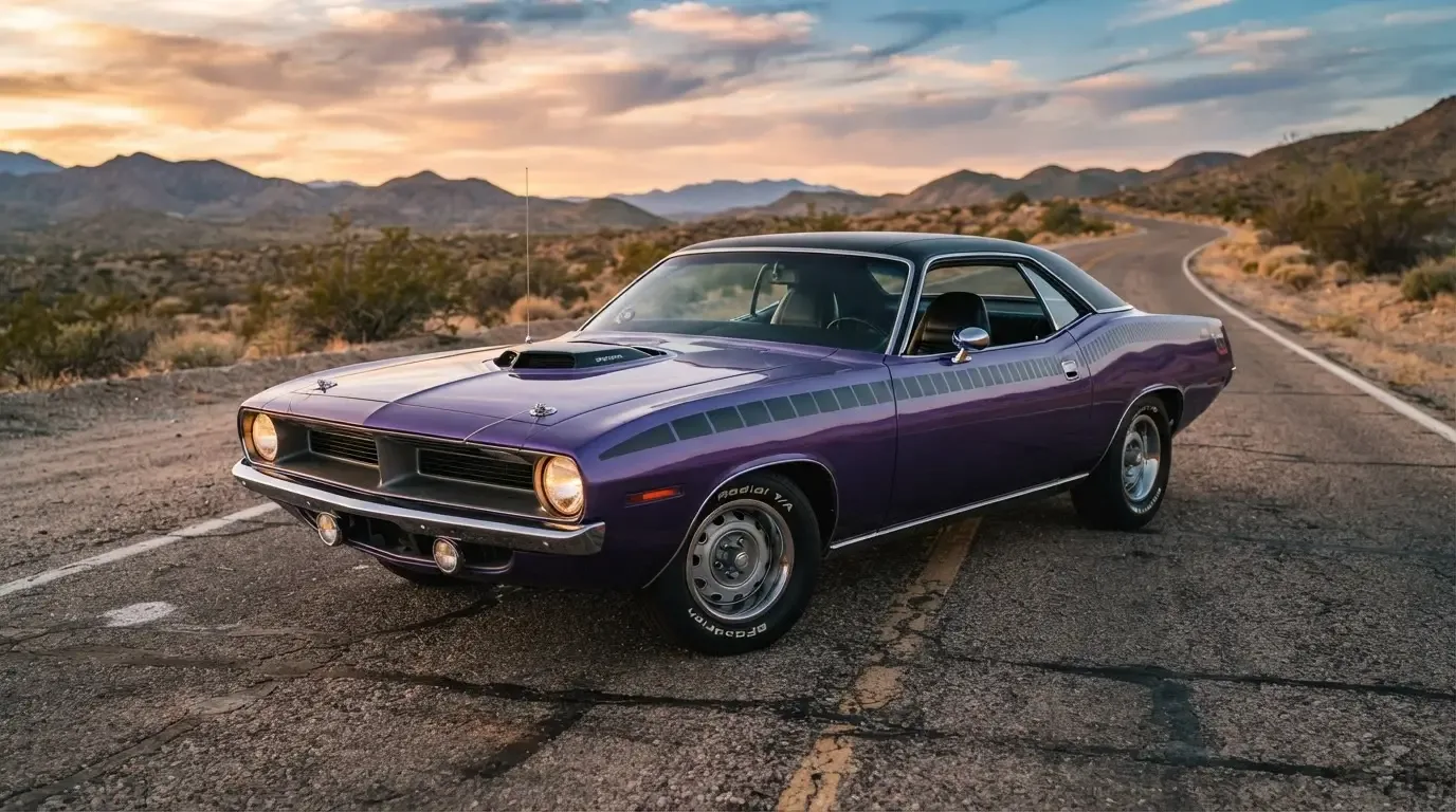
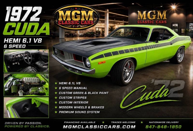
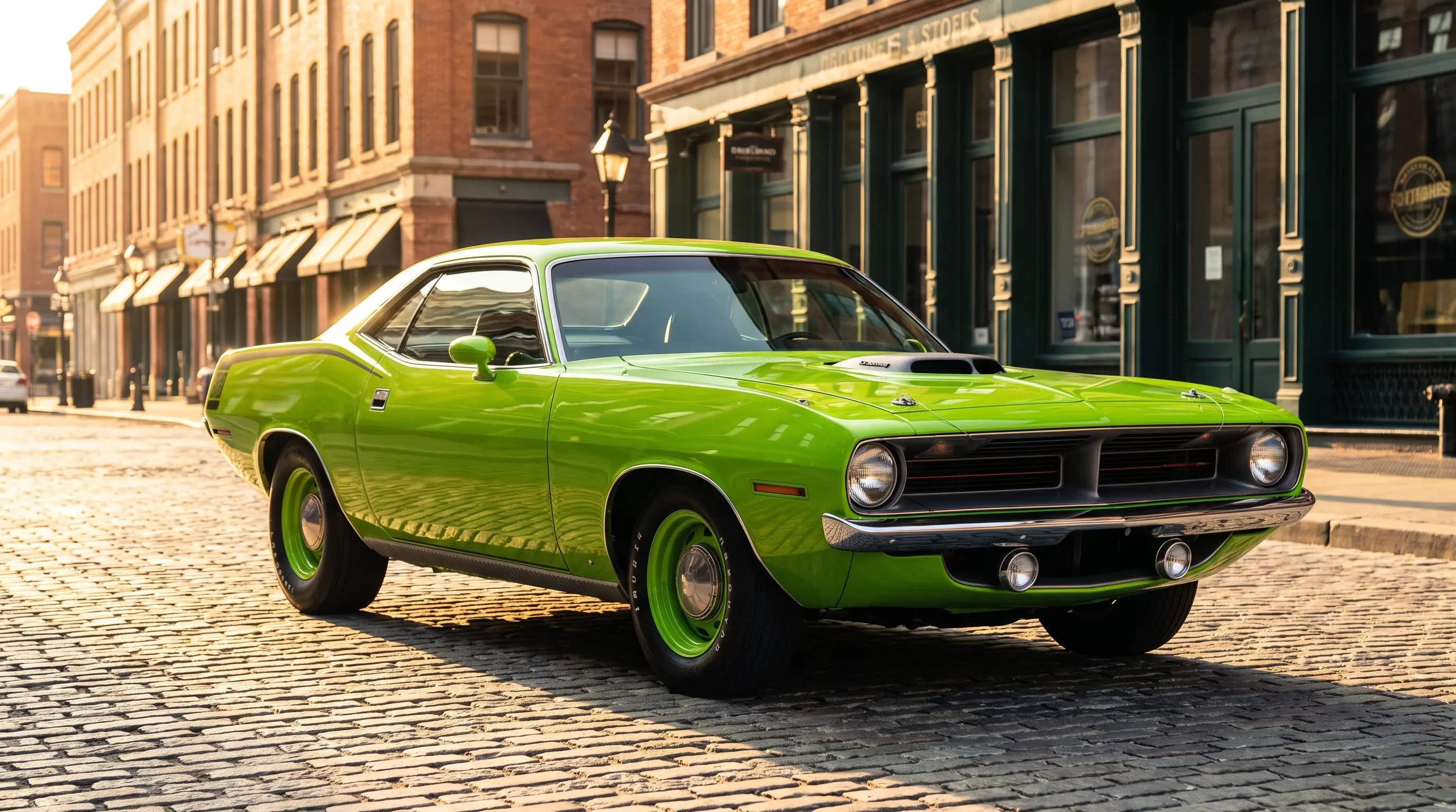
Plymouth introduced its High Impact color palette specifically to push loud, attention-grabbing shades into the muscle car market, and the Cuda became one of the primary showcases for that strategy. Names like Lemon Twist, Moulin Rouge, In-Violet, Vitamin C, and Tor Red were not accidents of marketing copy. They described colors that had no real precedent in mainstream American car buying, bright enough that a customer either loved them immediately or thought Plymouth had lost its mind. Both reactions sold cars, and that was the point.
From a paint booth, these colors are unforgiving. Lemon Twist in particular shows every flaw in prep work because the color has almost no depth to hide behind, unlike a metallic or a darker shade that can mask minor imperfections in the substrate. If you have ever wondered why a poorly redone Cuda in one of these colors looks off even to a casual eye, it is usually because whoever sprayed it treated the color like any other paint job instead of respecting how thin the margin for error actually is with these shades.
Getting the code right versus getting the look right
Chrysler's paint codes from this era are documented, but original formulas do not always translate cleanly to modern base coat and clear coat systems, and a shop that just plugs a historical code into today's mixing computer without cross-checking against a verified original sample can end up with a color that is technically coded correctly and visually wrong. I always tell customers to find an original, unfaded reference panel if one exists on the car, somewhere under a trim piece or inside a door jamb, before trusting any modern paint mix blind.
This matters more on 1970 Cuda colors than on almost any other muscle car palette I have worked with, because the whole appeal of these shades is their intensity. A slightly muted Moulin Rouge is not a close approximation, it is a different color entirely as far as anyone who has seen the real thing is concerned.
Colors and the stripe package
Body color and the available hockey stick stripe graphic were designed to work together, not independently, and Plymouth offered stripe color combinations specifically chosen to contrast against each High Impact shade. A car finished in a loud body color with a poorly matched or incorrectly colored stripe kit looks wrong to anyone who has studied original factory combinations, and getting that pairing right is one of the details serious buyers check closely before trusting a repaint's overall correctness. The wider billboard stripe most people picture on an E-body Cuda is a 1971-only graphic, so it should never show up paired with a 1970 High Impact color. For the full history of that stripe package and how it evolved between model years, where this started covers the ground in detail.
How rarity within the palette changes value
Not every High Impact color sold in equal numbers, and that unevenness matters a lot more to today's buyers than it did to the original showroom customers picking a shade off a color chip. Some colors, whether because of regional dealer preference, timing within the model year, or simple customer taste, were ordered far less often than others, and a correctly documented car in one of the scarcer shades carries a premium that has nothing to do with the mechanical spec underneath the paint. I have seen two otherwise identical Cudas, same engine, same trim, sell for noticeably different money because one wore a color that turns up constantly at shows and the other wore one that collectors rarely see in person.
This is where paint code verification becomes a genuine value question rather than just a restoration correctness question. A buyer who cannot confirm the original color from the fender tag is buying blind on exactly the detail that might be driving a meaningful part of the asking price, and I tell every customer chasing a specific rare shade to get that code checked before money changes hands, not after. Sellers know which colors carry a premium, and an honest one will point you straight to the documentation. One who cannot or will not produce it deserves a harder look.
There is also a practical shop-side reality worth knowing. Some of the rarer High Impact shades are harder to source accurate modern reference chips for, simply because fewer original samples survive for paint companies to calibrate against, which means getting a correct-looking repaint in one of the scarcer colors can take more research and more trial mixing than a repaint in one of the common shades. That extra labor is part of why a correct repaint in a rare color costs more from a shop like mine, and it is money well spent if the goal is a car that reads right to somebody who has actually seen the original shade in person.
Fade, repaints, and buying with your eyes open
Original High Impact paint fades in specific, recognizable ways after decades of sun exposure, and I can usually tell within a few minutes whether a car in front of me is wearing original, faded paint or a modern repaint chasing the original shade. Faded original Lemon Twist takes on a slightly duller, warmer cast that is nearly impossible for a fresh repaint to replicate without deliberately aging the finish, and buyers chasing originality points should know that difference before assuming a bright, vivid example is automatically a repaint or a bright, faded one is automatically original.
"These colors were built to be loud on day one. Fifty years later, that loudness is exactly what tells you whether you're looking at the real paint or somebody's best guess at it."
- Jim Vasquez
What this means for buyers today
A correctly documented High Impact color, verified against the fender tag's paint code and ideally supported by an original reference sample somewhere on the car, adds real weight to a Cuda's value story, especially in the rarer shades that were ordered less frequently in period. Buyers should treat color correctness the same way they treat engine and options verification, as a documentation problem first and a visual impression second. Anyone ready to compare real examples against everything covered here can go look at what is available as shop classic Barracuda listings and start checking paint codes against the cars actually sitting on lots today.
Fifty years on, these colors still do exactly what Plymouth built them to do. They stop conversations, they date the car to an exact moment in American design history, and they remain some of the hardest shades in the entire muscle car era to get truly right in a modern paint booth.
Sources and notes
- autoevolution: The 10 Mopar High-Impact Colors, Complete Guide
- Classic Industries: Mopar Paint, Dodge and Plymouth High-Impact Paint Colors
- Hagerty: High-Impact Colors, When Hot Muscle Cars Got Some Crazy Paint
- Mopar Connection Magazine: Plymouth's Big, Bold Billboards on the 'Cuda
- Motorious: The 1970 Plymouth Paint Chip 'Cuda