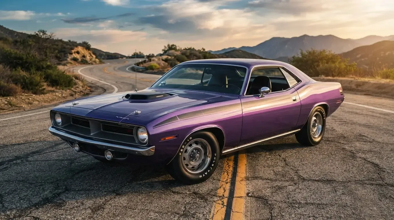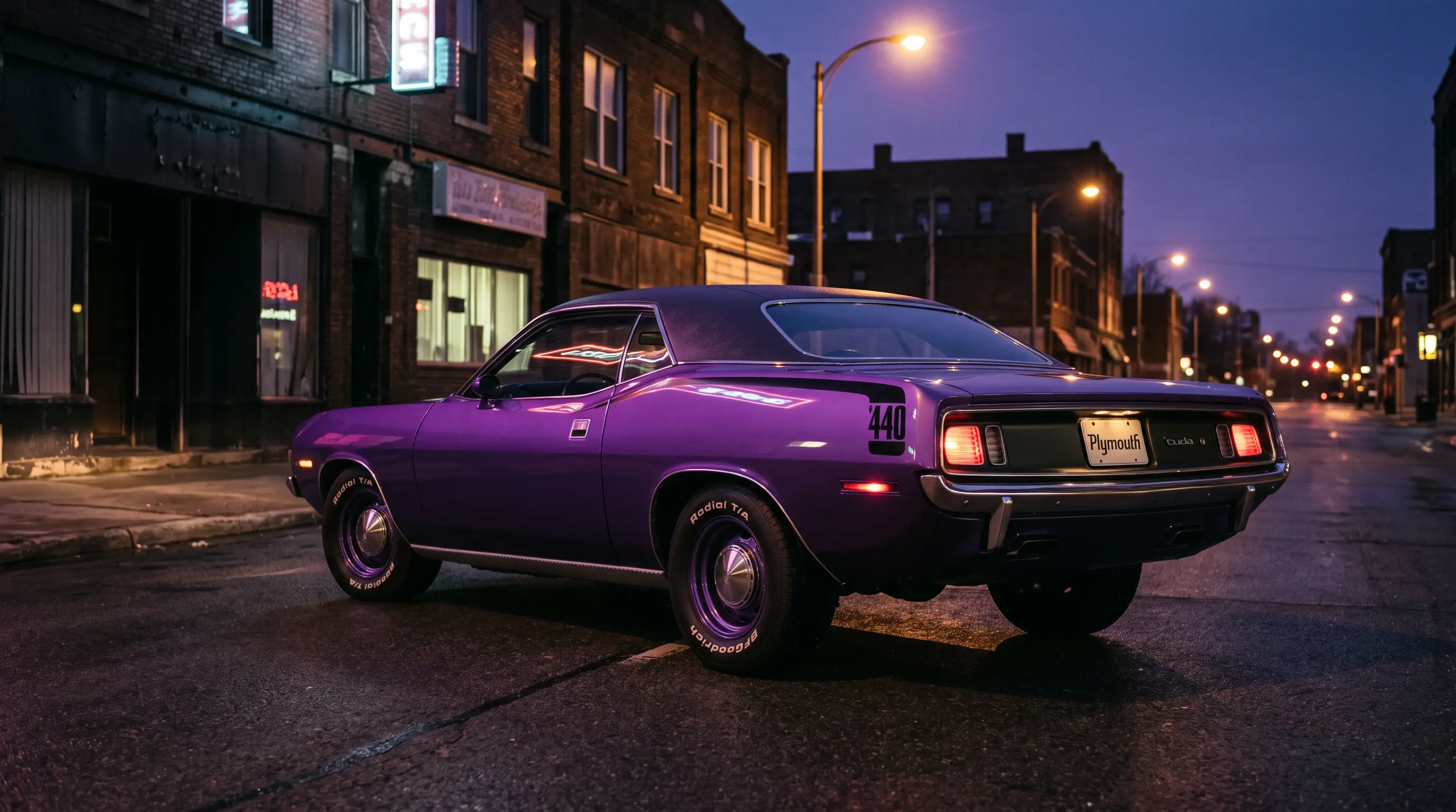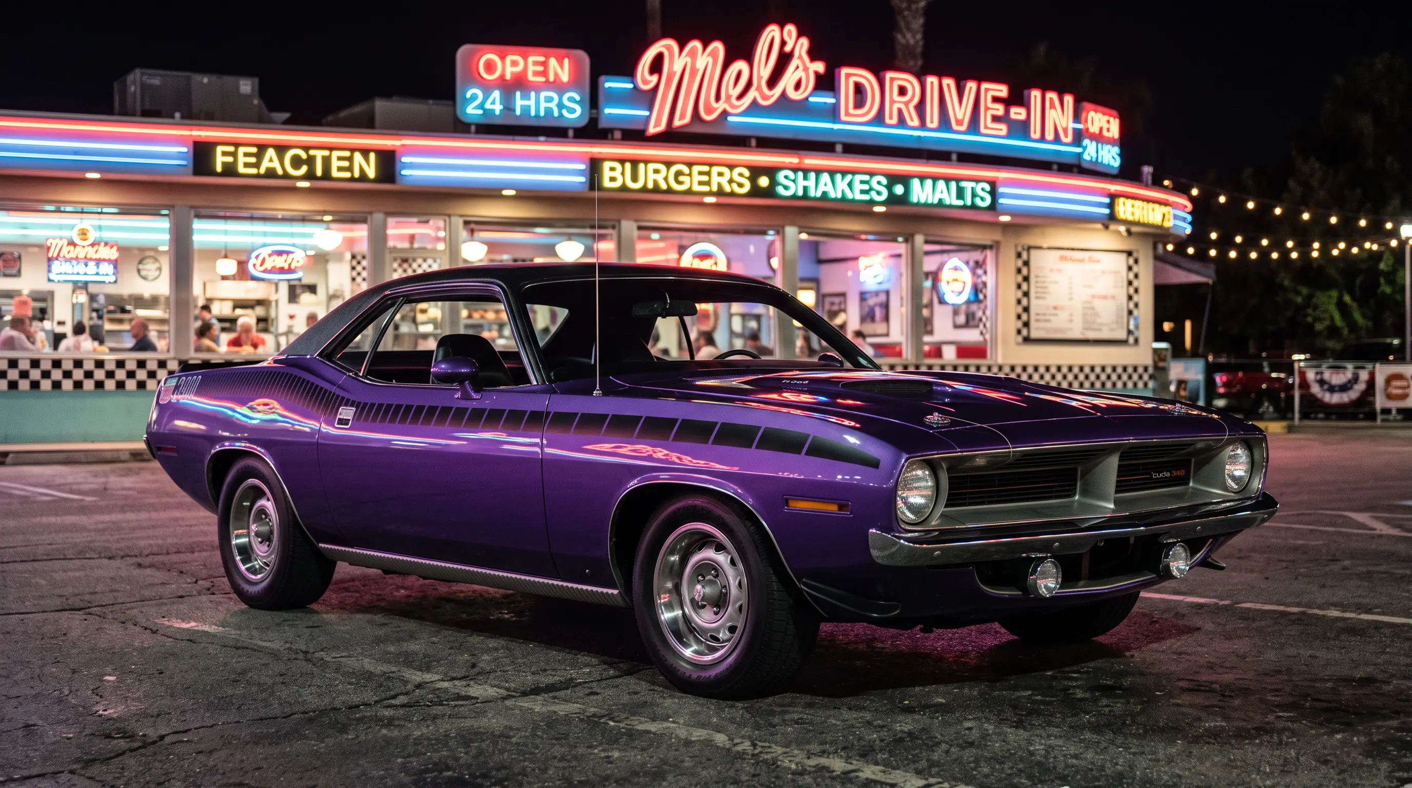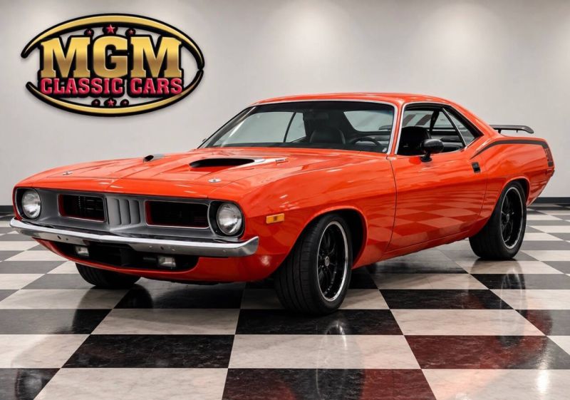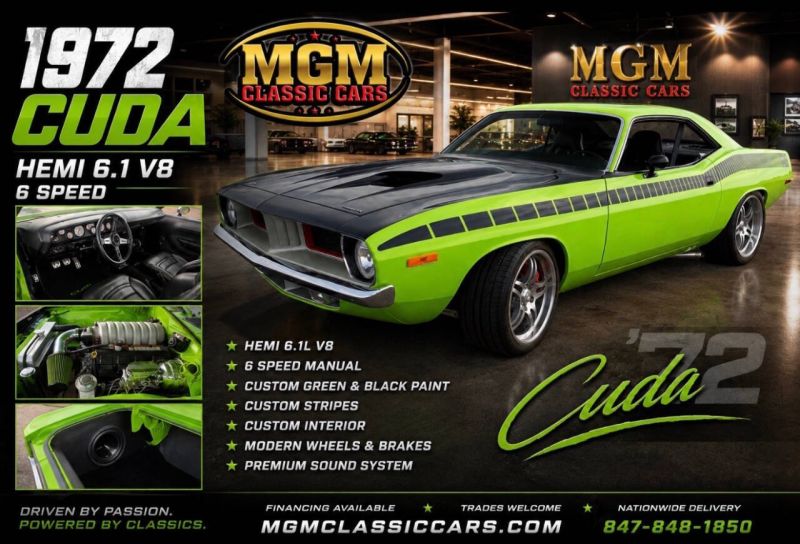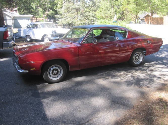

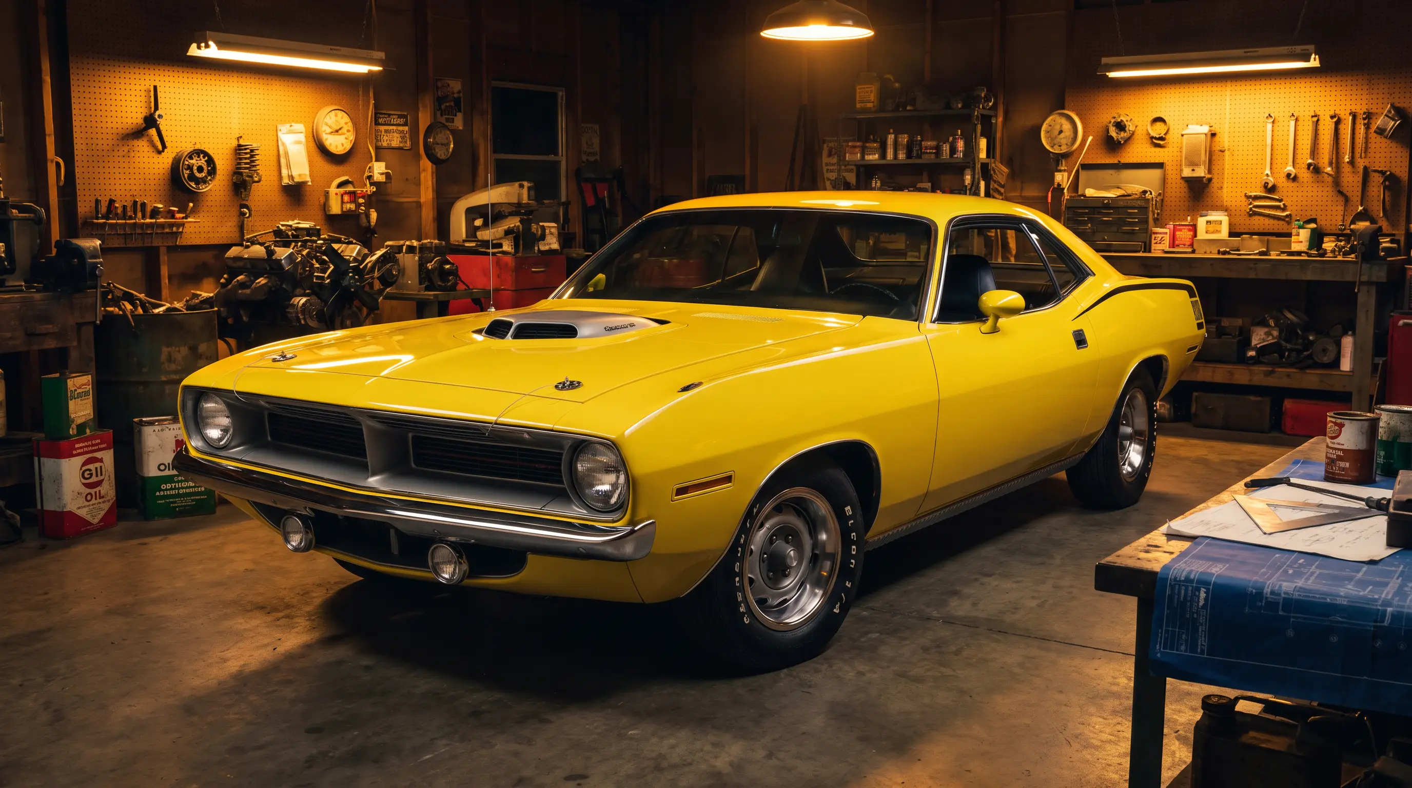
I have stripped paint off enough Cudas to know one thing for certain: the cuda high impact colors were not a marketing gimmick dreamed up in an office. They were a paint chemist's fever dream turned loose on a production line, and every one I have sanded down to bare metal still surprises me with how saturated the base coat is compared to anything else Detroit built in that era.
Plymouth called the palette "High Impact" starting in spring 1969 and kept most of it running through 1971, with a couple of shades hanging on longer on other models. That is the window that matters here. If you are working on a Barracuda from those model years and the color code does not match anything you would call normal, you are probably looking at one of these.
Where the palette actually came from
Chrysler was chasing younger buyers who were cross-shopping muscle cars against motorcycles and speedboats, both markets that had never been shy about loud color. The High Impact names, Vitamin C, Moulin Rouge, Lemon Twist, In-Violet, Sublime, were built to sound like they belonged on a drag strip flyer, not a factory order sheet. That was the point. Nobody wanted this palette to sound conservative.
From a builder's side, working with these paints today means matching a formula that has drifted through decades of reformulation as lead and certain pigments got pulled from automotive paint entirely. Getting a genuine period match on Moulin Rouge or Vitamin C takes real color work, not just pulling a can off a shelf with the old code printed on it.
Why builders treat these cars differently
A Cuda in a normal color is a nice restoration. A Cuda in a correct High Impact color with the fender tag to back it up is a different animal entirely, because the paint code becomes part of the documentation story, not just a cosmetic choice. I will not touch a car's original panels with a grinder if the tag says it left the factory in one of these colors. You are not just stripping paint at that point, you are potentially erasing evidence.
That changes how I approach bodywork on these cars. Filler goes on thinner, blocking gets more careful, and I photograph every stage before and after, because the next owner or the next appraiser is going to want the paper trail as much as the paint job.
| Color name | Approx. years offered | Builder notes |
|---|---|---|
| Vitamin C (Plymouth) / Tor Red (Dodge) | 1969 to 1970 on Plymouth, into 1972 on Dodge | Orange-red, high UV fade risk on originals |
| In-Violet (Plymouth) / Plum Crazy (Dodge) | 1970 to 1971 | Purple shift is dramatic under different light |
| Lime Light (Plymouth) / Sublime (Dodge) | 1970 only | Green-yellow, one of the hardest to match today |
| Lemon Twist | 1970 to 1973 | Bright yellow, common on documentation-heavy cars |
Get the cuda high impact colors history straight before you commit to a repaint, because getting the story wrong on a car this documented can cost you real money at resale. I have seen a car lose value because a well-meaning shop repainted it in the "closest available" shade instead of tracking down the actual period formula.
What goes wrong in the shop
The biggest mistake I see other builders make is trusting a modern paint code cross-reference without checking it against an actual original chip or a verified fender tag. Cross-reference charts have errors baked in from decades of being copied and recopied. If the car has any of its original paint left in a protected spot, a door jamb, under a weatherstrip, that is worth more to your color match than any printed chart.
The second mistake is rushing the blend. These colors do not forgive sloppy transitions the way a solid black or white will. A slightly off blend on Lime Light or In-Violet is visible from across a parking lot, and it will show up in every photo taken at a show for the life of the car.
"You do not fake your way through a Sublime respray. Either you have the formula right or the car tells on you the second it rolls out into daylight."
- Jim Vasquez
Interior and trim color coordination
Chrysler did not just slap a loud exterior color on any random interior. Certain High Impact exteriors were paired with specific interior color families to keep the overall package from clashing, and a builder who ignores that pairing when sourcing replacement upholstery ends up with a car that looks factory-wrong even with a correct paint code on the outside. I keep a reference binder of period brochure photos in the shop specifically for this reason, because a customer will hand me a swatch that looks close and it is not actually a combination Plymouth ever offered.
Stripe packages matter here too. A lot of these cars left the factory with contrasting hockey stick or side stripes designed to work with the specific base color, and a repaint that changes the base without adjusting the stripe design ends up looking like two different decades of taste bolted together. I always pull the original broadcast sheet, when one exists, before I let a customer pick a stripe color that "looks about right."
Where this fits in the bigger color story
The High Impact palette did not exist in isolation. It sat alongside more traditional colors on the same order sheet, and most Cudas built in this window still left the factory in normal shades. That is part of why the loud colors stand out so much now. They were a minority choice even at the time, which is exactly what makes a correctly documented example worth the extra work in the shop.
If you are chasing one of these cars specifically for its color, a related story on the purple end of the palette is worth your time, since the purple cars have their own quirks that do not apply to the reds or yellows.
None of this is trivia for its own sake. Every wrong pairing I catch before a customer commits to it saves them money and saves the car from another round of well-intentioned but incorrect work down the road. A shop that treats color as a checklist item instead of a system ends up doing the job twice.
Whatever color pulls you in, the underlying car still has to be sound. Barracudas for sale now are worth cross-checking against the fender tag before you fall in love with a paint job that may not even be original.